HOME | DD
 Utao — Flow flow
by-nc-nd
Utao — Flow flow
by-nc-nd

Published: 2014-05-26 18:58:51 +0000 UTC; Views: 322; Favourites: 8; Downloads: 4
Redirect to original
Description
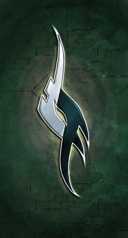
Scrapped later, I just wanted to upload this to get some feedback at my work flow. Ever since I start drawing graffiti, if I'm not lucky, I get lost in shapes and I'm never confident what to keep, what to throw out. Guys, could you help? I need advices!Related content


Comments: 19

Az első kettő szerintem ami igazán a te stílusodnak tűnik. Én talán egy kicsit egybefolyatnám a betűket, hogy nagyobb kohézió legyen köztük
 (Smile)")
👍: 0 ⏩: 1

All are really great concepts, but I feel the third is the least successful. Although I agree that the fourth fits the style to the word the most, it needs some dimesion and shadow to become more solid and readable. I especially like the style of the first and second concepts; the first is really cohesive being nearly contained to the shape, and the mecha design for the second is solid - I personally would like to seem some more like this.
Keep up the great work brother!
/no drips

👍: 0 ⏩: 1

Wow, thank you for the long-long comment! 
👍: 0 ⏩: 0

Let it flow!!
Cool job, dude ^^
I like the third one mostly
👍: 0 ⏩: 1

I love the top and the bottom forms, both seem really great yet so different, if you are looking to match the word you chose though, the bottom one fits the feeling of "flow"
👍: 0 ⏩: 1
Thank you for the feedback!

👍: 0 ⏩: 1

na, én abszolute nem értek a graffitihez, viszont tanácsot nem tudom mennyire lehet adni. mm ez is 1 kifejezési mód, neked kell érezned, h hogy szeretnéd, nem?
viszont olyan eszembe jutott, h a flow, az folyás, hömpölygés, hullámzás, áradat és ezért nekem a betűk most úgy ugrottak be, h vmi olyasmik is lehetnének, mint a japán festményeken azok a jellegzetes tenger hullámok, mint mondjuk Hokusainál. ")
illetve most nézem, sztaki szerint lehet havi vérzés is a flow... na, most ha megnézed az első rajzod... ")
👍: 0 ⏩: 1
Köszi a tanácsokat, általában nem szoktam a betűformákat a szó alapján megválasztani, elindulok valamivel, ami megtetszik, csak sokszor mire a végére érek, már úgy érzem, kifogytam az ötletekből, és ekkor jönnek a kétségek, hogy vajon tényleg ér valamit a rajz, vagy csak én akarom annak látni, ha már dolgoztam vele. Ezért is akartam ide feltölteni
👍: 0 ⏩: 1
valamit mindenképp ér. fejlődsz, alakulsz...
👍: 0 ⏩: 0

Don't be
👍: 0 ⏩: 1

well i can't give you advice ,
but i think this looks just perfect!~
👍: 0 ⏩: 1


Nekem a legfelső meg a két alsó tetszik alsó tetszik nagyon, de ez teljesen ízlés kérdése volt nálam.

👍: 0 ⏩: 1
