HOME | DD
 Utao — Protoss Icon Experiment
by-nc-nd
Utao — Protoss Icon Experiment
by-nc-nd
Published: 2008-10-23 21:38:28 +0000 UTC; Views: 5036; Favourites: 46; Downloads: 223
Redirect to original
Description
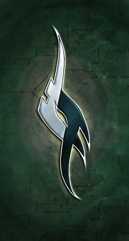
Tonight I was wondering about trying out some metallic effect often seen on certain icon designs. Actually I have some problem with my Windows again so I'll need some icon as a user, so I began to work on a proper icon. After I've finished it, I noticed the familiarities between my icon and the color schemes of Blizzard's Protoss, one of the main species in StarCraft game. So I was soon on the StarCraft 2 site and took the Protoss symbol to make a Protoss version about my icon design. It is an experiment, do not take it seriously.Made in Photoshop. Work time: about two hours.
Protoss symbol, StarCraft and related names, etc. (C) Blizzard Entertainment.
Related content


Comments: 19

Kick-ass. I made this [link] after I saw this in google images.
👍: 0 ⏩: 1


Két szó: WTF izdatt? Tudom, már beszéltünk róla, de azóta elfelejtettem")
 (Smile)")
👍: 0 ⏩: 1

Imba = Imbalanced, ami itt nagyon jót jelent.
👍: 0 ⏩: 1


Ez valami fantasztikus lett. Nagyon jól megcsináltad.
👍: 0 ⏩: 1


Nice nice! Me like!
But in all seriousness, it is good. The only part I would change is the harshness of the gradient transition, it looks too sold to me.
👍: 0 ⏩: 1
Thank you for the comment! I'll see about that harshness. Maybe I'll change something.
👍: 0 ⏩: 1