HOME | DD
 valkea — A sketch

Published: 2006-02-28 18:32:17 +0000 UTC; Views: 189; Favourites: 4; Downloads: 11
Redirect to original
Description
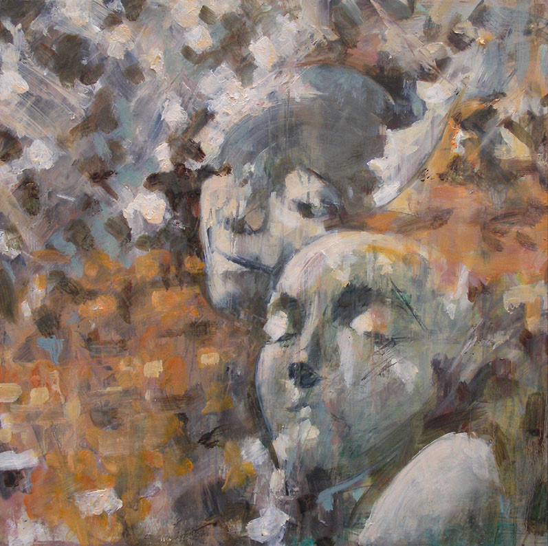
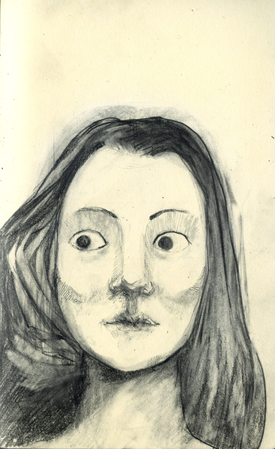
Charcoal and conte on colored paperAfter making a couple of copies/studies of the characters in Leonardo's Virgin on the Rocks, I thought it would be fun to do a classic Madonna and a child painting myself - and I started searching the stock photos for suitable images. This is one sketch that I quite like. I guess I should say I wasn't going for exact likeness. It's more of a light-study.
Based on a stock-image by ~desireisposionstock This one: [link]
Related content


Comments: 13

I love the looseness and flow of line! Beautiful work...i often prefer a sketch to a full blown 'finished' piece! Great work!
👍: 0 ⏩: 1
 (Smile)")

Man, I love this: the expression on he face, the angle of her head, the light. Love it. I'd like to see you work this into a painting.
👍: 0 ⏩: 0

Something looks so scary and cold about this face. I think this feeling is created by the color of the paper, the grayish blues and how silent the eyes look. Very nice piece that conveys character and style
👍: 0 ⏩: 1


")

I like this, because it seems like a bit of a juxtaposition. The face has a bit more personality or expression (for lack of a better word) than you would ordinarily find in an iconic painting and it suits the halo that probably took a second to draw, not much reverance shown there. I don't think I've quite articulated my point that well, but I've tried.
I think you should check out Craig LaRotonda's work, you might like it.
")
👍: 0 ⏩: 1

"The face has a bit more personality or expression (for lack of a better word) than you would ordinarily find in an iconic painting"
I think it's pretty standard for a Madonna to have her eyes cast down to the child, not to look straight at the spectator. I thought of reversing that, and have baby Jesus stare at her mother, and the mother stare at the spectator. Or maybe, have them both stare out of the painting. Something that looks interesting. And then make rest of the painting the halos and background nearly abstract - and try to unite classical beauty with modern art. Or something along those lines.
I check out la Rotonda, and liked and bookmarked him. Looks like he's used a lot of the same kind of symbolism I would've liked to use. Shit, there's always someone who has what you would've wanted to do...
Thanks for the comments
👍: 0 ⏩: 0

i love this drawing,i havent seen too many people on here doing 2 or 3 tones drawings,and i like your paintings aswell,,,
👍: 0 ⏩: 1

