HOME | DD
 VanGold — Drawing Syrus
#au #berry #blueberry #font #sans #skeleton #swap #sy #syrus #us #ut #vangold #sansational #skelefont #underswap #fontskeleton #underswapfanart #themagnificentsans #tutorialundertale #tutorialskeleton #syrusunderswap #alternateuniverse #tutorial #tutorialdrawing #undertale_game #sans_the_skeleton #sans_undertale #undertalefanart #sanstheskeleton #undertale_au #underswap_sans #blueberrysans #undertale_fanart_sans #blueberry_sans #blueberrysansunderswap
Published: 2017-04-20 10:33:12 +0000 UTC; Views: 5505; Favourites: 102; Downloads: 16
Redirect to original
Description
So, by the time I upload this I can welcome number 900 in my Watchlist.Greetings, bud, have a muffin
Now in order to get this thingy down. Asked earlier if there is any intrest for a "How to draw a Skeleton"-Toriel-thingy
")
A few bounced thus I take it as a yes

So, there we go:
Lets start with the basics here. I decided to draw a Sans, after he is easier to draw for the start. If requested I can also do one with a Papyrus later on
 (Wink)")
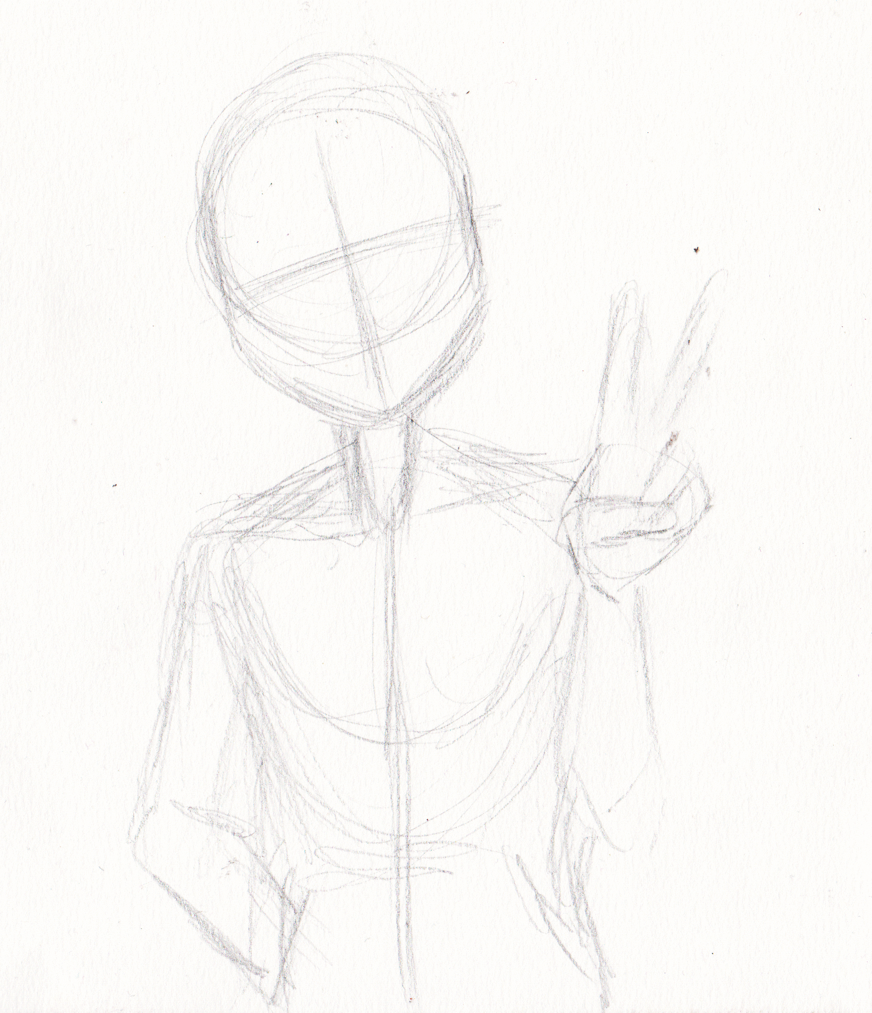
As you may have seen in other Tutorials or "How to draw Dudes"-Books it all starts with a circle. The important thing here (what they aint telling ya most of the time
) DON'T try to draw a perfect mathmatical construct. This construct simply is your guideline, not the final thing. So it is okay if it looks a bit messy, as long as you are able to build your character out of it. However geometry keeps helping us a lot here. Take a look at the shape of an actual skeletons bones and symplify it to easy geometric figures (a trapez for the breast - if it is a chick btw prefer a triangle - for most of the limbs mostly rectangle forms, nother triangle for the crutch if shown ect.). If you are insecure with the hands, thats okay. These are the most dificult parts of the body together with the feet. I needed ages for them (and I'm still pretty clumsy with the feet). The cool thing about skeletons however is that you can draw every finger bone on its own and nobody bothers. That actually helped me getting okay with the hands at all between us. However if you're too insecure to add hands - welp....that is what Sansy has these cute pockets for, ey So, now that we have the structure lets head on with first little details. I drew the face first here. That is what the cross is for. It helps ya finding the right place for the eyes and the nose. Now ye can also start characterising which Sans this actually is going to be. I actually planned to draw Classic, buuuut.....that smirk? *sigh* Here we go again, aint we, Syrus
 (Smile)")
Add the bones on hands and arms. Again it is recomented to look at an actual skeleton as a reference.....no need to kill ya neighbours though. Just google for Skeletons or annoy your Biology-teacher, you little Genociders
As you may notice I don't make a complete realistic skeleton. Usually there would be a damn mess of tiny, tiny bones at the end of the hands. After this is a pain in the neck to draw in a comic as ya will find out if you try that, I draw draw a simplyfied version simply making an extension of the fingerbone-lines.
Had to find a solution for the pockets since Syrus usually isn't wearing a Parker/Hoodie. Are ye looking for your clothers, Pans?
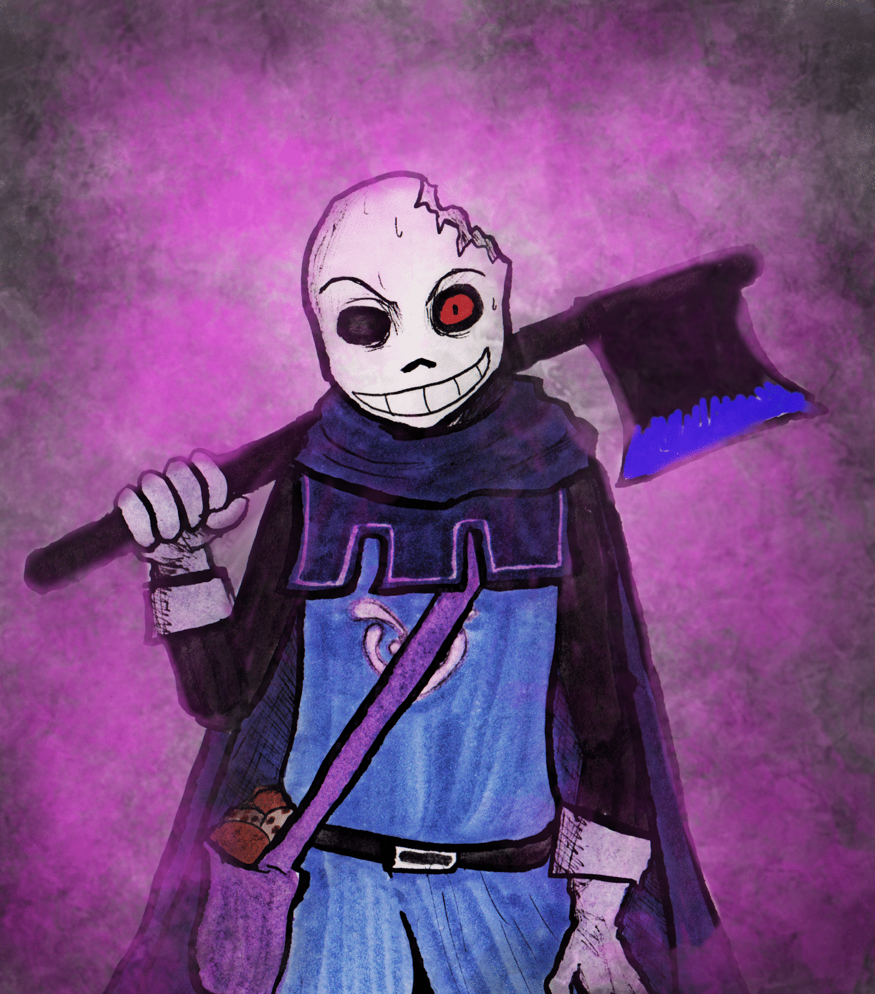
Continue drawing the details for the face depending on the Sans you draw once again. Syrus is a bit more humanalike than Classic with normal teeth and - include these later though - with an suggested iris and pupil, while Classic usually only has shown a white dot as pupil and that.......well....wellknown shiteating grin we love XD. Don't mind if your eyes look a bit strange at the moment. It looks way diffrent when ye colour out the eyesocket later on. If you are insecure though you can also softly colour them with the pencil for now.
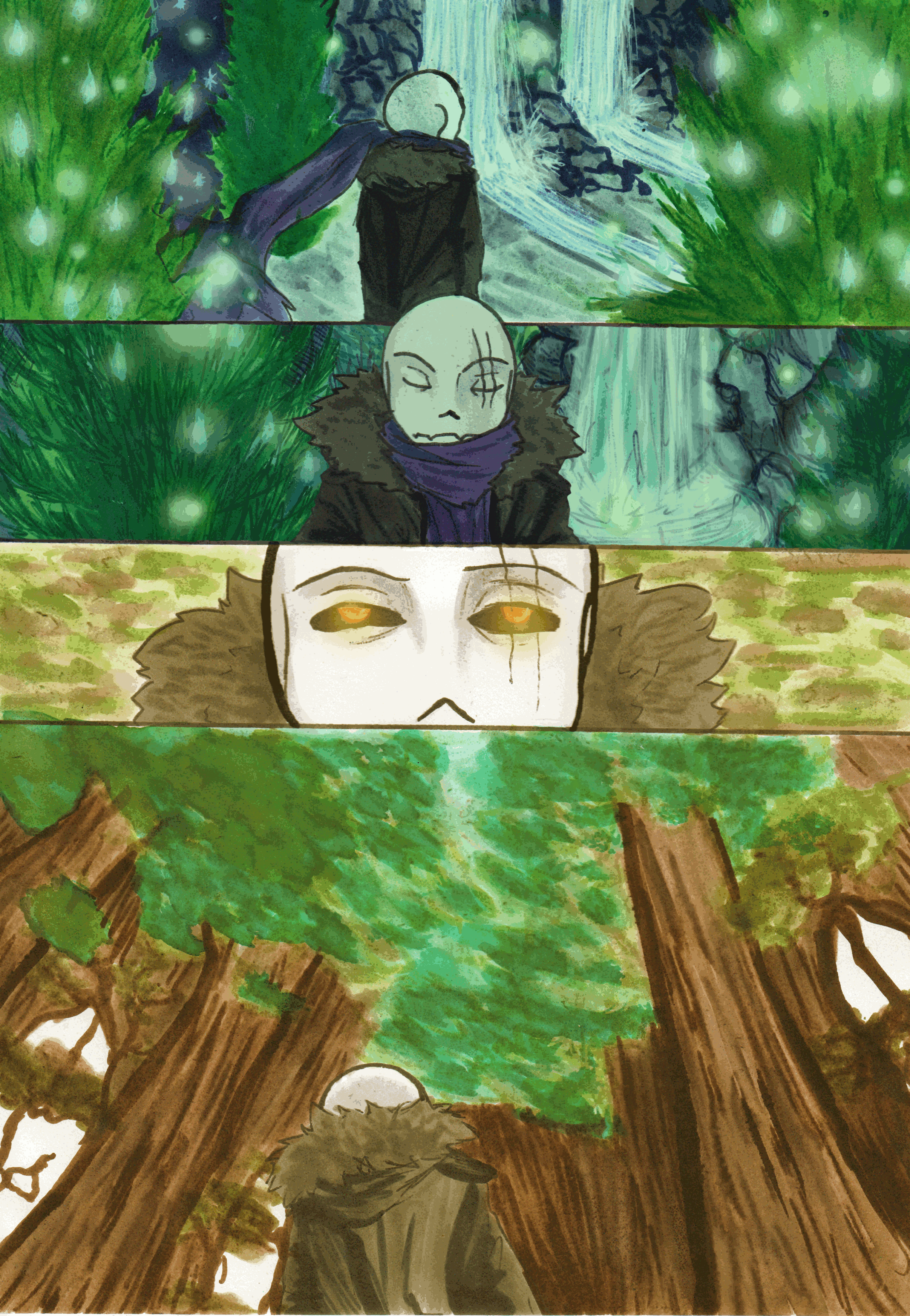
Also I draw the clothes now. Had to modify the pockets a bit. Since this is actually Pans' hoody it is too big for the little bugger, which sets the pockets a bit lower. Try around a bit with the folds in the clothing. Take a look at your own clothes and watch how they are folding for getting the idea (again practice is the whole secret here I'm afraid. Just take a look at this . This was one of my first attempts to work more with folds. Nope, I wasn't born with skills either
)Now we actually have everything of the sketch and can head on to the outlines.
On this point it is the big question what equipment you have for the outlines. I usually work with pigmented drawing ink and a feather. However time by time I switch between that and Multiliners. They are a bit easier to handle for the start. I recommend to use liners with a size of 0.3 or 0.5 for the start
I again used my ink here together with a blue liner for Sys eyes, since that makes them glow a bit more later on.
If you are brave enough you can also start adding the first rough shades and folds, or add details that are missing as ya notice by now (*cough* cords *coughcough*)
Bob Ross said a pretty nice thing once:
"If you make a mistake, that is okay. Work on around on it until it looks pretty."
This may sounds weird, but that actually is how I work most of the time XD
Aaaand if the mistake is to large to eredicate....welp.....for that case god created PC editing and white ink
Speaking of white ink: You have to try around till ya find a good white ink that covers the outlines ya make (I use a gel-biro actually
I also made the first shades with a 0.3 Liner aswell as colouring the sockets and adding more details. The liner-shades are not nessecary since you can also create the shades with the colours later on aswell, but they give the whole drawing more add. And since I've got a black pen in my hand by now, lets sign the thingy
Going on with the first few colours. Again the way you work here pretends on your equipment. I had to use two diffrent colour types here. Copics for eyes and skarf and - since my usual used copic for Pans' hoodie rests in potatos once again (these damn things die so soon) I had to use two diffrent shades of Farber Castell- Pitts here. That is some sort of waterproofed Indian Ink. Awesome little buggers they have a way better capacity than the copics. The best alternative I found so far. This tactic I used here btw works quite good aswell if you use coloured pencils. Start at the parts where the clothing folds the most and the most shadows are cast. With a coloured pencil you would now work you way to the brighter parts while reducing the pressure of your pencil. Since I have my ink though, I work out the shaddows with the darker colour-
-and fill the empty spaces with the brighter shade afterwards. This btw is the cool thing about Copic markers as you can see. Apart from a few exceptions I actually used only a B45 Copic for the skarf. If you give the colour a moment to dry, and work over it again with the same colour, the already coloured parts come out darker automaticly.
I also used my white gel biro once again for a bit more brightness in Sy's eyes.
Aaaand, yeah, here we are
Now - if you want to, you can now also make a few corrections, put in filters, throw some crap in the white parts and call that background......stuff like that. And BOOM its a Skelefont
*scrolls back up*
Okay wow, that became long....
I hope I can help ya out with that and didn't just bluther stupid stuff up there. I must confess I've never done something like this before
Most of this is so deep in my system I do quite alot steps without even recognising their existence actually. Thus.....if I've been to fast or unclear or if there are open questions don't be shy and ask
And thank you guys so much for watching. As I said in previous artwork, you are such a magnificent comunity. Thank you so much that I can be part of this fandom and for apriciating my art. It means the world for me
This is what I want to do and what I work for actually. I hope I can become a professional artist one day. And every single one of you supporting me, every single bit determination and encouragement you send me, every little comment, critique, fav, voice brings me closer to this silly dream of mine.
Thank you
Catch me on Partreon
Smootch me on Twitter
And most important
Stay Determined


Related content


Comments: 8

HAH! Literally - ANYTHING I search for, your art is there AND it is ALWAYS something I have never seen before! How can this be? You have covered all of the fandom's bases i see
So today i searched for 'Ink AU hoodie' because I'VE NEVER SEEN INK WEARING THAT HOODIE HE HAS AROUND HIS WAIST. So i will draw it tonight i think.
This is a nice step-by-step of how you draw btw ^_^
👍: 0 ⏩: 0

Heh))And I draw Underswap Comic Papyrus.What do you think? (I hurriedly drew this. I had job)
👍: 0 ⏩: 0


Welp you have Mentlol. That is almoust as good as Mentol XD
Okay, joke aside XD
What equipment do you have? Maybe I can give ya tips for those instead
Aside from the colouringstuff the principle of sketching stuff would be the same
👍: 0 ⏩: 1

eh. I have a wacom tablet and ArtRage Lite. XD
(MacBook!)
👍: 0 ⏩: 0