HOME | DD
 vaniergt89 — Rustic Arts Journal
by-nc-nd
vaniergt89 — Rustic Arts Journal
by-nc-nd

Published: 2008-02-16 21:10:06 +0000 UTC; Views: 2010; Favourites: 42; Downloads: 148
Redirect to original
Description
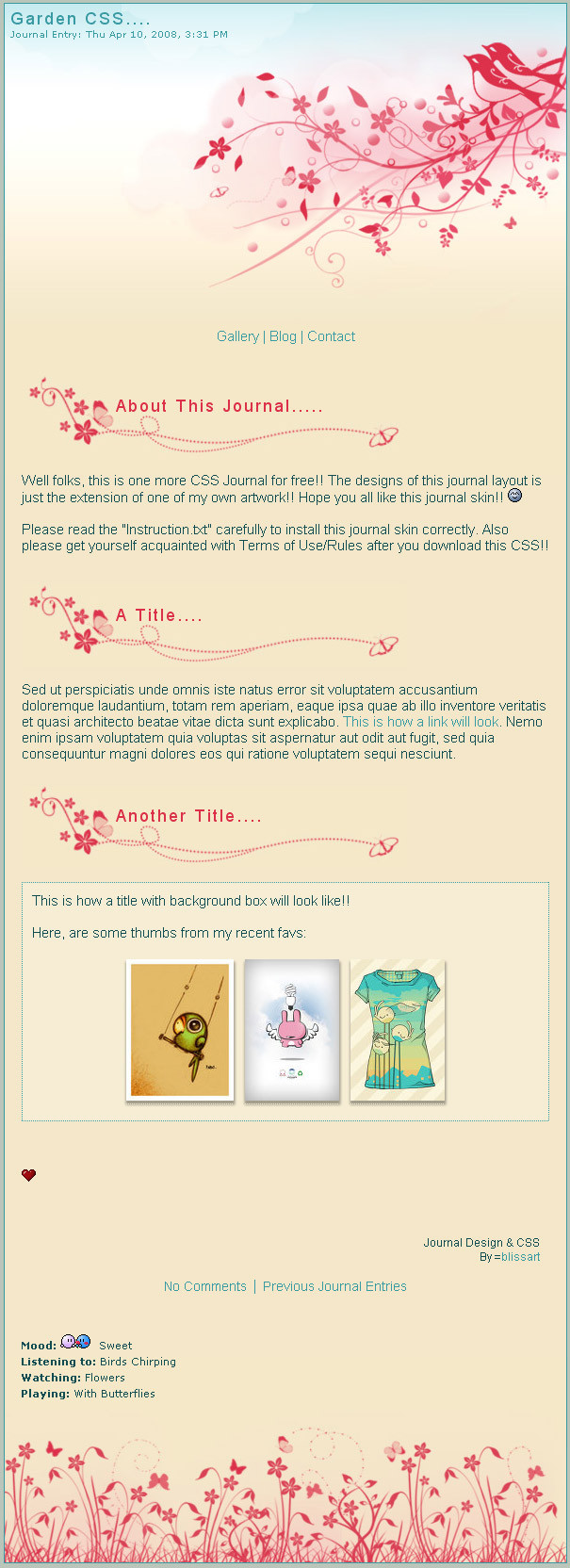
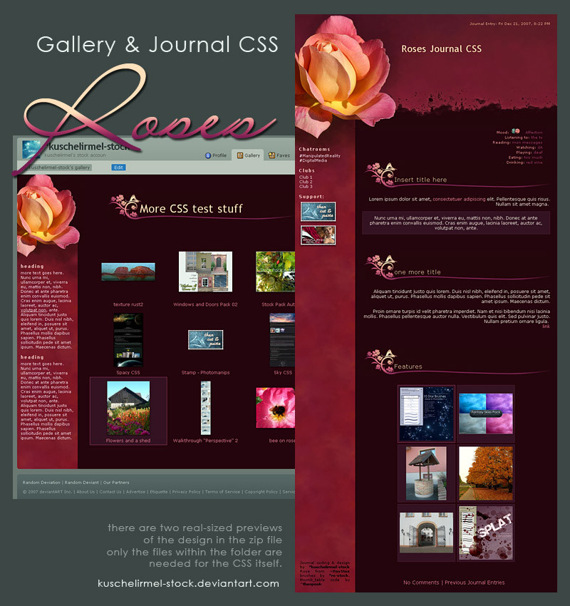
This is another design I cam up with todayStock flower paper from: Resugere
Brushes by: Ardcor
Hopefully will be coded after winter chill journal
Related content


Comments: 23

 (Smile)")


i would love to use this journal!
can it be used as a skin? xx
👍: 0 ⏩: 0

This is absolutely breathtaking!
i dont suppose its up for usage?
")
👍: 0 ⏩: 1

No, sorry. I was planning to ut things got in the way... :S
👍: 0 ⏩: 1
Not a problem, but nevertheless it was beautiful
👍: 0 ⏩: 0

I would use this journal in a heartbeat, it's so gorgeous! * 0*
👍: 0 ⏩: 0

omgomgomg this is so pretty. I would love to have a journal like this O_O
👍: 0 ⏩: 1
Thanks! There are some things that would actually be impossible, as I made it before I started really using css, but I will try and get on it as soon as I am done my current projects

👍: 0 ⏩: 1

This one looks great too
About the feature box, it might look fine without the box at all, just the heading with the brush background.
You might have problems with the moods list, as people can make them longer, or shorter that what you have there - so you might want to find a way to have them in the journal body. It'd be a good idea anyhow, as it would balance the header better imho.
Also, to keep things simple when coding this up, remember that you can stop journals from getting too wide by using the max-width property - this will save you from having to worry about how it looks on larger resolutions.
I like the designs you've shared with us so far, if you run into any problems when coding these up just drop me a note and I'll help you out as soon as I can

👍: 0 ⏩: 1
thanks so much! I see your point. The most feedback ive gotten so far is with that box. And I agree with both points. I think I would use the features header/brush thing and then a border, like 3px. Otherwise I think it will just look unorganized with all the different thumb sizes (as you can see in my journal right now lol)
👍: 0 ⏩: 1
ah - wrap your thumbs in a div with the class name 'feature', ie
For more info about the technique used to align the thumbs, check the journal/tutorial I wrote the other day, you're welcome to incorporate it into your design if you like
👍: 0 ⏩: 1
Thanks! I shall wrangle my thumbs ASAP
Oh and as for spacing on your vintage journal. how do I get a page break? It seems the just putting a line free does not separate text at all... is it just me???
")
👍: 0 ⏩: 1
I was wondering why the text and thumbs where arranged like that
I've got a feeling it might be because you've left a tag open in the header. I wrote some CSS that hides any break tags in there so that I don't have to scrunch up the source code to avoid deviantart inserting linebreaks - if you haven't closed the header tag then that bit of CSS might be affecting your whole journal.

👍: 0 ⏩: 1
ok thanks, I'll try redoing it
👍: 0 ⏩: 0


Absolutely beautiful! I'm in love with this design!
The only thing that I think could be improved would be the 'Feature' box. I don't think the square fits too well. Maybe if you added a brushed border to it to make it less plain, then that would work.
If it wouldn't be too much trouble for you, maybe a few light-colored flowers or branches could be added to the tan, background area. It looks a bit too plain to me. Just a little more texture would give it a nice feel.
But hey! Even if you didn't adjust those, you still have a magnificent idea here! It's much better than I could do and I admire that!
When would it be available for download?
👍: 0 ⏩: 1
Thanks for all the comments! wow. It's nice to know people appreciate my ideas. I was just looking over this one and I do agree that the feature box is boring. I have tried to make the layout equivalent to my css coding skills. So the plain background is because it neads to be repeated in larger browsers. Otherwise you get this weird stamp effect, where details are repeated over and over again and it just looks bad. The feature box though, you are totally right, square is square, so I think I know how to change that. I won't reply to all of your comments but I have read them all and appreciate them very much.
Thanks again!
👍: 0 ⏩: 1
I see what you mean with the background. It does make a lot more sense for it to be plain like that.
You're welcome, and I totally understand. :]
👍: 0 ⏩: 0
Thank you! As LigerNekoka suggested, there are some things to be done but overall I am happy with it.
👍: 0 ⏩: 1

I like the flowers a bunch, and I like how red color schemes were used.... it gives it a warm effect. it's nice and serene.
plus, the paint strokes are really cool, too. ^.~
👍: 0 ⏩: 0

This is really pretty! I like how relaxed it feels. It reminds me of Japanese art
👍: 0 ⏩: 0