HOME | DD
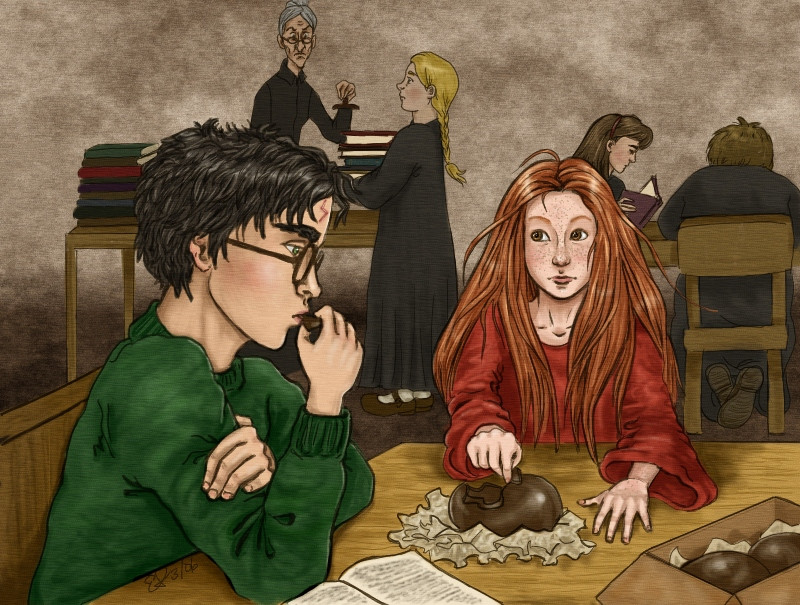
 VanishingShmink — Chocolate in the library
Published: 2006-03-11 07:35:11 +0000 UTC; Views: 3997; Favourites: 72; Downloads: 622
Redirect to original
Description
Another remake. The original was watercolor and very muddy; I re-drew all the lines with the tablet and recolored it. It's far from perfect and I still don't like Ginny's left hand, but I'm finally satisfied that I've done this scene justice.Related content


Comments: 19

 (Smile)")

")

Beautiful picture! Ginny is very cute. I loved this H/G moment in the novel.
👍: 0 ⏩: 0

Hello! I came here from COS forum!
I really like this picture, especially the texture, Ginny and the design of all characters.
The colouring is very nice, too!

👍: 0 ⏩: 1

Hi! *waves* Thanks for stopping by, and for the kind comment!
👍: 0 ⏩: 0

like this!! Ginny's hair look nice- and that look on mdm pince's face is


👍: 0 ⏩: 1
Thanks for the comment!
👍: 0 ⏩: 0


It looks great. Harry's eye might benifit from being lowered a smidge, but really, great.
I love the detail of the crossed feet on the boy with his back to us.
👍: 0 ⏩: 1
Thanks for the comment! I see what you mean about Harry's eye... I drew this so long ago that I didn't notice the flaw when I re-traced it. I'll just chalk it up to "style", eh?
👍: 0 ⏩: 0

Having not seen the original I can't comment on any changes, but this one is really nice. My only suggestion, if you do add on to it, is to add more of a background, books or something else. The grit from the watercolor paper (I'm assuming that's what that is) gives this a really unique quality. I guess it makes it look less digital. And Ginny's freckles are great, the more the merrier. Harry's a goofball for not noticing her earlier, especially with that wild hair of hers.

👍: 0 ⏩: 1
Thanks! I do agree it needs more of a background; I just don't know what would work without distracting too much from the foreground. Don't want too many bright colors there...
👍: 0 ⏩: 1
Something dark(er) would work nice. Maybe, um, we see bookshelves receding further into the background, but more in the shadows. Or even a wall with drapes covering the window(s) so the outside light won't affect the coloring of the figures already done. Two ideas at least.

👍: 0 ⏩: 1
Thanks for the ideas!
👍: 0 ⏩: 0


Yeah, their hands are much better than in the original one, but I liked the background of the original better - it somehow reminded me more of a library. Ginny's hair and freckles are better in this one though. Much, much better
👍: 0 ⏩: 1
Thanks! I might add to this one yet; I wasn't sure about the background.
👍: 0 ⏩: 0