HOME | DD
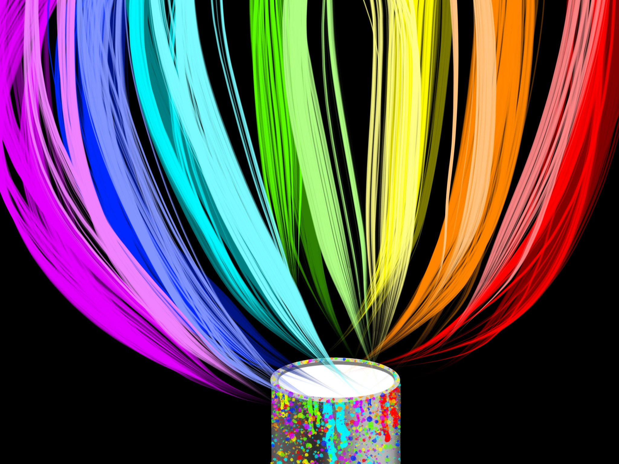
 vansc14 — Bucket
Published: 2013-08-29 22:13:07 +0000 UTC; Views: 947; Favourites: 46; Downloads: 8
Redirect to original
Description
I need a good title for this painting. I spent a long time on it, and I am very proud of it. It deserves more than "abstract painting ---."So, does anybody have a suggestion for what I should name this?
Related content


Comments: 44

Overall

Originality
Technique
Impact
This picture would look great as a background, it really has potential to be used with another drawings, not only as a picture itself. I really like the rainbow colours, it makes the picture look so alive! The technique makes it look like the lines are moving and gives live to the drawing. However one thing is not to clear; I can´t help but ask what the thing in the middle is supposed to be? It doen´t fit the rest of the picture (in my opinion). Anyway, a good drawing that would be great as a background picture for other artists to use.
👍: 0 ⏩: 1

Hi, 
👍: 0 ⏩: 0

Overall
Vision
Originality
Technique

Hello!
First things first, this a very very beautiful piece of art.
It caught my attention right away, the idea of having more than one colour is attractive.
I really like your idea of having the colours come out of the white paint!
Now I'll point out some negative stuff.
I think that the white paint is just too... plain? It would have been better if you used some kind of effect, and again this is only my opinion.
The second thing is that the two colours on the left would have been better if they seemed like they were coming out of the paint. but they're on the edges. I think that this work would have been prettier if the colours were glowing.
You did a very great job! keep up the good work. ^^
👍: 0 ⏩: 1
Hi,
👍: 0 ⏩: 0

Originality
Impact
I really, really like this piece of art! It's awesome! It looks so realistic. I especially like the vivid colors here, as well as the effects given by the spatter on the bucket.
The only thing that gets in the way is that the bucket looks like it's full of white color. It still doesn't ruin this amazing drawing! I just think that it would look better if you shaded the bucket from inside or colored it in the same colors on the picture. All in all, this is an amazing piece of art. Just keep going this way! :3
👍: 0 ⏩: 1
Hi,
👍: 0 ⏩: 0

Overall
Vision
Originality
Technique
Impact
Hello there, good sir e.deviantart.net/emoticons/b/b… " width="15" height="15" alt="
")
I really like this piece, it's quite beautiful to look at at a distance e.deviantart.net/emoticons/b/b… " width="15" height="15" alt="
First of all, the vibrancy and 'asymmetry' (if you could call it that) of this piece sorta made me a bit blinded (considering that my background was already too bright XD, no offense on that though!) but it really was pretty, nevertheless.
A bit of advise... if this is a bucket of paint, shouldn't the contents of the bucket contain at least traces of the colors that are going out from it? (unless it's something like a prism, of course...then disregard this!)
Other than that, I really like this one.
It's a tad bit original (According to me), the vision is exquisite as far as I can see, not much of an impact considering I have seen a lot of these before!
But really, you did an excellent job!
Can't wait to see more e.deviantart.net/emoticons/b/b… " width="15" height="15" alt="
👍: 0 ⏩: 1
Hi,
👍: 0 ⏩: 0

Technique
Impact
Wow! I really like the colors and the vividness of this piece. Great work! e.deviantart.net/emoticons/h/h… " width="15" height="13" alt="

One thing that you might consider, is adding shading to all of the paint splatters to make it more realistic... but you might not want that effect /: It's hard telling and giving critiques because you don't know that personal artist! haha! I like how all those colors come out of white... it's very neat!
Also, maybe add a handle to the paint bucket? haha just a though (:
you could also touch-up that white.. so it's shaded, and not just plain, or maybe even add some ripples like something was dropped into it!
It's very happy,and brightened up my day c:
thanks for the amazing work! <3
👍: 0 ⏩: 1
Hi,
👍: 0 ⏩: 0

Oh my goodness, I don't even know where to start!
Vision: Such beautiful colors! Love the fact that you picked a rainbow theme for this magnificent piece of artwork. However, is the rainbow of colors flying into or out of the bucket? That part may be just me, of course.
Originality: Nothing for this one. This part of my critique is officially PERFECT.
Technique: What is the Paint Program that you use to make such a beautiful masterpiece? One thing that bugs me though is the fact that you could of made the brush strokes look more like actual paint flowing into *or out of* the bucket.
Impact: Five out of five stars. I mean, this has the colors of the RAINBOW for crying out loud!
Overall, this is one of the best pieces of artwork I've ever seen. Well done.
👍: 0 ⏩: 1
Hi,
👍: 0 ⏩: 0

Overall
Vision
Technique
Impact
I'm going to be brutally honest with you. I find this to be done well, but not extremely well.
The vibrant colours on the black background work very well together, but the white in the middle is a little distracting. The bucket is also looking rather fake. I would suggest defining your light source and working on your shading a little more.
As for the streams of light, as vibrant as they seem with the contrast to the background, I'm not sure if you were going for random but the placement to me seems a little off.
Though the colours you chose look fantastic, I think the cyan is a little unnecessary.
I can tell that you had some fun with this, and it's very original. You should be proud of its uniqueness. I've never seen a rainbow portrayed quite like this. Good on you!
👍: 0 ⏩: 1
Hi,
👍: 0 ⏩: 0

Originality
Technique
Hi!
This is a very beautiful piece of work, I was really impressed as soon as I saw it. The colors are all so bright and vibrant, they just give me a good feeling when I look at them. I like the concept too, having a bucket of paint and then all these lines of colors flying out from it. As for a name, the things that first come to mind are "Lively" or "Vibrant" or "Alive" but it's really up to you, I just feel energized when I look at this.
As for critique, I wonder if the inside of the bucket should be colored or shaded. Maybe you could add rainbow paint or make it seem like it is glowing a bit from the inside. Also, all the strands of color don't seem to be coming directly out of the bucket; the purple ones are coming more from the side of the bucket and the red ones are hanging a bit off to the right of the bucket. It might look cleaner if you made it more symmetrical, although you could be going for more of a random or less structured look.
Awesome job overall, keep it up! e.deviantart.net/emoticons/s/s… " width="15" height="15" alt="
 (Smile)")
👍: 0 ⏩: 2
Welcome back, 
👍: 0 ⏩: 0

I was going for a more random approach. I love symbolism though.
I was trying to show how the colours were coming out of white paint, almost like a prism separates white light into a rainbow. The streams of colour are like creativity, random, not organized, but yet still beautiful. I admit that I messed up a bit on the streams, I originally wanted them to all originate from the bucket, but I made the bucket after the streams, and I liked how the streams looked so I didn't want to mess them up.
👍: 0 ⏩: 1
Oh ok, I see!
Well you did a great job! Keep drawing
👍: 0 ⏩: 0

Overall
Vision
Originality
Technique
Impact
This one really caught my eye as due to its vibrant colours. I really like how You have a rainbow going in (or out) of the white paint. A very interesting idea. I also like how there are overlapping of colours so that it isn't just a gradient. You did a great job with the bucket. The only thing I would change would be to add a little bit of shading on the paint blobs to make it "pop out" at us more. Some shading on the rim of the bucket would also be good. The purples on the side could also be made to look like it is coming out of the white paint instead of from the side of the bucket (but that's just my opinion).
Overall, good job with this.
👍: 0 ⏩: 1
The colours are supposed to be coming out of the paint.
👍: 0 ⏩: 0

Vision
Originality
Technique
Oh it's pretty nice : ) Looks very good as abstract work, would be awesome as stock as much as deviation itself, i can imagine a portrait in the two side next the the purple and the red.
The gradient is obviously really beautiful ! Who don't love colors of a rainbow ?
This is vivid so it catch ours eyes very fast : )
The brush you choose is very good, make some reflect, a good move, like hairs of painting.
The bases can deliver a lovely message: painting can permit to do awesome work, a media as painting can make us doing beautiful art.
That's the feeling and message i see when i saw this art:3
👍: 0 ⏩: 1
Hi, 
👍: 0 ⏩: 0

This is beautiful!
👍: 0 ⏩: 0

well, just say "bucket" and do it anyway
👍: 0 ⏩: 0

every troll needs a bucket to help the medicine go down~
👍: 0 ⏩: 1
Ha ha ha ha, lol, so true
👍: 0 ⏩: 0


Thank you. I love colors. (In case all my previous works of art didn't tell you that)
👍: 0 ⏩: 0
What?
Do you mean the whole "bucket" thing?
It's a Homestuck joke. In Homestuck, a bucket is a symbol of sex and is considered highly pornographic.
👍: 0 ⏩: 1

....buzzkill.
Yea both in that way and a normal art sense
👍: 0 ⏩: 1

omg this is so offensive to all the trolls in the universe
👍: 0 ⏩: 1
NONONONONON DONT YOU SCARE ME LIKE THAT
HIDE YO KIDS HIDE YOU WIFE GAMZEE IS COMING TO TOWN
👍: 0 ⏩: 0
mature content mister, this thing is highly pornographic
👍: 0 ⏩: 1

How about "Converging Threads" or "Color Threads"?
👍: 0 ⏩: 1
I want something simple, yet complicated. Something that does not describe what it actually is, but what it can be.
👍: 0 ⏩: 0