HOME | DD
 vantid — Preyfar

Published: 2006-07-19 19:23:45 +0000 UTC; Views: 2478; Favourites: 66; Downloads: 184
Redirect to original
Description
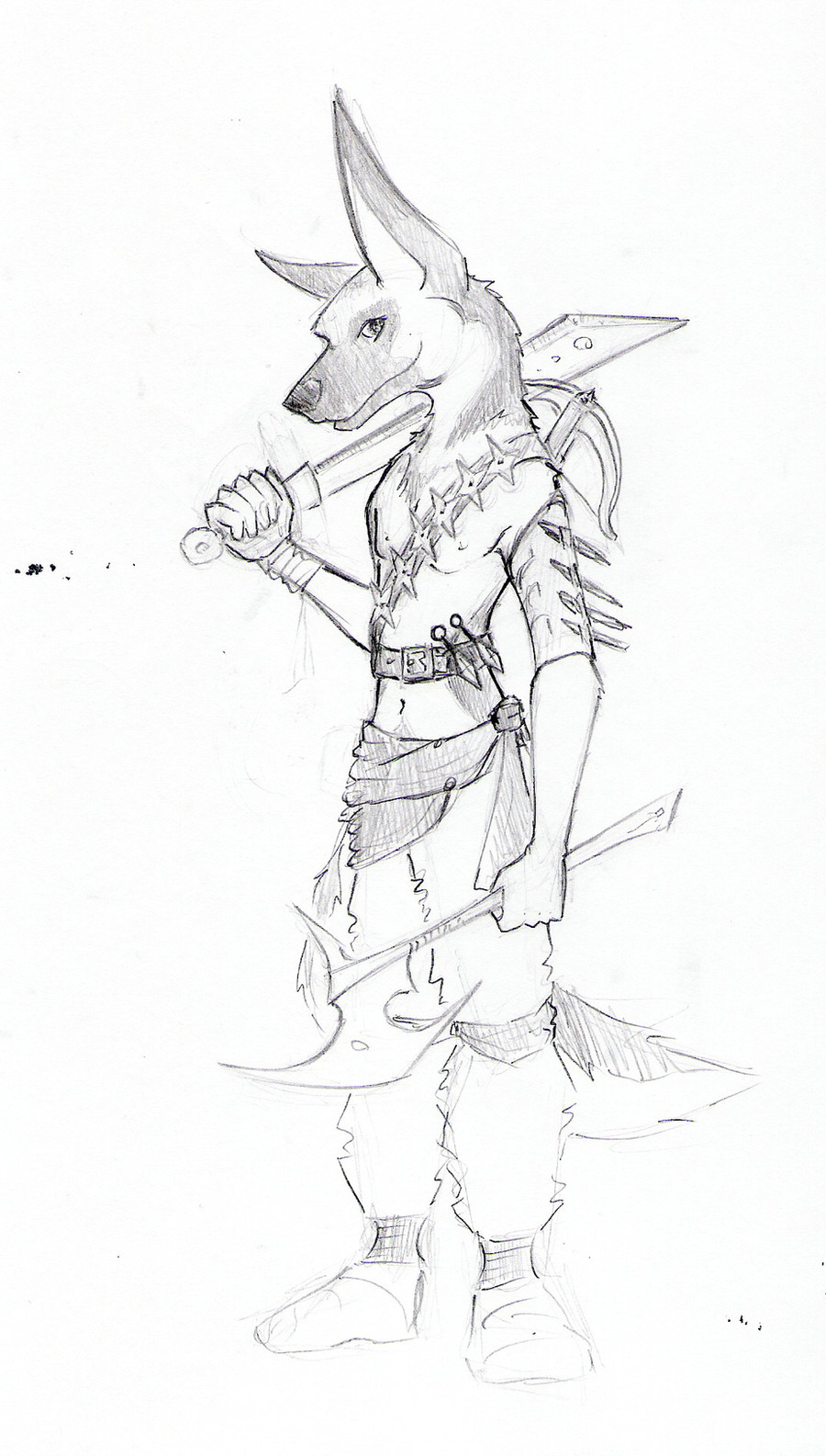
An ink commission for Preyfar the hyena. I sorta did some extra stuff on this. I experimented with grayscale brushpens. I goofed up a lot, but such is the manner of experiments in ink! This was fun, he gave me free reign on the pose and such. He ended up holding a scythe. *Reptanglian asked if the blade on the scythe should point the other way and I answered..."No."")
Edit: Ahhh I think the gamma of my Photoshop is set funny, this is a lot darker than I intended.
Related content


Comments: 17

man, this is the spitting immage of my hyena brawler in a table top i'm playing in. scary.
👍: 0 ⏩: 0

it's a hyena, it has a scythe, and nice paws.. was almost going to fav it.. but i don't like the shirt.. and the hand on the scythe seems off. well, kudos to you anyway
 (Smile)")
👍: 0 ⏩: 0

")

It seems you don't try too hard when drawig commissions... your originals are much more accurate and better done
👍: 0 ⏩: 1

Oh, you gotta explain! I am not very good at drawing human antomy or clothing so I know that things are off. But believe me, I spent a lot more time on this than I usually do on my own personal drawings, which are usually pretty redundant in subject matter anyway.
👍: 0 ⏩: 1
Looking at colour pictures of antropomorphs I don't get a feeling you have a problem with human anatomy (Kennel club). If you did use some references there, what stopped you here? This hyena has a simple pose and mirrow reflecting your own body is your best helper.
And ink is not a pensil, better not try to depict "grey" with it on a small pictures. Otherwise picture looks "muddy".
Try out true black and white.
👍: 0 ⏩: 2
Heh, funny that I used no human anatomy reference for the Kennel Club and for this one I used lots of anatomy books! I don't have a mirror that I can pose in front of even if my body were the right kind for this kind of drawing. I can understand critiques, I value them, but saying I don't try very hard on commissions is an incorrect assumption. The Kennel Club pieces were also commissions, as is most everything recent in my gallery.
I disagree about the ink. I am still just beginning to feel my way around inking and hatching and creating tone while at the same time creating form. Flat black and white is attractive but not the only way. This piece is not very small, it's about 10x13 inches, so a flat ink outline would be a lot cheaper looking and a lot easier to do! Then I would have been cheating Preyfar out of his money. As it is, since I think he is a great guy, I put in a lot of extra effort, plus it was fun!
Thanks for taking the time to comment!
👍: 0 ⏩: 0

Is it that you just don't like this piece because it's not in color? O_o One might bear in mind that this was a commission Vantid did, and the person that paid for it paid for an inked rendering, not a full color piece like the Kennel Club pieces.
And surely if you've taken even highschool art classes you're aware of ink washes to create tone?
👍: 0 ⏩: 1
dear Nambroth, ink is my favourite material and believe me I do appresiate beauty of b-w works. it's just third or so ink commision by Vantid in a raw that I find lower in class than her other works. I wonder why it's like that. Not only human anatomy, the whole piece leaves expression it's a work of amatour, when Vantid surelly is not. I'm not here to merely insult, but maybe to make a bit angry to do smth about it?
👍: 0 ⏩: 0

Quite impressive. I love your proportioning on this.
👍: 0 ⏩: 0

Hee, I thought of yooouuuuu while working on this!
👍: 0 ⏩: 0

Awesome, I love the design, goggles, and gloves :} Truly lovely ink work.
👍: 0 ⏩: 0

Very nice! Doesn't look like a wolf to me at all. Very yena and very cute. Great job with the head in particular. I'm sure preyfar will love it
👍: 0 ⏩: 0

Thanks! He is supposed to be a hyena, but I can get how he looks like a wolf.
👍: 0 ⏩: 1

Yeah a werehyena! that's original as idea
👍: 0 ⏩: 0