HOME | DD
 VdVector — INSPECTOR GADGET COVER 3
Published: 2011-07-15 09:20:17 +0000 UTC; Views: 6115; Favourites: 68; Downloads: 0
Redirect to original
Description
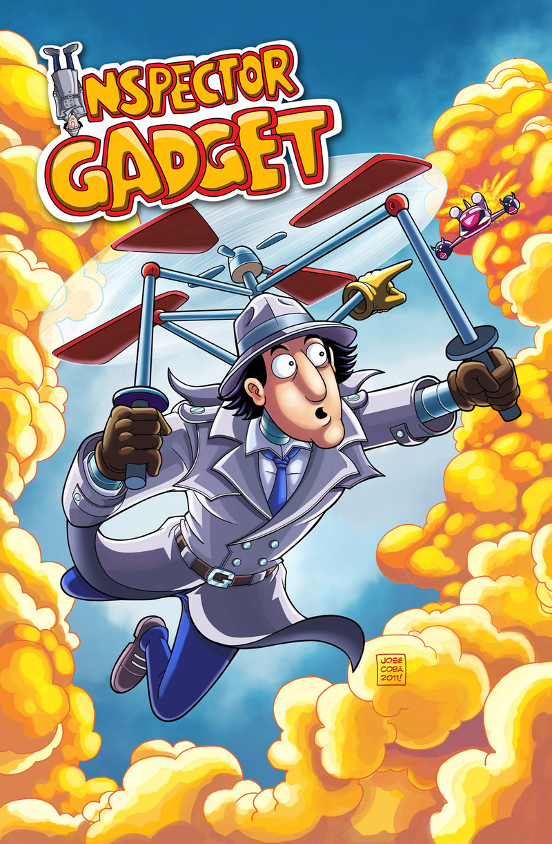
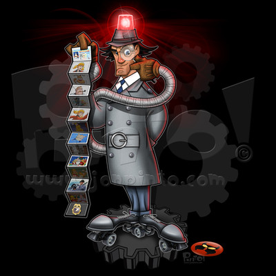
Special cover fot the Inspector Gadget Comic, especially done for the SDCC. Hope IG fans like it!Portada del IG, hecha especialmente para la SDCC de este año. Saludos!
Related content


Comments: 14


")
👍: 0 ⏩: 0

Better be careful, Inspector Gadget -- Dr. Claw's right on your tail.
👍: 0 ⏩: 0


Wait, did I read it right??
...They're making an inspector Gadget comic..... in 2011??? But the kids of the '80s are now too grown up to buy it, and the current kids don't even know who he is!! Or are they going to remake the cartoon?
👍: 0 ⏩: 0

As much as I love the fact that Inspector Gadget is getting his own comic book - and as much as I love that you’re staying true to the tone and universe of the original cartoon series - I have to say the following:
Gadget's face in this picture just looks... wrong.
Take a look at any shot of Inspector Gadget from the TV cartoon, and you'll see some big differences. For starters, there is too much space between Gadget's eyes and his hat. In the cartoon series, the top of his eyes are almost never visible, as they are hidden underneath his hat. Also, the hat is too big compared with the size of the head; and the face and nose aren't long enough - the face looks almost squashed from the regular design. And I agree with the above comment about his chin looking too flat, while the cheeks look too round. (One more thing about your drawings of Inspector Gadget in general: I’ve seen some of your FCBD preview pages and I have to say I miss the small dimples in Gadget's cheeks when he smiles. Here’s a picture from the TV show [link] which hopefully illustrates what I'm talking about. Somehow, that dimple line in the cheek makes him look more appealing to me. Yeah, I know… big-time nit-picking here. (Wink)")
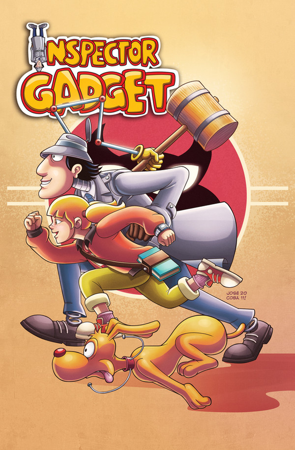
While we’re at it, I must admit that I have a few problems with your drawing of the other characters as well. Brain and Dr. Claw both look good. Quimby looks perhaps a bit too angry, but otherwise okay. But… I’m sorry to say… I think Penny looks downright terrible in some of the panels from the preview pages. Again, I’m thinking about the face. Penny’s eyes especially have lost the wonderful anime-ish look from the TV series, one of my favorite parts of her design. And a few of her facial expressions almost make her look stupid… while she is, of course, supposed to be super-smart and resourceful.
I'm almost sorry for being so picky. I know these are probably stylistic choices and there is no law stipulating that Inspector Gadget characters should be drawn exactly like this or that. But I am a huge Inspector Gadget fan and I feel that some of the changes you’ve made, especially in the characters’ faces, take away a lot of the appeal from the original designs. All in all, these details distract from my enjoyment of your drawings… and they really ruin some drawings for me, like the one above. (On the positive side, though, I love pretty much all I’ve seen of your coloring and shading. That aspect of your art perfectly evokes the feel of the original show.)
So please take this as constructive criticism from a very dedicated fan. I personally hope your drawing style in future issues will stick closer to the character designs - and facial designs - of the original TV show. Again, I hope I don’t come off as a complete hater… I simply care so much about the TV series that I felt a need to say what I’m thinking about your comic book adaptation. (Smile)")
👍: 0 ⏩: 1

Hi mr Mesterius, first at all, thanks a lot for passing by my gallery
")
👍: 0 ⏩: 0

Awesome! I loved the FCBD comic you drew, and have been looking for the 48 page comic, but I can't find any info for it anywhere (Not even at Viper Comics). So I thought the unfortionate that it might have been scrapped. I'm glad to see it's still being continued!
Is this one just for SDCC, or is it released nationwide? (the actual comic)
👍: 0 ⏩: 1
hI Neosquidgirl
👍: 0 ⏩: 1
OH! Alright! A variant cover. Awesome! And your welcome! Thank you for helping to bring Inspector Gadget back! XD Although, will there be anymore issues for Inspector Gadget? I'm looking foward to more issues, if there are. ^_^
👍: 0 ⏩: 0

I like it, haha! A pink M.A.D Mobile!!! xDD
P.S. You can do better at Gadget's chin. It looks kinda flat or too circle-ish and big XD
👍: 0 ⏩: 0

Wow, pues yo soy fan de Gadget y creo que te quedó padrísimo.
Qué es la SDCC???
👍: 0 ⏩: 1
Hola Archenm, muchas gracias por el comentario! Que buen pex que te gusto la portada!
👍: 0 ⏩: 1
jajaja, La famosisisisma San Diego Comic Con, soy malo con eso de las siglas. Un placer visitar tu galería.
👍: 0 ⏩: 0