HOME | DD
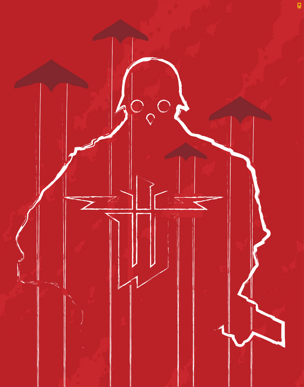
 VectorIce — Nazi Revolution Robots Series

Published: 2004-12-11 10:14:22 +0000 UTC; Views: 7882; Favourites: 89; Downloads: 1078
Redirect to original
Description
This is the first of RNVB. Code name: 47Use of 3D render tool on the Diggers at the back of the Robot.
Spent my whole afternoon doing this on Saturday.
Feel free to comment and query.
Adobe Illustrator CS, 10 Layers or less.
Related content


Comments: 79


Reminds me of a top trumps card.
Very well designed with a good colour scheme
 (Smile)")
👍: 0 ⏩: 0

It's possible but it wld be very tedious. It's best using vector software like Illustrator
👍: 0 ⏩: 1

ya, i've started playing around with illustrator cs2. I really like this picture and it's style. Did you draw out the picture first on a piece of paper, scan it, then trace it in illustrator then add the rest of the goodies?
👍: 0 ⏩: 1
i draw directly using illustrator. juz use shapes of circle and square, cut & path to the desired character in ur mind.
👍: 0 ⏩: 0

this is awesome! its clean, cool, and it looks like an evil gundam!
👍: 0 ⏩: 1

Truly jin roh inspired. most think it's killzone, but totally jin roh. Looks awsome, i might have some questions later about how you made it when i get adobe illustrator.
👍: 0 ⏩: 1

Indeed looks like killzone one of my favorite games
👍: 0 ⏩: 0

Ha ham this is so cool. Looks a bit like a Helghast Trooper from Killzone!
👍: 0 ⏩: 0

the work is very good, in consept and in colours. but why???? why??? why does it haves so small feet.
👍: 0 ⏩: 0

wow, this is awesome... nice concept and lovely result.. +fav
👍: 0 ⏩: 0

I used your stock - naaaaah, just used this picture as inspiration for a doodle at work. You can check here.
👍: 0 ⏩: 0

Love this man.....love your desing stile...do you do all of this with illustrator? cool!
thanks for your commens man

👍: 0 ⏩: 0

Thank u for ur kind comment.
👍: 0 ⏩: 0


in germany, stuff like that, is forbidden. and the nazi-cross is on the index.
👍: 0 ⏩: 0

I think you have missed a detail on that little logo in the corner.
You see, at the pinkyfinger, in the palm, shouldn't the pick continue in the middle of the hand? Because now it looks like the pick is behind the hand.
👍: 0 ⏩: 0

from what im seeing and reading, you ripped someone elses work... if so, im sure its been reported.
👍: 0 ⏩: 0


this is so damn cool, inovative, and has such style, words fail me!
👍: 0 ⏩: 0

check out some of my stuff.
kinda doing a future war.
good shite anyway!!!
👍: 0 ⏩: 0


reminds me hard on 'cannon fooder' by katsuhiro otomo
👍: 0 ⏩: 0

heh, kinda ")
")
even logo is from Red Faction... hmmm.....
anyway I think [link] is better coz there's no any scary symbols there
👍: 0 ⏩: 0


the style is kinda ripped ")


👍: 0 ⏩: 1

When I saw it as a feature I thought it was his (designprimitive's)..
Thats what it looks like to me aswell.
👍: 0 ⏩: 1
yeah, i wondered bout the artist nick  (Wink)")
")
👍: 0 ⏩: 0


Thx Zorrino
for eyeing on my error. U hv good knowledge abt these. I'll correct it at once. I juz learnt Clockwise and anti stuffs.
👍: 0 ⏩: 0


it looks like the hellghast from killzone, nice concept
👍: 0 ⏩: 0
Yes, it's a Swastika, not sauvastika. Not for game. I juz do it.
👍: 0 ⏩: 0

One truly phat piece... your Saturday afternoon was worth it, mon ami. And congrats on the Daily Deviation.

👍: 0 ⏩: 0
Excellent work! BTW, the symbol on the helmet is a sauwastika, an horizontally flipped swastika. Is it for a a game?
👍: 0 ⏩: 0


haha! awesomey cool, i like how it has some depth even thought its seemingly a flat image

👍: 0 ⏩: 0

| Next =>