HOME | DD
 vermithrax40 — Armor shading tutorial inks

Published: 2010-07-19 23:26:48 +0000 UTC; Views: 1616; Favourites: 19; Downloads: 5
Redirect to original
Description
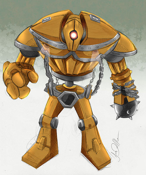
Ok, so here is the final version with some inks added to it.I kind of like the inked version and the previous version equally. Both have different looks that I like.
The inks, I think, bring out the highlights a little more and it gives the character a 'heavier' feel. which is good, cuz he's a gargantuan armored guy and he should be heavy!
So with a few extra lines, the inks make it more bold. I also messed with the eyes a little bit to give him a little more sinister look!
Anyway hope u guys like!
Related content


Comments: 16

The inking definitely adds a cool dingy quality to it.

👍: 0 ⏩: 1

Yeah, he looks a little 'rough' although clean. Thanks!
👍: 0 ⏩: 0

Awesome... We got to watch this beast of a armored guy get scarier panel by panel! Haha! Great job on the tutorial! For being the first tutorial of yours you did a dang good job.
👍: 0 ⏩: 1
Thank you so much! I really appreciate that! One of these days I'll get computer savvy and do it like everyone else!
👍: 0 ⏩: 0

Thank you. That was my main reason for doing it so maybe I could share some techniques that some are unfamiliar with.
👍: 0 ⏩: 0

Wow, i love those finishing touches ")
 (Smile)")
👍: 0 ⏩: 1

mmm it has this very nice rough feel to it
job well dome man
👍: 0 ⏩: 1

yah it really does bring out the highlights! awesome job!
👍: 0 ⏩: 1


Thank you so much!
👍: 0 ⏩: 0