HOME | DD
 vert-is-ninja —
Should There Be An Emergency
vert-is-ninja —
Should There Be An Emergency

Published: 2009-06-17 01:16:45 +0000 UTC; Views: 36651; Favourites: 1443; Downloads: 606
Redirect to original
Description
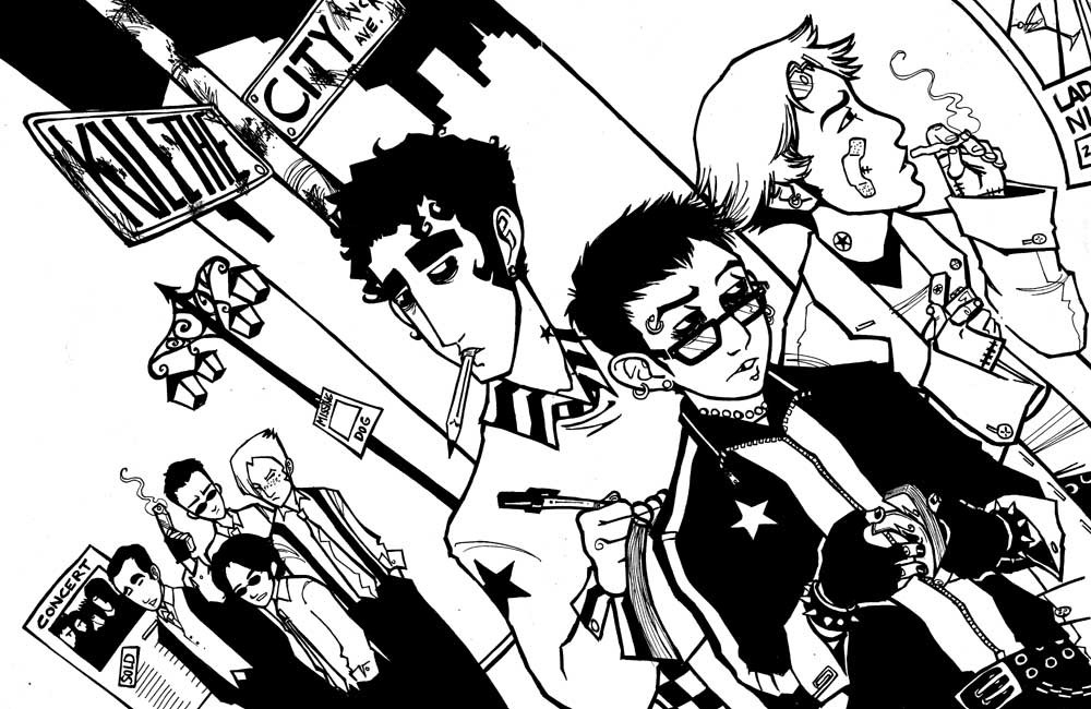
Usually I have a billion things to say in regards to a drawing, but I'm really scraping the bottom of the barrel for this one. I don't know why.It was an experiment on a lot of things, sooooooo....if I had to choose one word for it, I would choose EXPERIMENTAL. Give me a prize. I am the DEEPEST artist you have EVER MET. Don't deny it.
Give me my million dollars now, please.
Hanna Is Not A Boy's Name!
Related content


Comments: 119


Gosh, this is amazing. I just love the composition and the color and EVERYTHING. I love how you incorporate words with all your art, it just makes everything look so much cooler. Gaaah
👍: 0 ⏩: 0

By a million dollars, you mean a comment right? And by a comment you mean:
Yeah, I like it. nice use of white space.
👍: 0 ⏩: 0

I just began reading Hanna Is Not a Boys Name the other day, but I must say that I am highly impressed. Much like this illustration, I find myself trying to look at everything at once, because everything pops out at you. The colors are so vivid, and I love the starkness of the silhouette against the white. The upside-down city and the cross-shaped portraits are too cool for words.
This is the kind of print I’d love hanging on my wall. It’s that awesome.
👍: 0 ⏩: 0

FUCK. YES. This is AMAZING, I absolutely love how you did this, esp in the way of the HPish like commercial/ads but it works. SO. Beautifully. I love how in the + it goes down the line of characters and in colors as well and it's interesting how their colors. Basically go down the hues of the colors ;; that's amazing and I love the transition from the last one with Toni, to dark to orange for the title. SDLHKFDSF NGGG GOD YOU HAVE AWESOME COMPOSITION SKILLS, WOMAN 
👍: 0 ⏩: 0

Oooh, sorry! I'm just fresh-out of millions of dollars. Would you take my undying love and admiration instead?
👍: 0 ⏩: 0

DUDE WHAT. This rocks. First thing FIRST THING that caught my eye was the upsidedown city scene in the corner. Somehow that just looks SO damn schnazzy. And I friggin love the characters and their designs in this story.
ALSO sorry for my comments being sucky. D8 I'm bad at expressing why I like things ahaha. *feels bad*
👍: 0 ⏩: 0

.... *walks around computer, looks over the back of the screen* Oh dang, sweet. It's upside-down. <3
👍: 0 ⏩: 0

This is faaaaaaabulous I love it so much. <3 Hanna is so great. XD
👍: 0 ⏩: 0


I do not have a million dollars but if you give me a random object I will put it in my mouth.
. . .
Also, nicely done. I like the layout very much.
👍: 0 ⏩: 1

That is quite a talent!
It is very specific. Sadly I have othing but a bottlecap and my phone. :<
👍: 0 ⏩: 0

nice, the colors, the layout, its really preeeeeetty. i didnt like the name placement tho, it might be too small or detailed for the rest of the thing : O
👍: 0 ⏩: 0

You have wonderful compositional skills, Vert! Your style is chic and I love it!
👍: 0 ⏩: 0

 (Smile)")

i love this comic, i thought you might want to know!
KEEP ON GOIN
👍: 0 ⏩: 0

Tessa yay!!
Liking the approach for the colours, the hard edges especially. Great way to suggest form.
")
👍: 0 ⏩: 0
<= Prev |