HOME | DD
 Vetch — Comic Attempt

Published: 2007-03-04 03:51:14 +0000 UTC; Views: 177; Favourites: 1; Downloads: 1
Redirect to original
Description
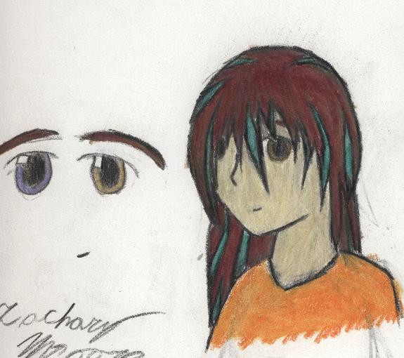
Ok. This is the final product of my attempt at making a comic. Touched up slightly in photoshop. I'm testing out... well... everything except drawing a face and body, here, so let me know what works and doesn't. I'd like to know what I'm doing wrong, what could work better, what could be fixed, everything. Tell me what you think.~Vetch
[link] First Draft
[link] Second draft
[link] Third Draft
Related content


Comments: 12

Very nice improvement, to make a comic in BW is something, butto make a comic in shades of gray, wow, that must have been hard.
Anyway, I really likethe dinamics of the main background and the way you arranged the pannels, great work.
👍: 0 ⏩: 1

Hey, thanks. It wasn't that hard, I like my shades of gray, so I use them alot.
Thanks. I'm working on a longer one that will have dialouge and be several pages. We'll see how that goes.
~Vetch
👍: 0 ⏩: 0

Excellent improvement. Now, sometime soon, you can make full-scale comics. Well done sir, well done indeed.
👍: 0 ⏩: 1
This would be the start of that, you see. I'm working on it.
~Your BROTHER!!!
👍: 0 ⏩: 1
Excellent. I am glad to see that you are putting effort into a project.
👍: 0 ⏩: 0

O.o wow a lot of shading in it, but thats a good thing cause it makes it look awesome ^___^
Looks really good i think, i cnat really criticize because im learning comic art myself >.<
...........I think its time for them to buy new shirts though *lol jk jk*
👍: 0 ⏩: 1
That's how I do it, really, with the shading, so... thanks?
You can criticize, certainly.
Well, you see, it is, but it's part of a story. Once I work out the problems with this sample, I'll redo it and go along with that.
~Zachary
👍: 0 ⏩: 0

I think it's working for you! The only thing I don't like about it is the diagonal stripes on the right... they make it a little busy. But beyond that, I'd say you're successful in the attempt.
👍: 0 ⏩: 1
Ah, yes. Those stripes there were an attempt of doing something like the stuff you see here, behind the panels... [link]
and, more evidently, here, [link]
I liked that, but I know it didn't turn out to well here. I just didn't think it would look right with a big white or black space. I'll try to use photoshop to make it black (rather than change the original) and see how it looks.
Another thing I found is that the panel order may be confusing. How are you reading it? I'm not too sure if that works, either. Let me know, and thank you for telling me what you thought. It helps alot.
~Vetch
👍: 0 ⏩: 2
Mmm, I dunno. I don't really like the behind-panel business much in general, but that's just a personal preference.
The panel order... I'm reading it top left, then the one with "creak", then the one with both people full-body, then the big one of the standing fellow, and then the one of the two heads.
👍: 0 ⏩: 1
Mm. Well, I dunno. We'll see what happens.
Agh, I was hoping you weren't gonna read it that way. The order you're reading it, and I was afraid of, is actually like 1, 2, 4, 3, 5. So I need to figure out how to make it less confusing... We'll see how I do with that. At least we've figured out that there's a problem. Thanks muchly, Mare.
~Zachary
👍: 0 ⏩: 0
Ok, tried that out, it does look better, I think. I'll keep that in mind for later attempts. Thanks again.
~Vetch
👍: 0 ⏩: 0