HOME | DD
 Vetch — Comic, Version 2

Published: 2007-03-07 22:33:58 +0000 UTC; Views: 148; Favourites: 0; Downloads: 0
Redirect to original
Description
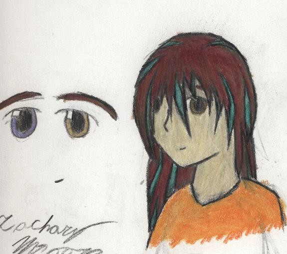
Second attempt at drawing the same comic. Completely changed the 5th panel, and changed the panel format so it's hopefully not confusing. Please, if you read it the wrong way, let me know. I don't expect that anyone will, the way it is, but... it goes top left, top right, big panel on the left, 2nd panel down on the right, bottom right. If any part of it is confusing, like you can't tell what's going on in a panel, let me know. I tried to fix that, too. Um... basically, any problems, say something. Tell me what you think. This is somewhat touched up in photoshop, mostly cropping and the borders on the panels 'cause I really had a bad sense of a straight line on this one. Let me know what you think.~Vetch
Related content


Comments: 9

Might as well just comment both here again. While this one's better than the first one with clarity and portraying some details, the overlapping in the original (or maybe just the absence of the ominous black bars) make it seem more friendly. Really great for your first comics. Keep it up.
-Luna
👍: 0 ⏩: 1

Good point about the overlapping... I'll have to keep that in mind.
I should redraw this at some point, I think. I've gotten alot better.
~Zachary
👍: 0 ⏩: 0

Ummm, that's hard to decide, I preffer in general the story here, but, even when it's easier to follow and clearer, the other style looks more fluid and natural.
👍: 0 ⏩: 1
Mm. Well, I'm trying to mix both in a non-confusing way when I can, and I'll probably use the overlapping panels when it suits me (I was told that having them at the end will get rid of confusion, so when it ends up that way, I'll do that, probably.) Thanks again.
~Vetch
👍: 0 ⏩: 0


This is not bad! but I think you can make the pic on the bottom right a bit smaller (I mean, I don't think you can "cut some floor" [sorry for the english -__-" ] )
But it's just a point of view ^^"""
But I think it's ok already anyway ~
👍: 0 ⏩: 1
Hm... you have a point. That'd also give me more room for the panel above it, which would help. (I made them too small this time, I need to fix that.) Thanks for the comment, Lumenox. Your english is fine, don't worry.
~Vetch
👍: 0 ⏩: 1
ok, I'm glad my comment wasn't too useless ^^"
👍: 0 ⏩: 0