HOME | DD
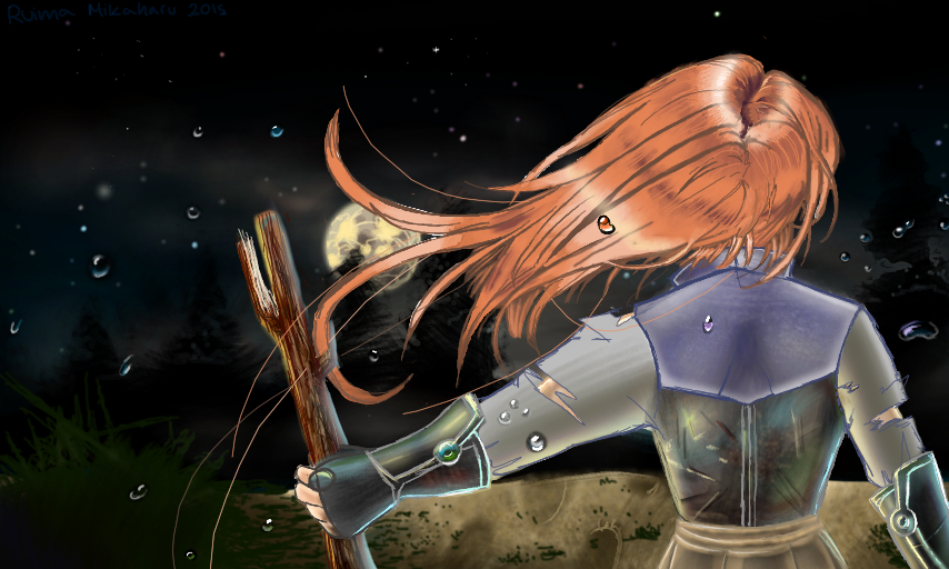
 Vibanib — A ways to go
Published: 2016-08-07 20:38:08 +0000 UTC; Views: 230; Favourites: 17; Downloads: 0
Redirect to original
Description
I was originally gonna do another backround, but because the weekly challange I wanted to do this for has past, I thought it didn't really matter anymore
besides that
It's hard to be on colors and sudomemo at the same time (I have to share an sdcard for both Ds' ) I should probably try to even out my time between here and there.
School started today, so I have a lot of work ahead of me.
Sept 1, 2015
Related content


Comments: 16

I like the entire concept of the piece, but it is hard to understand what the person is standing on, or how they are going in that direction.
👍: 0 ⏩: 1

It's hard to see because of the darkness, but it's a cliff, what she sees beyond is a large forest, and I guess you could say it's a hunch especially since it seemed somehow somebody got across the cliff not too long before she got to it.
👍: 0 ⏩: 0

Hello i am from
I would like to start by saying the first thing i liked about this work are shadings and lighting, they are the right place, they add three-dimensionality to the subject and overall composition. I really like the use of dull and limited number of colours, they balance very well the colour of armour, you can sense the tense atmosphere and how ready she is and this is highlighted by the drops of water. However i've noticed there are two things i feel to point out: the left arm seems too short compared to the rest of the body and a bit stiff, maybe it is due to the ripped clothing and the colour of drop of water behind her hair seems to sitck out while in the other drops colours are well blended, are more natural. Other than this i love how texture of the armour and hair are well made, they seem realistic, you can almost feel the metal. Overall i love the entire composition, you did a good job, your technique brought out the tense atmosphere  (Smile)")
👍: 0 ⏩: 1
Ooh > . <
you're right, the left arm also looks a bit too thick aswell. Nope, I accidentally made the outline around the water behind her head specifically with a black outline which makes it stick out in comparison to the others which I didn't really do the same thing to. I'm glad you feel that way about the armour and thankyou for your feedback
ó v ò
sorry I took a while to reply, I had to think about my response x'D
👍: 0 ⏩: 1
You are welcome, i liked your piece, i find it well made so i commented and gave some feedback
sorry I took a while to reply, I had to think about my response x'DNo need to apologise, i like when people think before to write or do something ^^
 (Wink)")
👍: 0 ⏩: 0

Hello! I'm here from
I want to start off saying what an atmospheric and powerful piece this is. The composition is very strong and I love the inclusion of water droplets, it really creates the appearance of a dramatic moment frozen in time.
The shading and lighting seems to be in all the right places, but the amount of detail doesn't look consistent to me. Her armor appears very life-like and reflective with all the colors you've brought into it, but her sleeves seem too smooth in comparison. I would suggest adding a bit more texture, and maybe a bit more depth to it with at least one darker tone added in. Her hair also appears very detailed at the roots, but the amount of details seems to lessen more and more after that. I really like those purple tones in her roots and some of the shadows, so I think it'd be great to see more of those used to shade her hair.
On the topic of her hair, it might just be my preference, but I think it would be interesting to have a clearer view of the moon in the background. All the movement in the hair distracted me from the moon at first, so I didn't notice the moon right away. The two longer strands of hair look out of place to me in general, but that might also just be my personal preference.
Overall, this is a very impressive piece. Keep up the great work!
👍: 0 ⏩: 1
Thank you very much for the critique~
Oh gosh, it's been forever since I made it so honestly, I feel like I'd have to go back and watch how I made this to understand a little bit more of the me of the past.
First off thankyou, when I was finishing the piece, it was actually the water droplets that I started to feel most confident about, and I'm glad you understood what I was attempting to do.
When I drew this I believe.... I might have started out on the top of the head. When I did the armour, I was trying to test out a new technique that I had learned but because it was my first time trying to draw actual armour, it was not coming out as shiny and metallic as I would have liked. And yes, I did not define the other materials of the armor well. The top purple was supposed to be a fuller metal backing, but the sleeves were not made out of metal, it was more as a tucked in/under dress shirt kind of thing, and I think that is why I added tears/holes to represent the thinness in fabric since I didn't know how to draw that either xD. I have no excuse for the skin, though. I just wanted it to be seen and attempted to contrast it with everything else.
Really? I felt like the hair was very unrealistic! At the start I wanted to challenge myself with the idea of thinking about a "video gamed-styled hair" but as I got further from the head, the hair was getting harder to draw, especially since I had to force it all into one layer. As a result of difficulty I had, It got flatter near the ends and the two long strands you dislike came to being because of my decision to end the hair while trying to define what it's location? (if that makes sense?, I know what I mean but it's hard for me to explain)
Anyway thanks again for stopping by in the group and critiquing. I think person-wise, I've improved since then, but I still have a lot of work to do o 3 o
👍: 0 ⏩: 1
You're very welcome!
I had no idea it was an old piece, it's still really great.
I think we can agree the hair isn't hyper-realistic, but the top of the head did seem to me to be at a level of realism that matched with the shading of the armor and the overall style of the piece. I definitely know what you mean, hair flow is hard to create sometimes, and sometimes we can make it more interesting by adding stray hairs or strands going off in different directions.
👍: 0 ⏩: 0

I love the water details, the pose and the colors you choose ")
👍: 0 ⏩: 1
