HOME | DD
 vic55b — Uncanny Avengers Colors

Published: 2013-12-20 20:51:06 +0000 UTC; Views: 18560; Favourites: 504; Downloads: 512
Redirect to original
Related content


Comments: 49

Awesome art work and good combination of colors dude, congratulations!
👍: 0 ⏩: 0


Who's the guy that almost looks like he's clapping his hands?
👍: 0 ⏩: 1

His name is Havok from the X-Men I believe
👍: 0 ⏩: 0


Thank you Im really happy with this one.
👍: 0 ⏩: 0

hello I'm looking for designers for a comics publisher and wanted to know if you want to join me.
👍: 0 ⏩: 0

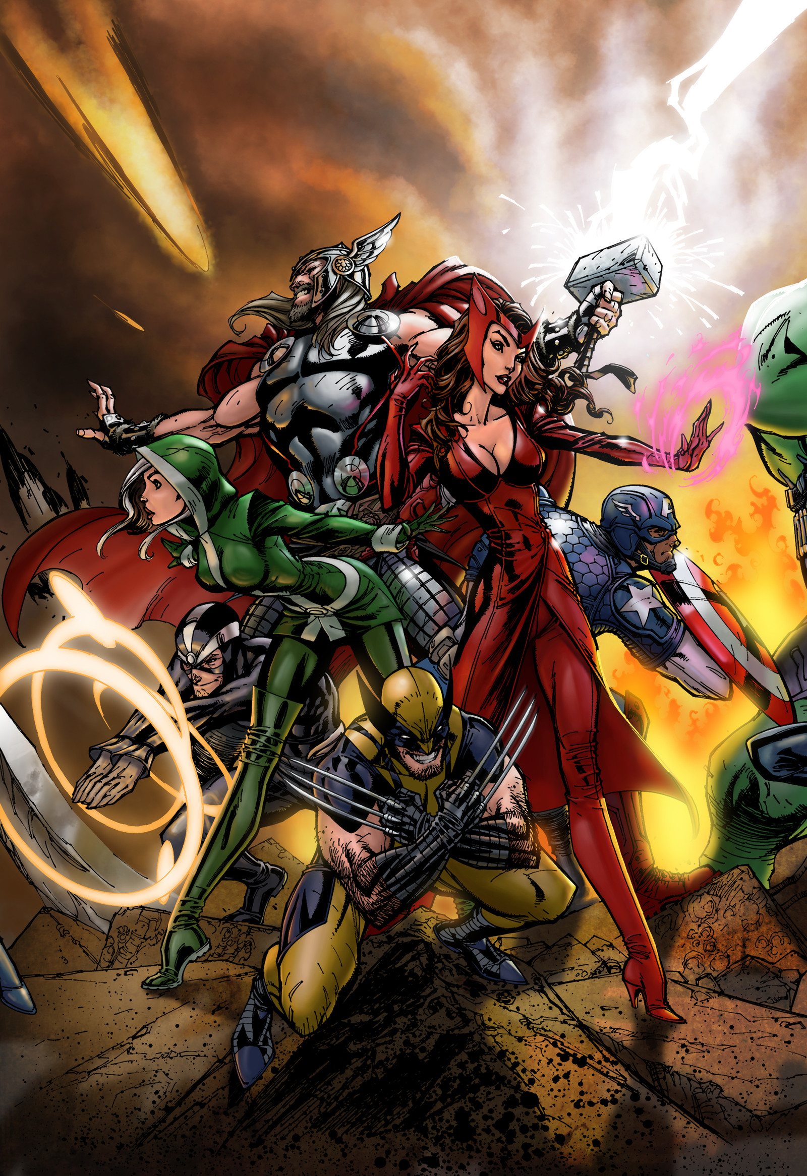
My apologies to all the combatants for the lateness. This was a very interesting battle as the peice really could go either way for lighting. I think everyone turned in top notch colors and I could see quite a few of you doing this professionally. I gave some critiques in my reviews, i mean these only as helpful hints that you can feel free to ignore if you disagree.
Battle 1 - Winner
Josh has the colors of these characters down pat and I like the effects he added to havok's rings, thor's hammer, wolvie's claws, etc. Vic though nails it with providing a more atmospheric feel. The lighting from the fire as well as the powers is amazing. Also I am so envious of how he used those highlights. Awesome stuff.
Battle 2 - Winner
Monte does a great job hitting the colors and the backgroun. Like that he added some shadows on the ground. I just feel like the piece is a little to highlight heavy. This was a close battle. I went with Peeter on this one because I thought he struck a better balance between highlights/shading. Also you gotta give him a little bonus point for making it a true cover haha.
Battle 3 - Winner
Haphzard does a great job again with these colors. Another good use of highlights and shadows. The piece just feels a little saturated maybe? The colors are just a little to dark and muted for me. Still a great job. Tas though turned in what I think might be the actual colored cover haha. Just an amazing job all around. The lighting, the embers, that sky? Perfect.
Battle 4 - Winner
This was a tough one, the two pieces are so different in their approach. One is light and the other dark. Shatter did a great job and brings a well lighted piece, but there were a few spots that felt rushed (like the ground color). Over all though I really liked this one. Zeth's piece could probably be slightly lighter as some of the details are lost in the darker tones, however the colors and highlights again are top notch. I also appreciate the background.
Battle 5 - Winner
Another close battle. Mizzim did a great job on the background and defining the characters to give them a 3d feel, but I feel that the halo lighting around everyone is just to much. It's a little distracting from the piece. Swamp pulls this one out for me. Another cool use of that open background spae and goodlighting effects. The colors are a little flat, but still very nice.
Battle 6 - Winner
Yin does a nice job with the effects on the cover, but the muted and dark tones seem to be a little heavy for me. Especially with Witch and Thor's powers not casting any highlights. Pask gives us the sort of bright colors I think a lot of people associate with the comics medium. A good use of highlights and shadows help this piece to pop even with the bright look.
Battle 7 - Winner
This was a good battle and three such different takes on this. I love the color battles for this reason. FS gives us some quality colors that look like they are from any comic in the 90s (which I mean as a compliment just in case haha). Good use of high lights and shadows. Jasen does a great job of making the colors pop and I liked that people added embers to the picture. Rogue especially shines in this one. Caravan took this one though. I like the way the whole piece has a texture to it that gives it a little more of a traditional feel. The lighting is great and I really dig how he did Thors hammer.
I always forget to say Best Battle and Best Battle Piece (if I'm even supposed too haha), but here are my picks.
BB - Battle 7 a great round with three great colors and all interesting works.
BBP -
Great round all and thanks for allowing me to judge. Keep up the great work.
👍: 0 ⏩: 1
Thank you for the kind words and the judging.
👍: 0 ⏩: 1

Thank you very much! Its great to hear from you hope all is well.
👍: 0 ⏩: 0


Brilliant piece! love how you've separated the characters and added depth using the flames glow. This is what I struggled to work out how to do and now I know, I love this competition!
Can I ask, did you section off each of the characters lines or just paint over the lines by eye?
👍: 0 ⏩: 1
Thank you very much for the compliment, adding depth to a piece is always one of my major focuses when Im working on something. Iv'e noticed a lot about how to achieve depth funny enough by watching 3D movies and being able to break down visually the levels in depth of field. Instead of bringing things forward 3D movies focus on pushing things back to achieve the illusion of depth. Usually they have large foreground objects that are darker and frame around the screen then travel into the picture separating the elements form mid ground to background. I approach coloring a piece in the same way. I start by separating everything in the image from foreground to BG by creating individual solid flats for each piece such as the foreground rocks all the way to the BG rocks that way I can select each area based on the plain it is in the picture. I then do the same for the characters, every character that is on the same plain I create a separate solid flat for. I do all this under the actual flat layers and I basically use them to be able to just easily select everything thats on a separate plain easily. After that I just paint everything with the principle that the further things go back I add more haze to represent atmospheric perspective, being that the further things go back the more particles there are in the air in between them. I do that for the line art as well, as the picture travels back I lighten up the line art using my solid separating selections. You can see a good example of how I do that in the Tomb Raider flats I just did, I separated all the vines, plants and branches into individual depths of field. I hope that helps and that I made it all understandable Im not very good with writing or trying to explain myself. If you need any more help or me to clarify or elaborate on anything just send me a note and I'd be happy to help you out. Thank you again.
👍: 0 ⏩: 1
Brilliant thank you for such a comprehensive reply. I think I can do that or at least give it a shot. I'll try for my tomb raider colour (using your flats as they're better than mine  (Smile)")
👍: 0 ⏩: 1
Your welcome, glad I could try and help out. I'd be happy to take a look at it when your done, just send me a note or a link to it on the flats page or something and Ill give you any critiques or feedback you would like.
👍: 0 ⏩: 0


The best work I've seen on this piece yet! I really like the effects on the fire and energy!!
👍: 0 ⏩: 1
Thank you very much for the compliments.
👍: 0 ⏩: 1


I think you may have just won the competition!
👍: 0 ⏩: 1
Thank you, we'll see there is a lot of mad skill in theses battles.
👍: 0 ⏩: 0

Thank you very much for the compliment.
👍: 0 ⏩: 0


A worthy addition, my friend. you check your messages? get back to me when you can
 (Cool)")
👍: 0 ⏩: 1
Thank you very much, I did and got back to you. Look forward to hearing more.
👍: 0 ⏩: 0


Thank you kindly, Im glad you liked it.
👍: 0 ⏩: 0


Thank you very much, I think your off to good start.
👍: 0 ⏩: 0
