HOME | DD
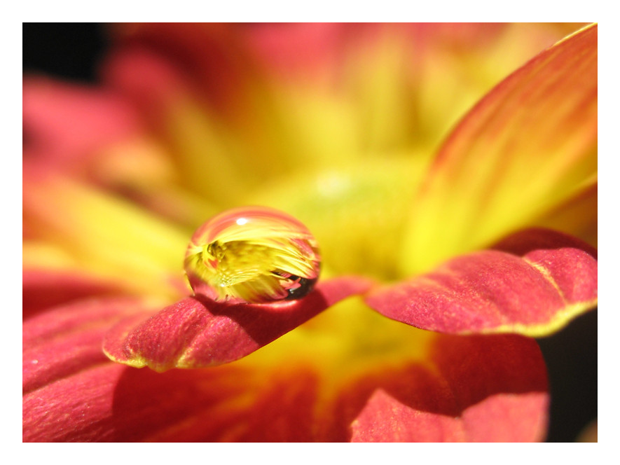
 vinayan — reflection 5

Published: 2006-03-14 16:02:52 +0000 UTC; Views: 588; Favourites: 30; Downloads: 64
Redirect to original
Description
full view for details.Related content


Comments: 20


Sorry, i have to say the same here..
Just as rockclimber say. i just want to help. beacause the concept and view is brilliant!
👍: 0 ⏩: 1

")

i really like how the water droplet stands out...keeps the image interesting
👍: 0 ⏩: 1

 (Smile)")

thats wonderful! I love how everything fits exactly where it should
👍: 0 ⏩: 1

Nice concept and detail. What seems a little inconsistent is the blurring. Some areas are blurred while others aren't, therefore detracting from the main focal point of the piece..which seems to be the dew/rain drop. I may be wrong but that's what I see. Did you try different lighting and different angles or was this the intention you had from the beginning? Also the border needs to be even all around unless you have a title/caption on the top or bottom. I don't know as far as standards what you should do about the title placement..are you trying to go against "standards" (if there is such a thing for photography).
Hope this helps. Good luck!
👍: 0 ⏩: 1

thnx for the suggestions. i m just a beginner and am learning things every day. ur comments will definetly help me in coming up. thnx again for the support.
👍: 0 ⏩: 0

that's really wonderful 
👍: 0 ⏩: 1