HOME | DD
 VinceAndrews — docking
Published: 2013-08-21 00:04:52 +0000 UTC; Views: 1170; Favourites: 72; Downloads: 20
Redirect to original
Description
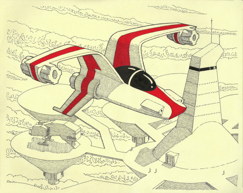
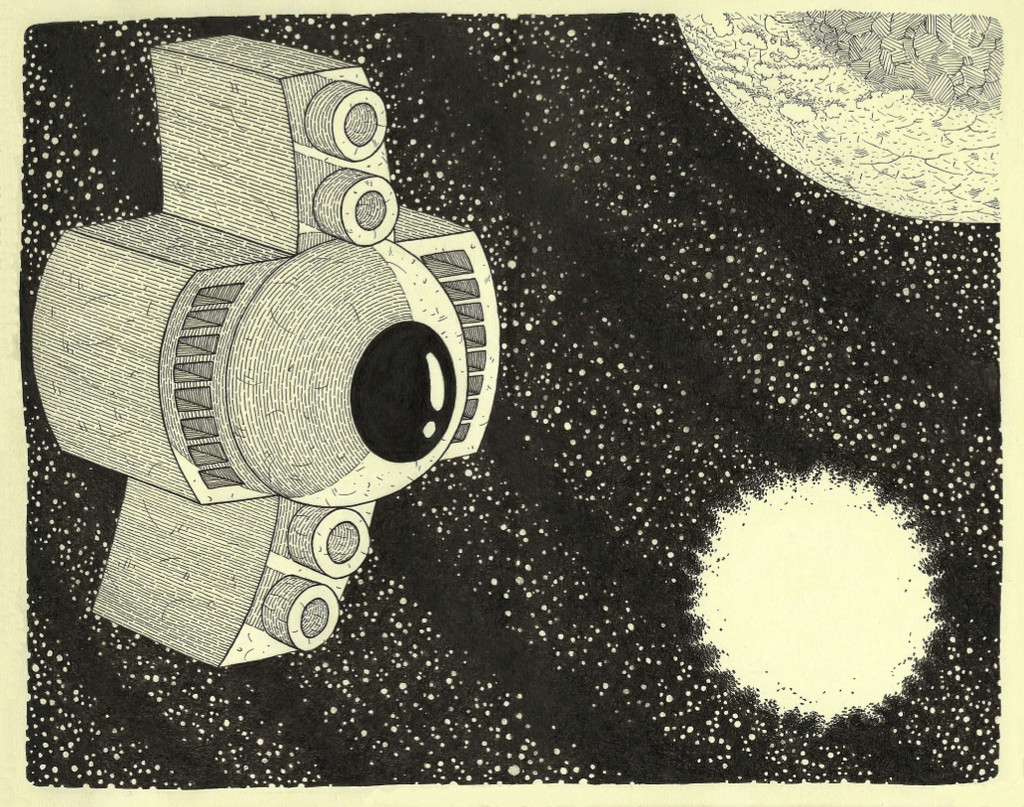
concept art for the comic. microns and red gel pen in a moleskine sketchbookRelated content


Comments: 28

this is awesome! it has some sort of "moebius" feel to it
👍: 0 ⏩: 1

thanks! he's a huge influence.
👍: 0 ⏩: 0

Nice, has the feel of the best of the 80's indie comics (sort of a Matt Howarth style shading). Trust me, that's a compliment coming from me.
👍: 0 ⏩: 1
thanks, i'm trying to find a line between indie and professional, don't know if i'm quite hitting it yet but it's getting there
👍: 0 ⏩: 0

 (Smile)")
Really love this - and I love the nice disciplined shading. I can never resist the urge to scribble when my stuff gets to the rendering stage!
👍: 0 ⏩: 1
thanks! yeah it can be tough maintaining discipline through a whole piece, i get scribbley occasionally myself
👍: 0 ⏩: 0

I love how the bright red of the ship totally pops off the page, the limited coloring in this piece is really successful. And your line work shading is out of this world, great job!
👍: 0 ⏩: 1


Nice! You should definitely put together a portfolio of all those concept sketches, as they're quite good.
👍: 0 ⏩: 1
That's nice to hear, I've been trying to draw sci-fi for about a year and am just now starting to feel like I'm getting the hang of it, so I definitely appreciate the encouragement
👍: 0 ⏩: 1
Well, the great thing about sci-fi is the more unique the style, the better it turns out. You have a distinctive style (with a sort of Moebius twist to it), so that works out really well. I'll need to read the rest of that comic, but the splash page made me laugh (you can't do much without thumbs, that's for sure!)
👍: 0 ⏩: 1
Thanks, when doing sci-fi it's hard not to be influenced by Moebius, even if you never heard of him you're probably inspired by someone who was inspired by him. So far I've only got 5 pages of the comic up but it's all written so it'll get up eventually.
👍: 0 ⏩: 0

wow, thats fantastic. the touch of colour makes it really stand out!
👍: 0 ⏩: 1


Absolute awesome! I just love this style!
👍: 0 ⏩: 1
You're welcome!
👍: 0 ⏩: 0

BRILLIANCE! The curved lines you used to shade the conical structures is A+ Badass.
👍: 0 ⏩: 1
thanks! nice to hear that from someone with your ink skill
👍: 0 ⏩: 0