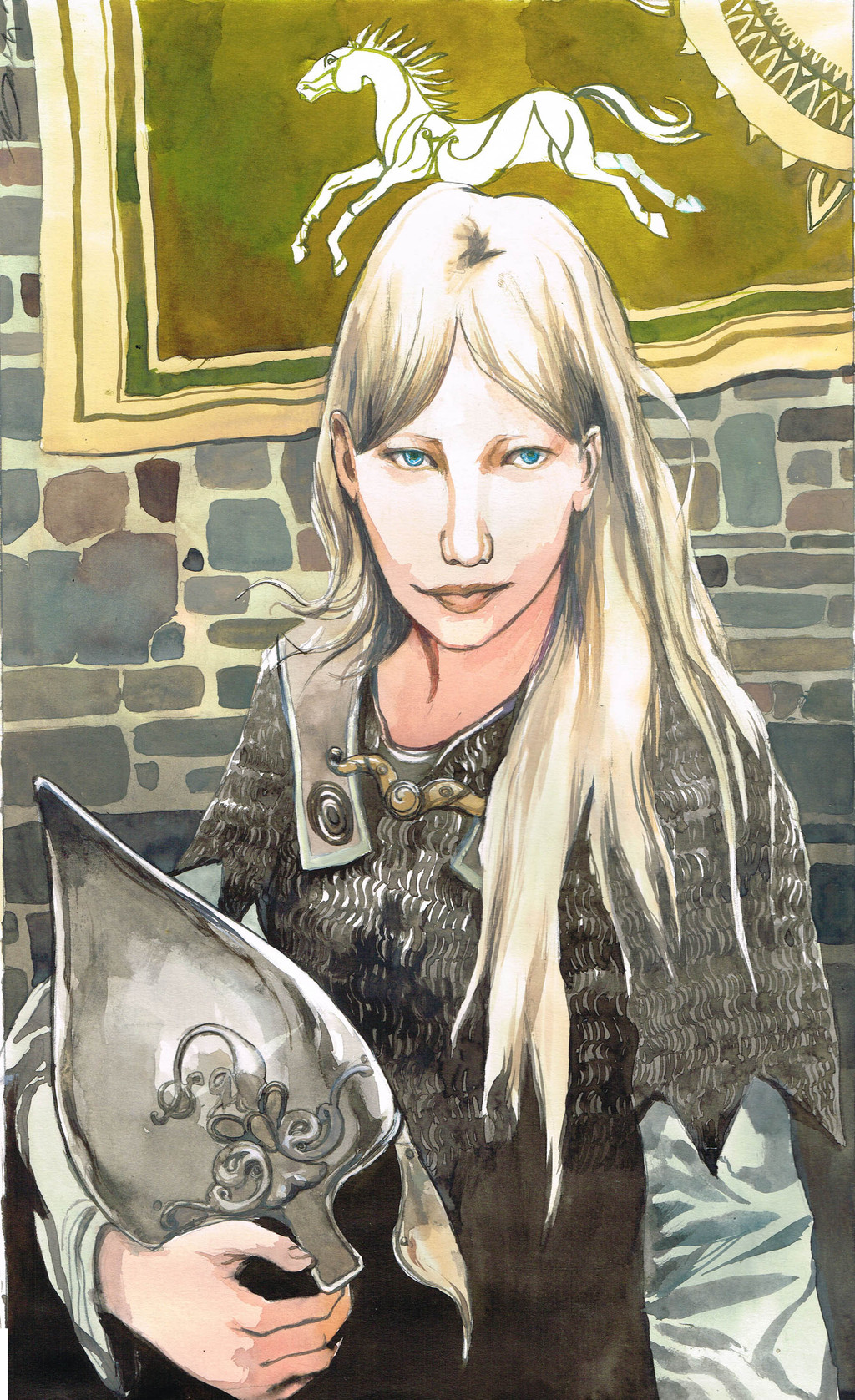
HOME | DD

VincentPompetti β€” Eowyn

Published: 2014-04-22 22:53:05 +0000 UTC; Views: 2646; Favourites: 101; Downloads: 25
Redirect to original
Related content
Comments: 27

dev4res [2016-03-21 18:46:21 +0000 UTC]

Pretty nice, I get to tell you that. Keep it up!

πŸ‘: 0 ⏩: 1

VincentPompetti In reply to dev4res [2016-03-21 19:10:12 +0000 UTC]

thanks !

πŸ‘: 0 ⏩: 0

AmbergrisElement [2016-03-21 15:15:16 +0000 UTC]

A very beautiful portrait,she has such a mysterious appearance here.

πŸ‘: 0 ⏩: 0

ThorfinnR2D2 [2016-03-09 14:58:19 +0000 UTC]

If I was a book publisher who could obtain rights for both LOTR trilogy and Hobbit, I would definitely hire you as illustrator!
Your gentle way of painting is so Tolkien-ish... I love it!

πŸ‘: 0 ⏩: 1

VincentPompetti In reply to ThorfinnR2D2 [2016-03-09 15:46:32 +0000 UTC]

I wish you become a book publisher It would be a dream to illustrate a Tolkien story. Thank you very muchΒ 

πŸ‘: 0 ⏩: 0

Skogflickan [2016-02-29 19:17:17 +0000 UTC]

you have such a cool style!

πŸ‘: 0 ⏩: 1

VincentPompetti In reply to Skogflickan [2016-02-29 19:18:11 +0000 UTC]

thank you very much !

πŸ‘: 0 ⏩: 0

kimberly80 [2014-12-28 20:29:19 +0000 UTC]

I really like this color and how to make himself a character, such as you see it, it's great)

πŸ‘: 0 ⏩: 1

VincentPompetti In reply to kimberly80 [2016-02-29 19:22:05 +0000 UTC]

thanks a lot !

πŸ‘: 0 ⏩: 0

11by [2014-06-10 23:14:05 +0000 UTC]

Very well done. I love the look of her and the style.

πŸ‘: 0 ⏩: 0

k2inspire [2014-06-09 11:44:17 +0000 UTC]

nice

πŸ‘: 0 ⏩: 0

Moony-moo [2014-06-09 11:38:23 +0000 UTC]

Wow! So beautiful!

πŸ‘: 0 ⏩: 0

DelliriumTremens [2014-06-08 00:05:33 +0000 UTC]

Nice!

πŸ‘: 0 ⏩: 0

Foxy-Knight [2014-06-07 23:13:42 +0000 UTC]

Has a very pure badassity by the looks of her.
Go girl.

πŸ‘: 0 ⏩: 1

VincentPompetti In reply to Foxy-Knight [2014-06-11 17:02:37 +0000 UTC]

thank you very much ! My vision of Eowyn is quite far from the actress in the moviesΒ 

πŸ‘: 0 ⏩: 0

giselleukardi [2014-06-07 22:25:39 +0000 UTC]

nice colouring

πŸ‘: 0 ⏩: 0

ChaosTrevor [2014-06-07 20:13:39 +0000 UTC]

cool

πŸ‘: 0 ⏩: 0

bleedingpure [2014-06-07 01:29:09 +0000 UTC]

the colors on the helm are perf

πŸ‘: 0 ⏩: 1

VincentPompetti In reply to bleedingpure [2014-06-07 20:27:47 +0000 UTC]

thank you !

πŸ‘: 0 ⏩: 0

Noctualis [2014-06-06 13:55:17 +0000 UTC]

I love the colors! and there is so much detail its amazing Β 

πŸ‘: 0 ⏩: 1

VincentPompetti In reply to Noctualis [2014-06-06 15:03:57 +0000 UTC]

thanks !Β 

πŸ‘: 0 ⏩: 0

rosane-delattre [2014-04-26 01:51:32 +0000 UTC]

She looks like Joni Mitchell.Β Β 

πŸ‘: 0 ⏩: 1

VincentPompetti In reply to rosane-delattre [2014-04-26 02:02:53 +0000 UTC]

I didn't think about her when I drawned, but thank you ! a sweet comparisonΒ 

πŸ‘: 0 ⏩: 0

SomniVision [2014-04-22 23:20:57 +0000 UTC]

Very nice detailing on the chain mail and I really like the muted color palette on the bricks. May I ask, what type of paper you use?

πŸ‘: 0 ⏩: 1

VincentPompetti In reply to SomniVision [2014-04-22 23:33:19 +0000 UTC]

for this one - and the "Galadriel" before-, I used a sheet "Canson" 220 g/m .But my favourites are "Velin d'arches" 280 g/m, or the "Canson Edition" 250 g/m

πŸ‘: 0 ⏩: 1

SomniVision In reply to VincentPompetti [2014-04-23 04:46:40 +0000 UTC]

Ah thank you for the info! It looks like hot press paper, but I think Velin d'arches / Canson edition has a similar surface.

πŸ‘: 0 ⏩: 1

VincentPompetti In reply to SomniVision [2014-04-23 10:31:00 +0000 UTC]

Yes, the Canson Edition is thinner, and the Velin d'Arches is specially adapted for watercolor or inks
I edited the picture, the top was missing

πŸ‘: 0 ⏩: 0