HOME | DD
 vir2l — Infinity v2

Published: 2000-12-03 15:19:24 +0000 UTC; Views: 5266; Favourites: 3; Downloads: 1742
Redirect to original
Description
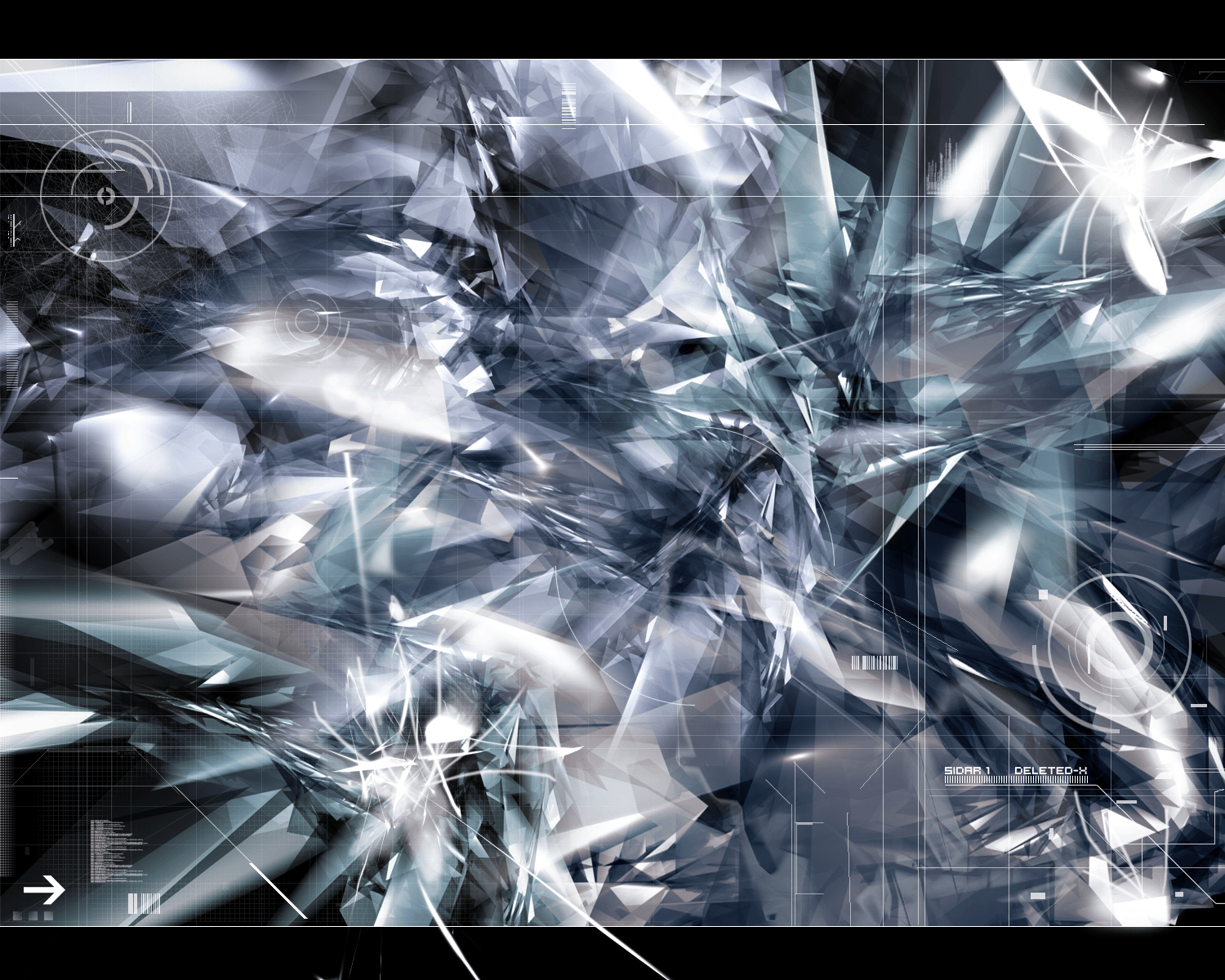
This is one of my new pieces. I spent all week adding to it and I think it turned out fairly well. Please comment, you know they're all appreciated whether positive or negative. Thank you and Merry Christmas!------------------------
[link]
Related content


Comments: 15


the 45 degree is fine, its just in conflict with the blue tile image... perhaps if the perspective created by the lines in the tiling weren't so obvious, they wouldn't look so bad at the edges... good job though..
[ phusion
| ghostreactor.com
| 2001
| somebody set us up the bomb!!
👍: 0 ⏩: 0

Thats awesome as hell.
----------------------------------
http://www.createdbycheney.com/
👍: 0 ⏩: 0

i like the image in the foreground, but the background and the black 45 degree angles aren't that fitting
👍: 0 ⏩: 0

the 45 degree line effect going on hetre is way overdone....I like 45 degree lines but not to this extent, the rest looks somehow unfinished...the pannel is nice, if the rest of the wp could be made like that then you'd be on a winner here.
👍: 0 ⏩: 0

looks nice, but i dont like the black shapes, maybe if they where transparent.
apart from that..interesting.
👍: 0 ⏩: 0

i like the way it could look...but right now the quality is not so good...the balance is good
D I G I
http://www.awedigi.com/optic
👍: 0 ⏩: 0

I think you may want to try either blurring the 'cutout' along the top/left side and perhaps changing it from black to a dark blue from elsewhere in the piece- the crisp lines and color don't seem to go well with the softness that I see everywhere else in the piece and I find it very distracting.
Also, the 'warped sheets' within the nested area seem to have a slight case of 'the jaggies' along the top edges, I would suggest blurring the 2 or 3 pixels surrounding the edges to smooth them out.
Other than that, it's got a lot of potential there.
👍: 0 ⏩: 0


Make your icons transparent (the text).. with TransText.. get it at www.phong.com
--
Tom Sommer
http://www.tsn.dk
👍: 0 ⏩: 0


This is a very sweet piece when I saw it on my desktop, but then I noticed it was hard to situate my icons. This has all the technical aspects of a great wallpaper to me, just that one little quirk about the icons.
--
Attila the Thug.
http://attila.xrs.net/
👍: 0 ⏩: 0
Very nice, love the smoooth colors and lights
--
Tom Sommer
http://www.tsn.dk
👍: 0 ⏩: 0