HOME | DD
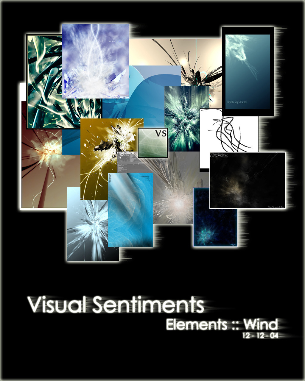
 Visual-Sentiments — Elements :: Wind Pack
Published: 2004-12-12 21:52:13 +0000 UTC; Views: 1208; Favourites: 13; Downloads: 527
Redirect to original
Description
Series: ElementsPack: 01 Wind
Release: 12 - 12 -2004
First art pack of the first series compiled and created by the visual sentiments are community. Enjoy, and thanks to our members for helping create this wonderful art pack.
Related content


Comments: 16

I used one of these here: [link]
Could you tell me who made it so I can credit them properly?
👍: 0 ⏩: 0

OOOH thankyouthankyouthankyouthankyou, this is perfect! ill let u know if i use
👍: 0 ⏩: 1

yw hope you enjoy
 (Smile)")
👍: 0 ⏩: 1
I will 
👍: 0 ⏩: 0

awesome work on the first pack peoples, congratz to all of us, and thanks to everyone who made a submission to maake this pack a success and get our new group kickin with a good start ")
👍: 0 ⏩: 0


Great working with you guys, and an awesome turn-out!
👍: 0 ⏩: 0
good work everyone, i'm proud of everyone's participation
👍: 0 ⏩: 0

Just a casual lurker (non computer artist).
First off, congrats you guys. It's great to see a new team get off the ground - and a great idea too. Graphic artists of the World Unite! You have nothing to lose but your lack of page views (oh, wait...).
With this pack I especially like the Nature inspiration. The recurrent "dandelion puff" theme - as if the centerpiece in each is ready to be blown by the slightest puff of air and moooove. You've given a dynamic kind of pre-motion feeling of being poised to dissipate. Not at all static. And yet each of you doing it in your own way. Cool! A true collaboration.
Having said this - committee are dangerous, especially on line. For God's sake - you have a poster here!! The typesetting is illegibly light and very poorly placed. The composition requires it be moved way lower and to the right - rougly lined up with the blue piece.
No one's going to look at your packs if you don't present them professionally. This would be a great shame. And while I'm at it - maybe it's just me, but I can't blow it up to see the detail of each piece. If you're selling a bunch of individual works (and not a poster) it's vital that the viewer - hopefully purchaser - be able to examine each work. Remember - first impressions count! You can edit and edit, but if somebody clicks on to see a new group and is turned off, you've blown it.
This goes in spades if you present a portfolio to a greeting card co (hey, somebody - go to big card stores, museum shops, Barnes & Noble etc. and examine what they have. See what companies might be doing things up your alley - but make sure you're not just retreading territory already marketed. These would make nice postcards too.
Best of luck!!
~~~
👍: 0 ⏩: 1
thanks so much for the comment, we really apptreciate people who take the time to examine our work and give creative comments.
👍: 0 ⏩: 0

woot, I'm part of a pack release ^^.
Awesome work guys.
👍: 0 ⏩: 0


 (Wink)")