HOME | DD
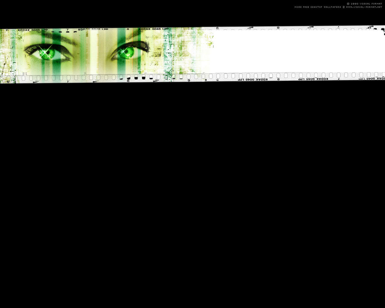
 visualformat — Virtual Jade
Published: 2003-12-01 16:14:41 +0000 UTC; Views: 325; Favourites: 1; Downloads: 91
Redirect to original
Description
Resources: some brushes by: itsuji.net/brushes/Tools: Photoshop
Related content


Comments: 13

This is ****ing awesome, I adore eet  (Smile)")
*walksaway*
👍: 0 ⏩: 0

looks great, im really for simplistic wallpapers that dont crowd your desktop too much or make it look to busy, but there just seems to be something missing in that big black area... :-/
👍: 0 ⏩: 0

Very nice! A unique work of art, but good nonetheless!
👍: 0 ⏩: 0

i really like this pic,
i live the eyes !! they really catch you.
the colours are nice too

👍: 0 ⏩: 1

Thankyou thankyou thankyou! 

👍: 0 ⏩: 0

The green looks great! Such a beautiful and creative piec!
")
👍: 0 ⏩: 0

ooh. this one is absolutely great!
and again: nice design!

👍: 0 ⏩: 1
tnkyou sooo much mate!
👍: 0 ⏩: 0


Thank u sooo much for your comment
👍: 0 ⏩: 0

Lovely just lovely... I like it a LOT... but still too much black!
👍: 0 ⏩: 1
Do I take it that you are not a black lover?  (Wink)")
A big tnk you for the comment!

👍: 0 ⏩: 1
No... I like black... but too much is too much... it stands out too much
No prob
👍: 0 ⏩: 0