HOME | DD
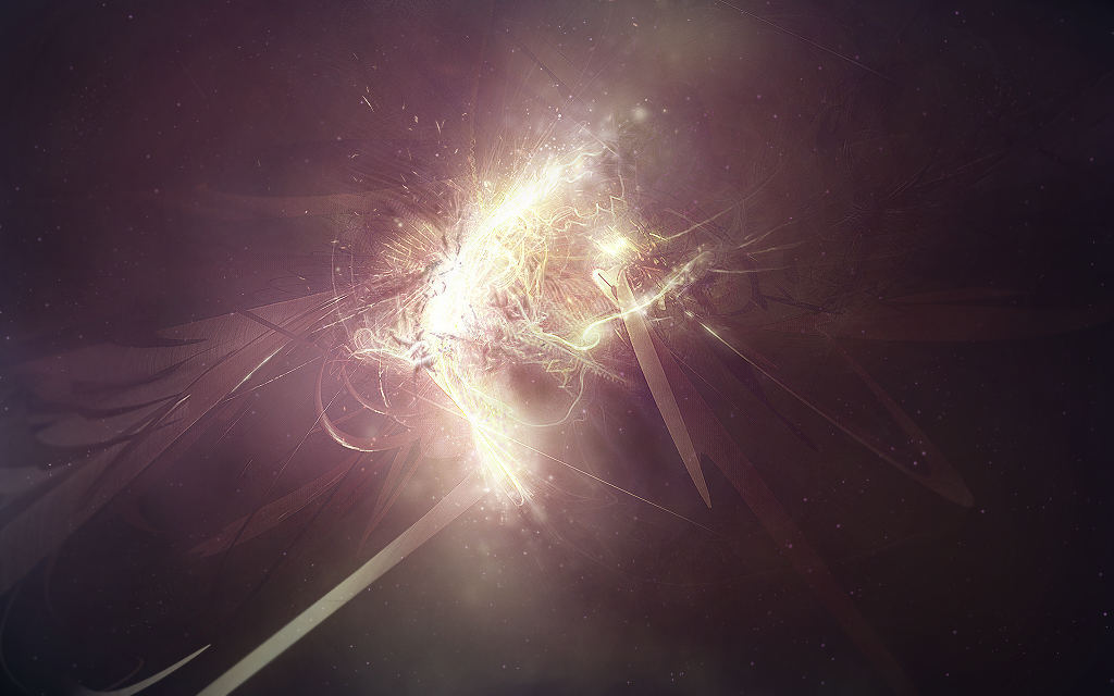
 VisualFour —
Prismatic Nature
VisualFour —
Prismatic Nature

Published: 2008-10-19 02:47:29 +0000 UTC; Views: 16248; Favourites: 527; Downloads: 562
Redirect to original
Description
The Luminarium submission for Prismatic[link]
Related content


Comments: 55

Loving the colors in this one, they're simply enchanting. That's some gorgeous text... and I would love to see such colors in something a little more graphical, like a story, or a movie, just... something. Seeing them in something so little as a few letters just feels slightly unfulfilled, you know?
👍: 0 ⏩: 0


I love the colouring and how well the white stands out! It's incredible!
👍: 0 ⏩: 0


I feel like I've seen something like this on abduzeedo before…
👍: 0 ⏩: 0

i really like the feel of this one. what font is it that you used for the word 'Prismatic'?
👍: 0 ⏩: 0


This is beautiful; I love how the colours contrast against the black.
👍: 0 ⏩: 0


Wow, that is awesome work my friend! Esp on the IV, the colors are amazing! Again, awesome!
")
👍: 0 ⏩: 0

 (Wink)")


Your work has been featured in the SPECIAL big Text Art issue! 
👍: 0 ⏩: 1

I just love this, I recently discovered the Luminarium and immediately fell in love with this exhibit title in particular. The colors and shapes go so well together and with the theme of the exhibit.
👍: 0 ⏩: 1

thank you very much
👍: 0 ⏩: 0

Your wonderful typography has been featured in this News Article ! [link] So hope you'll like it and meet others who does the same type of art  (Smile)")
If you 

Sangiev,
👍: 0 ⏩: 1

Thank's
👍: 0 ⏩: 1


This work has been featured in a news article: [link] !
👍: 0 ⏩: 0


The best one of the pack, it was the best pack yet and I'm sure that the next will be even better ;D
Wonderful effects!
👍: 0 ⏩: 0

This is one of the most beautiful things I have seen i a great while. Did you use photoshop? And if so, could you make a tutorial? A full tutorial on how you made this? A videotutorial would be best of course.
👍: 0 ⏩: 1
Well I made it all in photoshop, Its all painted, and I normally dont do things off the book, I play with photoshop to get the right effects... So a tutorial would be rather hard to pull off. Another reason I couldn't make a tutorial is becuase I wont have the time as I am leaving to Job Corps.
👍: 0 ⏩: 1


Brilliant! Wonderful colors, and use of empty space to emphasize the text. The fine detail in the background is amazing!
👍: 0 ⏩: 1


| Next =>