HOME | DD
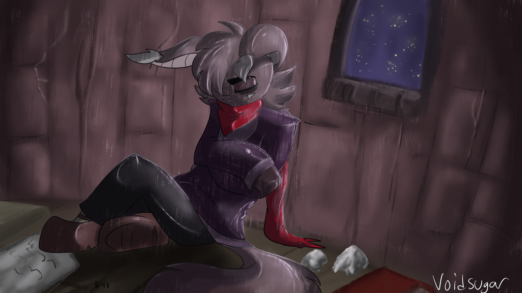
 VoidScare — Isolation
Published: 2017-05-23 23:55:14 +0000 UTC; Views: 534; Favourites: 36; Downloads: 1
Redirect to original
Description
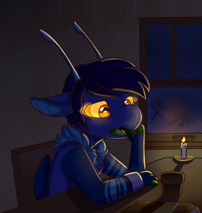
tried a new brushvasha is sad what a surprise
speedpaint link: www.youtube.com/watch?v=fjn299…
a critique would be nice
Related content


Comments: 4

Yo, I'm not one to critique, but that doesn't mean I can't say I like it. The vertical lines give it a brush look which I like. Might want to look at how the top of the character seems to fit with the background better with the lighting around the edges, than the pure dark lines at the bottom..
Either way, I'm no expert, just like the look of it.
👍: 0 ⏩: 0

This is beautiful! I love the shading with the rain and shadows, so pretty <3
👍: 0 ⏩: 0

Ooh boy, I want to critique! I like the dramatic colors as well as the shape of the room. Vasha fits well in the picture and does a good job of setting the mood for the piece, especially with the body position.
I think you should try to focus more on a specific light source. The shading itself is fine, but I think it would look better if it looked like the little window was the only source of light; the shading would have to be deeper and the lighting more limited. Also, to really bring out the depth of the picture, the outside of the window could use some deeper colors, like navy. The stars may also look better if they are smaller and more plentiful (unless those are fireflies). The crumpled up paper looks a bit out of place since it lacks lines like the rest of the piece. I also think it would be worth your while to experiment with different color lighting; with this piece, a light blue might look good.
I really love looking at your art! Just keep experimenting with new brushes and colors! I love the new brush btw, it makes me think of rain! I hope this helped!
keep drawing your babies, I love them
👍: 0 ⏩: 0

Y O This is pretty good m8! ")
I think next time you could use some more intense colors on the sky to make it seem like it's more on the outside than the interior background than part of the wall. Also, maybe pay more attention to the anatomy on the right arm (XD sorry if you feel tired of people saying this lol I know all artists are) and maybe vary the brush sizes more?
gimme some more vasha
👍: 0 ⏩: 0