HOME | DD
 vonPipkin — A little Spyro - Color

Published: 2008-09-28 16:01:28 +0000 UTC; Views: 3509; Favourites: 92; Downloads: 124
Redirect to original
Description
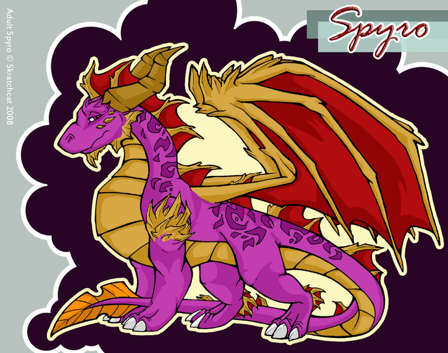
Alright, desciption time!So I finally go the lineart piece colored
 (Smile)")
so glad this is done for show, although there were things about this that almost had me tearstaining the paper of pure frustration. Example of that frustration is (as you might have noticed) the sky, which I originally didn't want fully colored because it doesn't look too great, but because I don't have any lighter blue than the one you see here, this was the only alternative, because I wouldn't have been able to make a proper gradient effect. Also, my scanner killed a lot of the shadowing on Crona and the BG, but in the end, I still hope you guys like (if not just a little) of what you see
Full view for details
Cynder (C) Universal
Related content


Comments: 88

Yeah I know, but sometimes I just don't feel the inspiration, and I wan't all my art to be special to me, so when I draw something else than Spyro, it's not because I don't want to draw it - it's because I don't have any ideas that I'd like to get down on paper
👍: 0 ⏩: 1

Ah...that explains everything XD
👍: 0 ⏩: 0


I LOVE the water and the grass hills!!! they alone look soooo amazing!!!! and Crona looks cute!!!!!! I think it turned out really lovely in the end

👍: 0 ⏩: 1
Thank you so much Poldalle! There's been so many lovely responds to this pis, it's quite overwhelming, and I'm really glad you liked it
👍: 0 ⏩: 1
you're welcome!!! heheheheh well see! *pokes and winks* it's good! and I'm not the only one that thinks it!
👍: 0 ⏩: 0


Eee, I like it a lot! ^_^
The only thing that need be mentioned is that Cynder is a bit too dark; but aside from that, wonderful work
Kryos looks even more awesome in color o.o
👍: 0 ⏩: 1
thank you
Cynders colors are, once again a result of my lack in different colors, the only color I had for her was pure black - which makes is all but impossible to do any kinds of shadow or highlihgting.
👍: 0 ⏩: 1
I agree. He looks really cool with those colors ")
Ah, that explains it then. Now that I think about it, I should have deduced that from what you said in the description; my bad
👍: 0 ⏩: 1
Well I might keep them...I'm pretty sure those are the one I'll stick with
and, it's ok I didn't have a description ready when I submitted, and had to update it later so you might not have seen.
👍: 0 ⏩: 1
I hope you will, he looks so cool with them
Actually, I saw it when the description was already there. I just didn't think. So like I said, my bad there ")
👍: 0 ⏩: 1
That's ok, don't worry about it
👍: 0 ⏩: 0

oh my!
this looks absolutely briliant!
one thing cauth my eyes thought... the size of the dragon on the background. compared to the surroundings he is kinda... pig... well i dont know his real size so i think it is more than ok.
👍: 0 ⏩: 1
Yup, he's a big one
that's purely intenstional - he's probably about the size of Ignitus, maybe a little smaller, but that size category.
The trees in the background are even further away...I might not have been too good at making it seem like that, but that's the meaning of it.
👍: 0 ⏩: 0

It's astonishing! OMG! Nicely done~!
👍: 0 ⏩: 1
hey thanks 
Glad you like it ^^
👍: 0 ⏩: 1

I very much like colour use you did on the pic. Might consider to use this as a background
👍: 0 ⏩: 1
Go right ahead! I'd be honored
I too use other artists art as my desktop.
👍: 0 ⏩: 0

Wow! It's amazing! Very well colored~!
👍: 0 ⏩: 0

The detail is so cool! The colors is amazing, but the sky could use a few touch ups. Amazing though!
👍: 0 ⏩: 1
Thank you so much for the honest opinion! (I'm not saying that anyone else doesn't state their honest opinions, but I think many are havin difficulties saying the "bad" things)
And yes, I had real trouble with the sky - this is partly because I don't own many different colors yet (they are SERIOUSLY exspensive...I use the Japanese COPIC Markers)
But also - I still lack some technique and general skill towards this new coloring media of mine
👍: 0 ⏩: 1
Yeah, it is hard to get critique sometimes.
If you have a digital art program then you could do a little smearing on the sky. That could work instead of buying all new markers, because, I agree, they are very expensive.
I find tutorials here on deviantART very useful for that kind of thing. I have seen some truthfully amazing marker work here.
👍: 0 ⏩: 1
Well I really like the markers, and I just got them recently so that's why I don't have too many of them yet
I'm a mediagraphic artist by profession, so I have all the Adobe programs, and know how to use them, but I'd just rather find an appropriate technique to do by hand instead of "cheating" with PSP. After all, that's the whole challenge for me ^^
👍: 0 ⏩: 1
Wow, I just have Photoshop, and Corel Painter Essentials 4. Both very good programs.
Makes sense, but cheating is always fun too! For me it's usually, just digital, or just traditional. Unless it is way too bad to ignore, then a little editing is fine.
👍: 0 ⏩: 1
It's not lame D:
we all have our preferences, and I've always made digital coloring in the past, but now I just wanna go back to the basics and do some nice art with traditional media coloring.
And as I said, it's my job to know these programs, so of course I should know how to use em - not many people actually work with these program daily, so it's understanderble if they don't know as much about them.
👍: 0 ⏩: 1
I guess so, but being an artist it would be good to expand my range of knowledge when it comes to traditional, and digital art. Photoshop is great thing to have for digital!
Your job? What do you do?
👍: 0 ⏩: 1
I'm a Mediagraphics Artist
(I make all sorts of printed stuff - commercials, and websites)
👍: 0 ⏩: 1
Cool! Wow, that sounds like an awesome job!
👍: 0 ⏩: 1
It's a very stressfull job, but very revarding when everything goes just as it should ^^
👍: 0 ⏩: 1
Well, as long as it pays off.
👍: 0 ⏩: 0


