HOME | DD
 Wally-in-the-Alley — Guardian of the Path
Published: 2013-02-12 01:22:27 +0000 UTC; Views: 1216; Favourites: 27; Downloads: 0
Redirect to original
Description
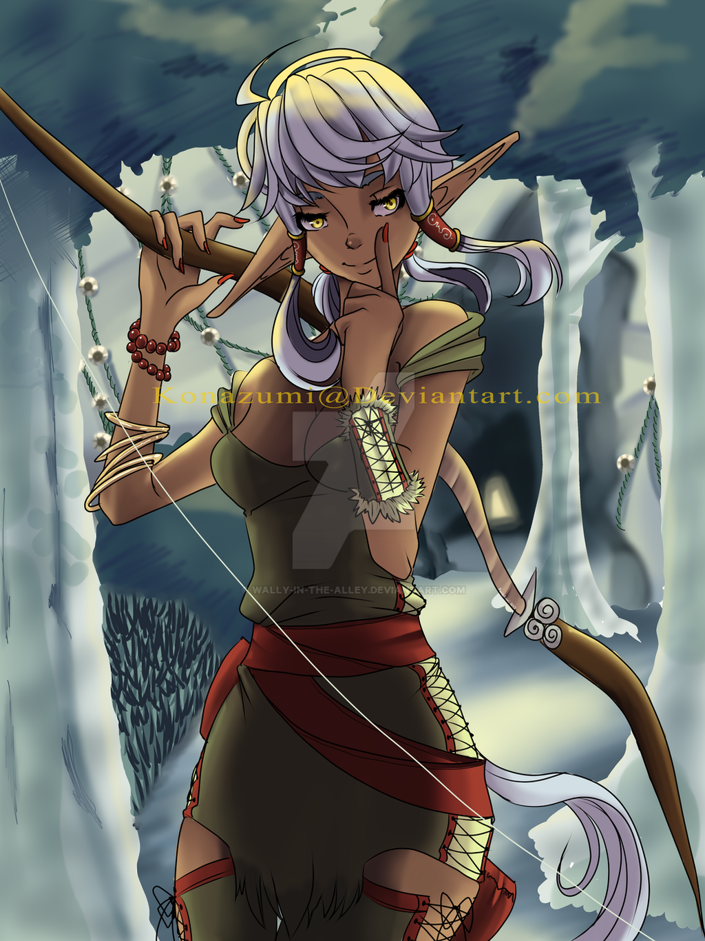
Some artwork I decided to do for the Katsucon Art show. Hope it does wellVideo of me drawing this is right here: [link]
Also:
DAT BACKGROUND <3
I cant believe I actually did one point perspective, with actual trees and other forest crap...
There is hope for me.... ;A;
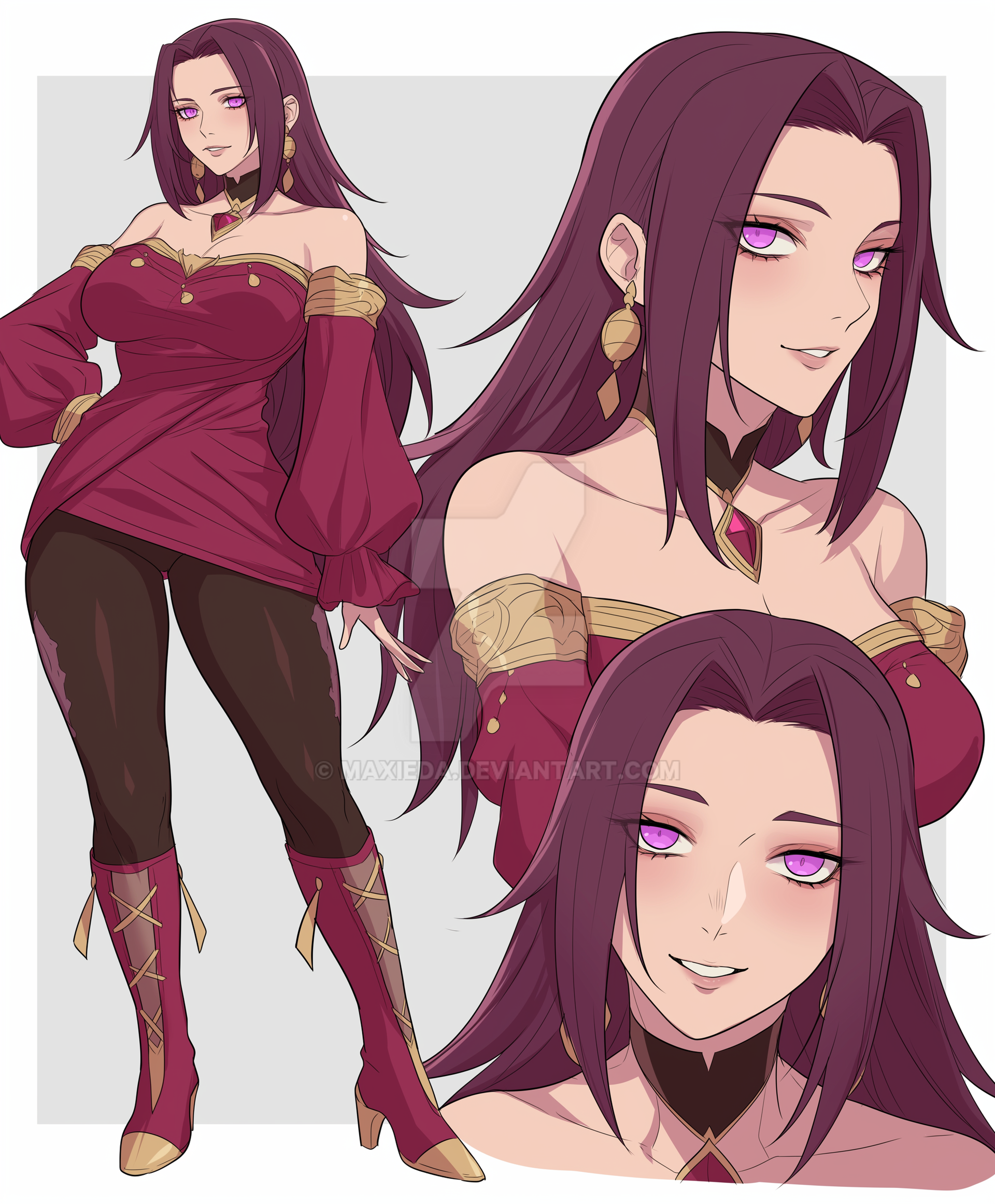
Elf Girl(c) Konazumi
Time it took- 8 hours
Related content


Comments: 10

Overall
Vision
Originality
Technique
Impact
I wish it didn't have two tags on it. It's distracting me from the image. But I guess since you are entering this in an art contest you don't want it stolen. MY suggestion? Final submission take off the tags and put a signature somewhere in the image that doesn't distract or take away from the work.
What's that white line from the top left to bottom right? A fishing line of some sort I'm guessing? I didn't read the description. I'm assuming whoever is critiquing it for the art show won't be either so I am looking at it the same way he or she will. I'd do something to make it clear what it is, because it is kind of distracting. It's like..WHAT IS THAT!?
I think you could have put a little more effort in the grass. I like what you did with the trees. It just seems that one grass patch kinda comes out a little too much in comparison to everything else. Not sure how to fix that...But I recommend putting more effort into the ground in general. I can't make up my mind if it's some type of acryllic like ground or something. Almost looks shiny? A lot of art critiques will analyze the background hardcore. It's easy to neglect especially on a site like Deviantart where you want people's focus to be on your character. But in a competition, they will look for EVERYTHING.
Put it this way. Lets say the judges have two pieces of artwork and they can't decide what's better. They are going to look for anything to give one image a bump over the other one. A background can easily suffice in such a decision.
Okay, last criticism and then I promise to give this the praise that it deserves! Sorry if I'm coming off as an ass. But I think this has real potential so I want to help you if I can!
The green colored costume is not bad. Maybe you could have added a bit more to it? Stetching perhaps? Random designs or insignias or something? It's a bit bland. The color wouldn't be an issue if it wasn't bland. She almost looks like a commoner, not someone as a main character in any setting. Clothes can make the person, ya know?
Clearly you have a damn good understanding of anatomy. You are so ahead of so many artists in that regard, you should applaud yourself.
Your character is absolutely aestetically pelasing. Not this OMG MEGAN FOX level hot, but she is certainly a sleek looking character. I like how the ears I kind of different, makes her look natural ya know?
I like the way you work with hands. Simple, yet executed well.
I want to remark on your bracelets (on her right arm). I dont' know why but that seriously helps the ims as well. age. A lot of times it involves little things that really give it a certain unique edge. You did a real good job on that. It really looks like it's loose and dangling and hanging on awkwardly...the way a lot of bracelets WOULD look on an arm.
You do a good job in making clothes look like clothes as well. I know I criticized her garb earlier so I want to remark the execution is good though.
Her eyes are nice. I like the yellow color. But it seems like the background of the eye has the same tint or color as the hair? Eh, seems a bit tacky. Maybe make it a litttttle bit whiter?
Can I make a few suggestions to make this really stand out?
There's a lot of things on her that, if you add more detail, will make it look really cool.
For example, thtat wood thing that's hanging from her weapon (?). That could use a really cool insignia or design. Maybe a shoutout to her trainer or family. Maybe something, a memory that keeps her going. Add personality in art, it can really help.
I'd add some detail on the nails too if possible. Maybe a little small unique design.
Again, a detail in the clothes. Maybe something barely noticeable, but clearly there.
I know I may have come off as pretty critical here but I did it because you are a real talented artist. Not many people get the honest criticism that they deserve. It's not disrespectful, it's out of respect. I think if you really focus and put effort you have a shot of really impressing some people.
Thank you for sharing and thank you for your time.
👍: 0 ⏩: 0


Again you're work is amazing! I always love seeing your new pieces and watching you draw in person. I love how different your characters always come out. You have like over ten of them so far and yet each one is unique and different. My only problem I have with this piece is the background. It seems so pale and boring compared to the colorful and detailed character. Maybe make it more natural in color or just adding some details would help. Over all this is a great picture and I just love it to death. Keep up the great work!!!
👍: 0 ⏩: 0

Overall
Vision
Originality
Technique
Impact
Here is the critique you requested:
Pros: Nice pose form the waist up. Nice facial expression. Your work also has a foreground, middleground and background. You have color to your light.
Cons: From the waist down the pose becomes a little stiff and a little contrapposto. You light work has a little weight variation to it, as I see it does taper at the ends, but I think that it could have more. While you have a nice color to your lighted areas your shadows are flat. Shadow has color to it just as light does with shadow being cool and light being warm. Check out this article I wrote to help you out more. tobiasartwork.blogspot.com/2013/01/color-blending-fx-brushing-and-photos.html Lastly your brushstroke for the background are taking away from the style of your character and they are rushed with little consideration for form.
I hope that helps.
👍: 0 ⏩: 1

Thank you~
The artical doesnt appear to be there anymore, but thanks for the help anyways~ ^__^
👍: 0 ⏩: 1
Try that [link]
👍: 0 ⏩: 0

Originality
Technique
Impact
wow this is really good artwork. the first thing i think when i see this is AMAZINGLY BEAUTIFIED KATNISS EVERDEEN! very good e.deviantart.net/emoticons/s/s… " width="15" height="15" alt="
 (Smile)")
e.deviantart.net/emoticons/w/w… " width="15" height="15" alt="
 (Wink)")
e.deviantart.net/emoticons/s/s… " width="15" height="15" alt="
e.deviantart.net/emoticons/s/s… " width="15" height="15" alt="
👍: 0 ⏩: 0


I'm a little shocked this doesn't have more comments...
I think this was a marvelous effort. You did a really good job with the posing, colors, and aesthetic of the piece!! I'm also a fan of the way you have shown the clothing folding on her arms and lower abdomen... pretty awesome work!!
I see why you did it, but that left ear still looks a tad odd... I dunno, maybe it's just because the ears are a longer variety than human ears.
👍: 0 ⏩: 0
