HOME | DD
 WayneBenedet — Lost In Time
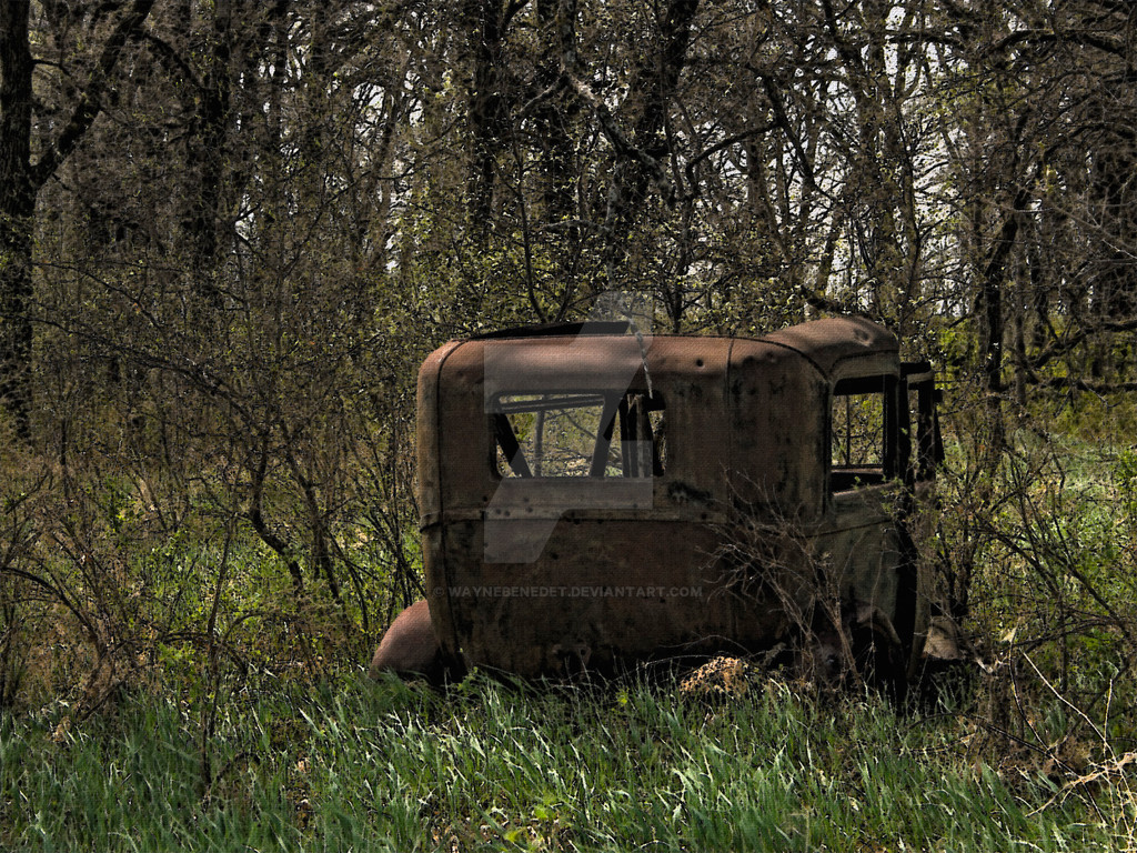
#ford #modela
Published: 2009-04-17 14:35:41 +0000 UTC; Views: 1597; Favourites: 127; Downloads: 0
Redirect to original
Description
Online Sales Gallery: The Untapped Source www.theuntappedsource.com/wayn…RUN by: Blueskye27
once, we were a
clean, bright dream
of new paint and
smooth angles
on a run into tomorrow
when the world
seemed as new
as we were
we laughed and
loved and put
the top down
in the rain
but we ran
too far, too fast,
losing each other at
a blind curve
now alone, we succumb,
our dream
a rusting hulk
in a forgotten field
as the road runs on
without us
Thanks Cindy, I really appreciate this.
Sorry about the re-post, but I have been experimenting with this image. One of the issues for me was how dark it was printing, so to correct that I moved it into CMYK and adjusted the Hue, Saturation and Lightness. That created some unexpected positive effects, so I decided to exchange the original. Over all, I have been trying to get an image that looks more like a water colour than a photograph.
If you have a mind to.. let me know what you think.
Model A Ford
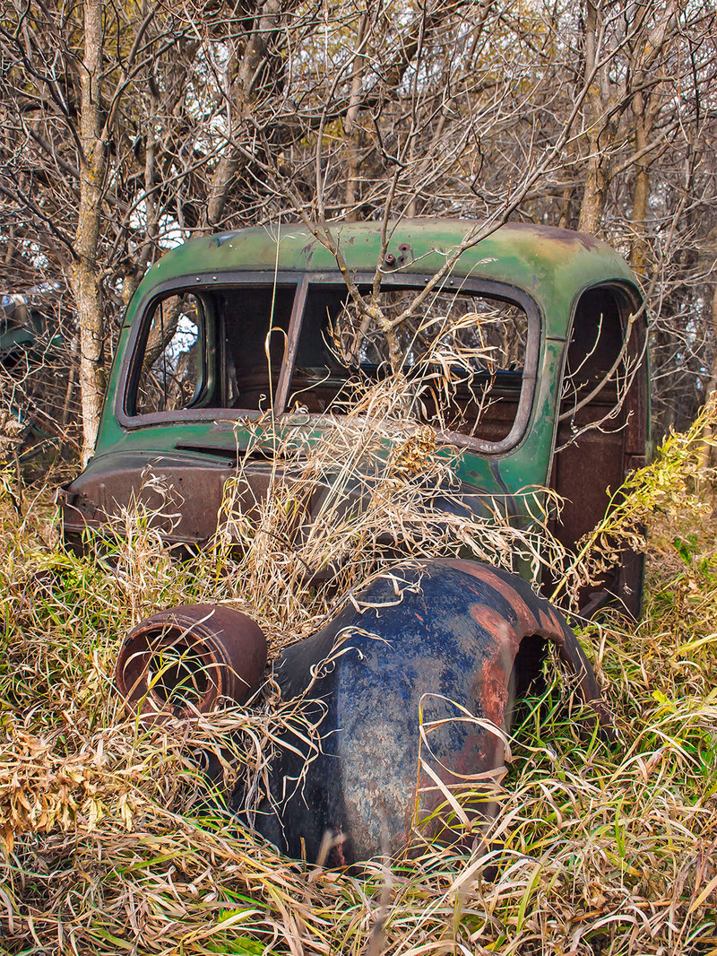
Related content


Comments: 67

You're welcome. What was the reason for wanting the piece to look like water-colour, just experimentation?
👍: 0 ⏩: 1

I am trying new approaches in my processing, not sure if anything will stick. We shall see.
👍: 0 ⏩: 0


thanks dave,
It was too dark for me, and I exhausted what I could do in RGB, so I went to CMYK and adjusted it a bit more.
👍: 0 ⏩: 1

your so welcome. yup.. Excellent work!!!!
👍: 0 ⏩: 0

This one is nice, too..but I like the ethereal quality of the mist in the first one
👍: 0 ⏩: 1
that is why I left that one, but it really was not the effect I was going for, it was more like a failed experiment that worked out. I have re-worked and posted it again, I hope people don't get annoyed at me. I did not like to density of the previous version and it printed poorly. So i moved it to CMYK and used some of the advantages of the colours pace, then went back to RGB for the post to dA. It is less dark, and the colours are more.... colourful.
")
👍: 0 ⏩: 1
I love when you talk dirty
👍: 0 ⏩: 1

I like the grain of this image, and I prefer it to the previous upload because i have a bias against soft focus. But i feel that this might feel more complete with a darker vignette. It has that kind of feel too it.
👍: 0 ⏩: 1
thanks,
this is turning out to be a work in progress, I have already changed it again. I got into an experiment here, which is unusual for me. I usually finish something then post it.
The grain is actually a burlap texture. I put it onto the image as a separate white layer. It took about 10 tries to get it right, but I like it now.
👍: 0 ⏩: 1
Sometimes feedback helps the completion.
The grain is very low key, i couldn't really tell until i got really close. Kudos, that's really impressive and looks amazing.
👍: 0 ⏩: 0


Thanks Kat.
I was not satisfied, on screen it looks Ok but for me the rubber meets the road at printing. It failed at that level, so I made some additional changes. I knew that CMYK colour space offered some advantages that RGB did not, so I used that knowledge to change the image. It is lighter, and the colours are more.... well colourful. Sometimes, the colour space makes a huge difference. Of course I had to change it back to RGB in order to post it, but the modifications I made in CMYK translated back nicely.
👍: 0 ⏩: 0
<= Prev |