HOME | DD
 webPHIX — interface.local_heroes
Published: 2004-07-07 17:51:46 +0000 UTC; Views: 911; Favourites: 1; Downloads: 320
Redirect to original
Description
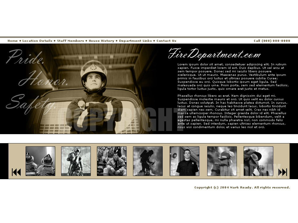
A web interface I designed with local fire department use in mind. I am quite proud of this design and have a thing lately for sepia tones. This is a late dedication to all the souls of 9/11 and the local heroes from every hometown across the world.Images are stock from Getty Images .
Comments and favourites are most appreciated. Cheers.
[ Edit ]: Tweaked a few minor things, cleaned up some edges I noticed when viewing it on a Mac.
Related content


Comments: 28

well... i only can repeat what the others already sad...  (Smile)")
I really like this one, the layout is great! very clear... everything on the right place...
Pride... honor... safty... maybe a little bit to much phatos... but its good! Very well done!

👍: 0 ⏩: 1

thank you.
yeah i like to add lots of visuals to my web design sometimes. keeps them content rich and gives the user something to look at.
👍: 0 ⏩: 0

nice your work i like your visual order & your layout...DESIGNER0008
👍: 0 ⏩: 1

Not only is this a very well done layout, but it is very touching too. The colours are nicely put, they aren't a bright red colour, that most people think of when you say fire department. The photographs at the bottom really add to the picture, showing the people and the work that they do. I'm sure that the people are very proud being able to do these things, and you display it very well.
Nice job.
-Att
👍: 0 ⏩: 1
Thanks for the well-thought out and detailed comment. I appreciate those!
👍: 0 ⏩: 0

I love the layout, the fonts, the graphical elements, everything! A fantastic layouy and indeed fitting for such a tribute!
👍: 0 ⏩: 1
thanks, it's my fave design so far
👍: 0 ⏩: 0

I have to say, this looks like a great design to me! Clear, not crampy as too many sites are, easy to find the information needed... without any active links, I can already picture how such a site could "work" (as dumb as this sounds, there *are* sites where even with the links it's impossible to find one's own way...).
The sepia tones works very well in this layout too, not only because they "fit the theme", so to say, but also because of the general contrast: the white parts, above and under the main area, make it easy on the eyes, and the color scheme does contrast enough, but without being "violent" (read: one can look at it at 4 am in a dark room without feeling like their eyes are burning).
The slideshow at the bottom is a nice addition, too. I don't know if it'd "only" be small pictures, or if each of them would open to a largest version of them, but in any case, it also makes the site more dynamic.
👍: 0 ⏩: 1
Thanks for the comments, it's nice when someone puts so much thought into them.
👍: 0 ⏩: 1
You're welcome
👍: 0 ⏩: 0

nice web layaout, the pics are cool and I like the colour... good work!
👍: 0 ⏩: 1
Thank you, this is my favourite design I have done so far this summer.
👍: 0 ⏩: 0

nice! Looks very professional!
👍: 0 ⏩: 1
cheers for the comments. i always prefer neutral and/or minimalistic designs.
👍: 0 ⏩: 0

hey, that's a really nice design, clean and organized. you can find everything on the first sight.
also the sepia tone is a really good idea here, works excellent
good work!
memod
👍: 0 ⏩: 1
Thanks a lot, I sent you an e-mail ...
👍: 0 ⏩: 1
oops sorry, responded to the wrong comment. never mind.
👍: 0 ⏩: 1
yeah, already noticed that
👍: 0 ⏩: 0

dear sir. i work for a fire dept and that is a great layout i was wondering where i may beable to find it at.
if you can help me feel free to email me at alex@sxsecurity.org
thanks.
👍: 0 ⏩: 1

Thank you, I am quite fond of this design too.
👍: 0 ⏩: 0
depends on what you're looking for and what kind of budget you have
 (Wink)")
👍: 0 ⏩: 0

this is awesome!!!! what a cool web layout, I really like that picture slideshow at the bottom thats way cool.
👍: 0 ⏩: 1
thanks. yeah the photo gallery really adds a nice multimedia presence.
👍: 0 ⏩: 0