HOME | DD
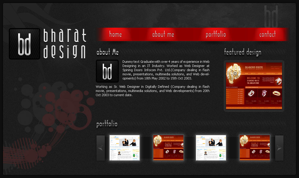
 WebRules — layout for my portfolio
by-nc-nd
WebRules — layout for my portfolio
by-nc-nd
Published: 2007-04-23 08:06:09 +0000 UTC; Views: 1614; Favourites: 17; Downloads: 94
Redirect to original
Description
comments and fav are welcomeRelated content


Comments: 32


Hey there
Design looks cool, but you could improve it a bit ;D
Like the shapes / brushes in the lower left. You could try 2 add sum more interesting...3d strokes..short profile.. i dont know x]
👍: 0 ⏩: 0

")

This is a nice layout. Only thing is that I find the navigation and title text hard to read. You may also want to try different shades of the various colours you've used to find the one that's best. That aside, good work
👍: 0 ⏩: 1

thanks dude
still not able to get fav right?
👍: 0 ⏩: 0

i don't like it....the menu is so large...........the gradients fonts.....the design in general doesn't like for me....
👍: 0 ⏩: 1
thanks for ur comments friend
i will try to improve my work
👍: 0 ⏩: 1
No problem dude!! i will try to write english better!!  (Wink)")
👍: 0 ⏩: 1


Nice template! Good color choice! Overall is 5 out of 5
👍: 0 ⏩: 1

Do you really need the "About Me" nav link since you have that on the first page? If that paragraph is simply a preview (more than likely), then I would include a "read more" link so visitors can get to the rest of the information about you.
The "Featured Design" area is nice, but would lose the "Portfolio" preview area, letting the featured design draw people into your portfolio.
👍: 0 ⏩: 1
thanks for ur comment friend
actully i want to target all type of user, some user always in hurry they just visit ur site n look around what is usefull for them, if they dont find any thing intersting they will simply hit the close button, they wont going read our site from top to bottom
thats wht the resone behind this
sorry for bad english
👍: 0 ⏩: 1
Makes sense  (Smile)")
👍: 0 ⏩: 1
the resone is same if users would not click on top navi link than i will try attract them with my thumbnail images at bottom bar
👍: 0 ⏩: 0

thanks
i m trying on some more layout, after working on that i will online one of my best.
👍: 0 ⏩: 0

Nice Work. keep it up.. best of luck for ur future
👍: 0 ⏩: 1
