HOME | DD
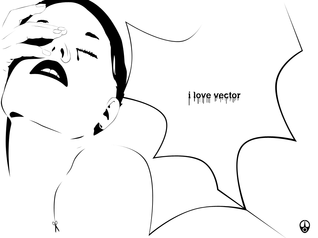
 webthi — Traces_002
Published: 2004-09-01 13:56:48 +0000 UTC; Views: 705; Favourites: 6; Downloads: 276
Redirect to original
Description
...Related content


Comments: 28


prefiro com fudno preto com fundo branco fica muito Cru,nú mas de qualquer forma um belo vetor ")
nice!
👍: 0 ⏩: 0

 (Smile)")


i like the style that you used. the small scissors is a nice touch. and so is the tear falling down fromher eye. very cool work
 (Cool)")
👍: 0 ⏩: 1


What a master piece u hav here.....
I' stunned cause i follow the same style in my art but cud never ever even distantly near to the grace this pic has...
I cudnt get the hairstyle though...it looks strange near the ear.......but still somehow looks fabulous
And the scissors......I'm spellbound [good for me. I was talking too much]
👍: 0 ⏩: 0


")


nice. . i like this one more than the darker one with a gradient .. ! great job
👍: 0 ⏩: 0

Ae brow, o outro ficou mto bom, mas gostei mais desse! O contraste falou mais alto! Mto show... 
👍: 0 ⏩: 0

ahhh I like this one allot, this has ceratinly got style!!
👍: 0 ⏩: 0

nice.
striking image  (Wink)")
👍: 0 ⏩: 0


gosto mais deste....devemos dar espaço ao branco....fica sempre bonito...em preto fica mais pesado
👍: 0 ⏩: 0