HOME | DD
 weirdone — 0_2

Published: 2004-01-26 11:10:38 +0000 UTC; Views: 1751; Favourites: 15; Downloads: 527
Redirect to original
Description
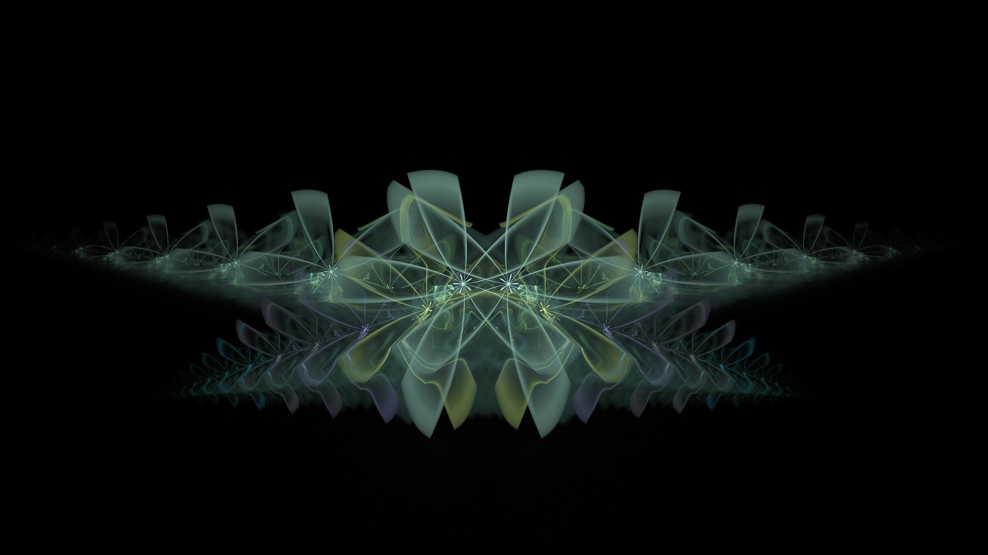
typografic composition---- enjoyRelated content


Comments: 28

")


a bit grainy, up the quality of the jpg and it'll be sweet.
👍: 0 ⏩: 0


~ oddly soothing to me - short of great but very good!
👍: 0 ⏩: 0


great work. love the 3d and the shadow it casts. nice use of colour and shape too. love it
 (Smile)")
👍: 0 ⏩: 0

I like this, nice and simplistic, good colour choice too.
👍: 0 ⏩: 0
")

Nicknick, this is an insubstantial, vague, and lousy comment. You should try to be more pithy.
👍: 0 ⏩: 1

and you should try to spell my name right before tryin to get at me ")
👍: 0 ⏩: 0


i really like the look of this piece. some nice colors and shapes.
👍: 0 ⏩: 0


")

totaly agree, nice piece but very sloppy quality
👍: 0 ⏩: 0

Aha, looks who's there!  (Wink)")
Where's the typography in this typographic submission?
")
👍: 0 ⏩: 0

Very nice work, the only thing I don't like is the red color, it doesn't fit with the rest.
👍: 0 ⏩: 0

good to see a new submission .. this is a nice piece .. good perspective
👍: 0 ⏩: 0

the image being cluttered on the other half seems to bring some balance to the other side. great composition.
👍: 0 ⏩: 0

innnnteresting..
..im surprised that this feels balanced, even though there's so mcuh going on at the bottom..but nicely done, i dig it.
👍: 0 ⏩: 0
