HOME | DD
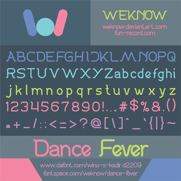
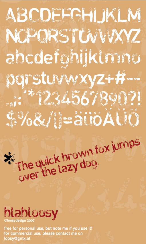
 weknow — abc font
by-nc-nd
weknow — abc font
by-nc-nd
Published: 2012-04-20 07:50:17 +0000 UTC; Views: 2232; Favourites: 26; Downloads: 333
Redirect to original
Description
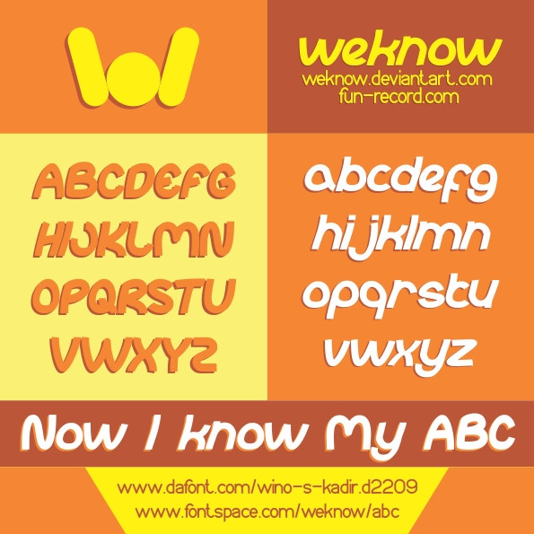
donate me to raise my creativityweknow Font \o/ font
funrecord
Related content


Comments: 15

Oh and Z is also too upright and the curves are too smooth. Rather go for a sharper angle like the lowercase z. M and W could be a bit more narrow, and it might be smart to add an ij digraph for Dutch users, otherwise you will have this big gap in between i and j.
👍: 0 ⏩: 1

thank you again ill fix later
👍: 0 ⏩: 0
Pretty nice looking font. S and s are too upright though.
Why did you choose such a generic name for your typeface? Actually, I just noticed on dafont that all your typefaces have generic names. A bit weird.
👍: 0 ⏩: 1
generic name, for easy using purpose of this font, yes, all my font still under development, i work alone, im always back to check the font, and updating with some new fix, thank you for your comment
👍: 0 ⏩: 1
What do you mean easy purpose? I can't imagine your fonts are easy to find or easy to market as you use 2 words or even a short sentence.
👍: 0 ⏩: 1
i mean kind like this, my abc font named abc, if u can remember song abcdefg for kid, so this font close to theme kid, like cartoon comic, children book, so the font easy to use as the purpose, ......maybe my english is not really good, because its not my main language... i hope you understand
👍: 0 ⏩: 1
Yeah I understand your point, but to be quite honest I don't think this looks like a font for children. Comic book maybe, yes. Other than that though, 'abc' makes me think of school and education and not of a kid's theme. Anyway, whether the name brings the correct associations or not, 'abc' is just not a unique name so people will have a harder time finding it. Type in 'Garamond' in Google and you know what you will get. Type in 'abc' and I won't find your font. If you called it something more unique like 'Enfanterie' ('enfant' is French for 'child') people will find your font easily.
Anyway, I'm not here to tell you how to name your fonts or market them. I just wanted to let you know your market strategy could be improved if you wish.
👍: 0 ⏩: 1
amazing, you really helpful, thank you for your advice, someday i choose name like what you suggest
👍: 0 ⏩: 1


 (Smile)")
")
