HOME | DD
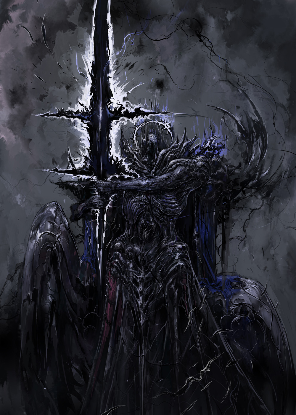
 Wen-M — Anima: Beyond good and Evil

Published: 2009-03-16 05:47:04 +0000 UTC; Views: 104541; Favourites: 2799; Downloads: 5508
Redirect to original
Description
This is actually a pretty old pic...I think from the summer of 2007.lets see, composition is bad, background color/darkness is bad against the characters....sigh.
I am worse in character composition than I am in perspectives @__@
just gotta start practicing more i guess...
Related content


Comments: 215

also the way the front characters eyes are uneven. the cloud effect runs over the tip of his hair which looks kinda weird :/
👍: 0 ⏩: 0

Im terrible at perspective too!
I don't think the composition is bad, I think it's more of something that needs to be worked out with photoshop filters that need some contrast.
👍: 0 ⏩: 0

Looks pretty damn good to me, The-True-Faceless says it is too.
👍: 0 ⏩: 0


well, your better than 8/10ths of the dA community, so please don't be to hard on yourself.
👍: 0 ⏩: 0

Well...I'd like to be this "bad" at drawing too..
👍: 0 ⏩: 0

Hey, that's really good though! Most people on this site would love to be half as skilled as you.
👍: 0 ⏩: 0

I wish my "good" was a smidge as awesome as your "bad," Wenny -_-
👍: 0 ⏩: 0

I don't think it's bad at all! I really like it!
👍: 0 ⏩: 0


Awesome!
The hair, the armor... and the post format of the pic! Real cool <3
👍: 0 ⏩: 0


Well, I know you may have a little of your own quirks with it but I personally really want what the guy in white is wearing!
")
👍: 0 ⏩: 0

Na, I reckon that background really fits with the characters. No point having a pink background for scary looking fellows, right? ;D
This is totally amazing, I can tell it's a bit older but that doesn't make it any less jaw-dropping <3
👍: 0 ⏩: 0

is it just me seeing this or are the friken feathers changing colors? look from one feather to another and the illusion of color change is amazing
👍: 0 ⏩: 0

i dont think the background looks back with the characters, think it gives it a kinda ominous feel to the whole picture
👍: 0 ⏩: 0

Start by blocking things out with generic shapes, refine the composition first, then make the characters, and make if 25-50% bigger than you think you need, then crop it down to find the best composition.
Wen, the only bad part of this is the mostly-centered composition and the smudgy BG.
You pointed them out, you know, and knowing is the half the battle.
Only other thing I would do is be careful with ghosty people... the edge of the cross looks like ghost wang.
👍: 0 ⏩: 0

The drawing is amazing to say the least; maybe if you place the central figure in white on the left side of the image in a similar position as the figure on the right it would help to centralize the image overall. It would also help if the translucent figure had a more dynamic pose but nothing overdone. As for the girl on the cross she is definitely hot, fleshing out her overall details and making her image a tad bit bigger would fill space and make the piece alot stronger as a whole. Otherwise than that, you have a tremendous talent and its always a pleasure looking at your work.
👍: 0 ⏩: 0

Feathers and wings are always the best part of your art. Such detail!!
👍: 0 ⏩: 0

the only one that doesnt seem to work is the see tho guy the rest is really good!
👍: 0 ⏩: 0

Well, I suppose there are possible ways to improve things but it is still really good. The guy with the sword is amazing but the guy in the middle stands out because he isn't wearing dark clothes or fading into the background. The lady in the background who's being crucified is also really neat. Maybe if the image was larger and they were spread out a bit more it wouldn't look quite so crowded.
Sorry if this sounds really upity or snobbish. I can't draw or anything and really admire your work. This is still really good too!!!
I also know nothing about art so sorry if my attempt at constructive criticism fails epically. probably does......
👍: 0 ⏩: 0


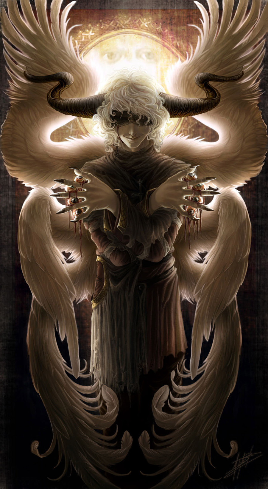
You know, the third figure from the top reminds me of .hack
...
*shot*
👍: 0 ⏩: 0


wen you inspire me..with the beauty you create...
seriously
👍: 0 ⏩: 0


This is great! Looks just like a video game cover! I would so take home the guy in the middle, Meow!
👍: 0 ⏩: 0


I can tell that it's old.
Goodish imo... and, definitely old.
👍: 0 ⏩: 0

Stop with the bad artist comments ")
 (Wink)")
It's as if like a story was told in a single picture. I would write one
👍: 0 ⏩: 0

I think the two characters on the front are pretty well placed, but the left part of the picture seems like it's to empty..
maybe if the "ghost" guy was closer.. or if there was another character there.
the characters are awesome, by the way
👍: 0 ⏩: 0

i can see everything you say actually. you're right O.o but to tell you the truth that's as you said: old. you're so better now, i can't point those same mistakes anymore like i do here. however, i really (and not surprisingly) love the front character and the one right behind him (so basically: the white and black guys)
i'm very much interested in knowing their names and if there's another artwork of them since that costume is amazing. it'll go for the list, but i'll do it one day if i have better reference. 'cause they're plainly asking to
 (Smile)")
👍: 0 ⏩: 1
oh. btw. for the compo problem the ghostly guy should go down. that'd solve the majority of it, but honestly, you must know that already so i'm sorry :\
👍: 0 ⏩: 0

The thing that definitely caught my attention were the green gloves up front. Just seemed to contrast a lot from the rest of the picture. This looks like it was a hard piece to do, but you did great! Don't be too hard on yourself!
👍: 0 ⏩: 0

Artist are their own worst critics. I wish I could draw like you do.
👍: 0 ⏩: 0

lol
you're too hard on yourself....
it looks awesome ^_^
👍: 0 ⏩: 0

Hey, at least there IS a background XD
Whatever, I've hounded you enough on your lack of backgrounds, it's nice to see something from the vaults ^_^
👍: 0 ⏩: 0


Dude? Poor?...
This is awesome! The character perspective is a bit off... No one is perfect... But you're definitely closer to perfection than me!
I just uploaded the best colored picture I've ever done, and it hardly compares to this!.
👍: 0 ⏩: 0


Something looks a little off, but I can't put my finger on it >_<
👍: 0 ⏩: 0

OMGWTFLMAOLMAOGAWDBBQ !!
I LOVE YOU SOOO MUCH~
You're always doing such a wonderful job!
Kudos to you!
👍: 0 ⏩: 0

dont say that its amazing!!!!!
👍: 0 ⏩: 0

in terms of character composition, pretty much centered is bad. though if being somewhat centralized is your goal in the piece then place the character slightly off center, by simply putting it off center you cause you general senses to jar a bit which will cause someone to break themselves from looking dead center down a piece. this is one of many composition elements to keep in mind
👍: 0 ⏩: 0

Well, if you're looking to improve composition...
...I suggest flipping the black-white-eyed character on the right side so his staff is pointing in towards the top of the picture, which will help draw attention to the title
And adjusting the purple transparent guy so he takes up more on the right side, which looks rather empty.
...
I'm not being obnoxious, am I?
👍: 0 ⏩: 0

OMG !!!! I love you!!!!! you are God indeed!!!
👍: 0 ⏩: 0
| Next =>