HOME | DD
 Wen-M — Anima: Beyond good and Evil

Published: 2009-03-16 05:47:04 +0000 UTC; Views: 104538; Favourites: 2799; Downloads: 5508
Redirect to original
Description
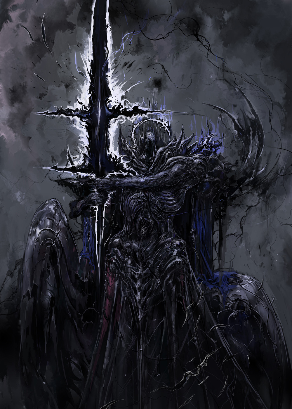
This is actually a pretty old pic...I think from the summer of 2007.lets see, composition is bad, background color/darkness is bad against the characters....sigh.
I am worse in character composition than I am in perspectives @__@
just gotta start practicing more i guess...
Related content


Comments: 215

Wow, three this time! We are sure spoiled. (:
While I only agree with the background complaint of yours, I will say that I would rather have this background than none at all.
I'm in love with that character to the right of the one in front. rawr.
👍: 0 ⏩: 0

This is epic. o-o I love it when you do stuff like this.
👍: 0 ⏩: 0

other than being a little heavy on the right side, it looks fine to me.
👍: 0 ⏩: 0


Hah! It's Anima Beyond Good and Evil!
Just epic, as always!
👍: 0 ⏩: 0
this looks awesome regardless of whatever errors or discrepancies that i cant even see that you mention. 
")

👍: 0 ⏩: 0


Actuallly I think the chaotic composition and the background that is a little too dark gives some qualities to the characters that an organized composition wouldn't. I like it!
👍: 0 ⏩: 0


Такое впечатление, что намутили чего-то, а чего непонятно.... (простите, что на французском ^^ )
👍: 0 ⏩: 0

This is incredible...I love the Trinity idea of it...Your characters are so intense  (Smile)")
👍: 0 ⏩: 0

I can see how it pales in comparison to your more recent work but it's still pretty good. I like the figure all the way in the back and the colors.
👍: 0 ⏩: 0


I like the detail, but every face has the same expression. Kinda throws it off for me.
👍: 0 ⏩: 0

why are you uploading a lot of really really old files? just wondering
👍: 0 ⏩: 1

")
haha so we can compare your old work to the more recent ones? and then be like "wow...he was really awful compare to his new stuff now....I'm almost embarassed for him, except he was still pretty good then...I think I'm depressed now...I'm gonna curl up into a ball and cry myself to sleep cuz he's just that good...now."
haha
👍: 0 ⏩: 0


omg dude what are you talking about?! this is awesome!
maybe the colors don't look right to you or they dont contrast enough or too much but i like it
👍: 0 ⏩: 0

lol mark of a true artist lol
u always think ur work could be better XD
but ur work looks great man
👍: 0 ⏩: 0


Bad??? @_@
I don't know if it's bad. But I think your work is great 
And I really like the magical purple wings you did it.
👍: 0 ⏩: 0


first thought I had was "now, how could I make feathers that glow like that, using LEDs and some fiberoptic plastics...?"
No but seriously, I wish I would even put that much work into my backgrounds so shut up
recognized your work in one of the books recently, made me giggle
")
👍: 0 ⏩: 0

BAH! Your character composition is waaaay better than mine, and way better than many people's. I love the colors you used in this, although the background would be somewhat improved if you contrasted it better (you are right about this).
Keep doin' your thing, Wen!
👍: 0 ⏩: 0


LOL I saw this and was immediately reminded of Squall and Cloud.
Anyway, nice work as usual! Your coloring is always so fantastic. "Squall" looks a little off for some reason, but other than that everything looks good!
👍: 0 ⏩: 0

This is a really good picture, except I feel like their all staring at me really wierdly.
This is just personal preference but I'd make the character on the bottom face downwards slightly while looking up.
👍: 0 ⏩: 0

its great. are u mixed 3d in ur artwork??? or this is really full painted? i'm just curios...
👍: 0 ⏩: 0


I disagree. I mean, yea, I guess the composition could be improved, but it's still a great picture. While it's good to be critical of one's self, you need to give yourself credit where credit is due. The poses are dynamic, there is a clear increase in the characters, showing depth, the detail is amazing, as it normally is in the work I've seen, so yea, I guess we all have areas we need to improve on, but it is still an amazing piece, overall.
So yea, pretty much what everyone else has said, haha.
👍: 0 ⏩: 0

I dont think your perspective is off, but i agree, especially the left side of the composition seems weak
👍: 0 ⏩: 0

The idea and details are awesome *_*
👍: 0 ⏩: 0


is not so bad as you say... you did an incredible progress if you compare.
👍: 0 ⏩: 0

That looks better than anything I could do xD Just wondering but what do you use to draw and color your art? It looks so cool xD
👍: 0 ⏩: 0

Well, I agree with you in that the composition needs work, and I would love to be able to see the guy in the very back better, but all in all this is amazing work.
What a surprise.
Don't complain about your talents. You're not perfect, but you're still pretty freaking amazing.
👍: 0 ⏩: 0

Besides feeling like smacking you for what you consider to be junk (makes the rest of us just want to through away out tablets and die), let see if I can summon up what I would change.
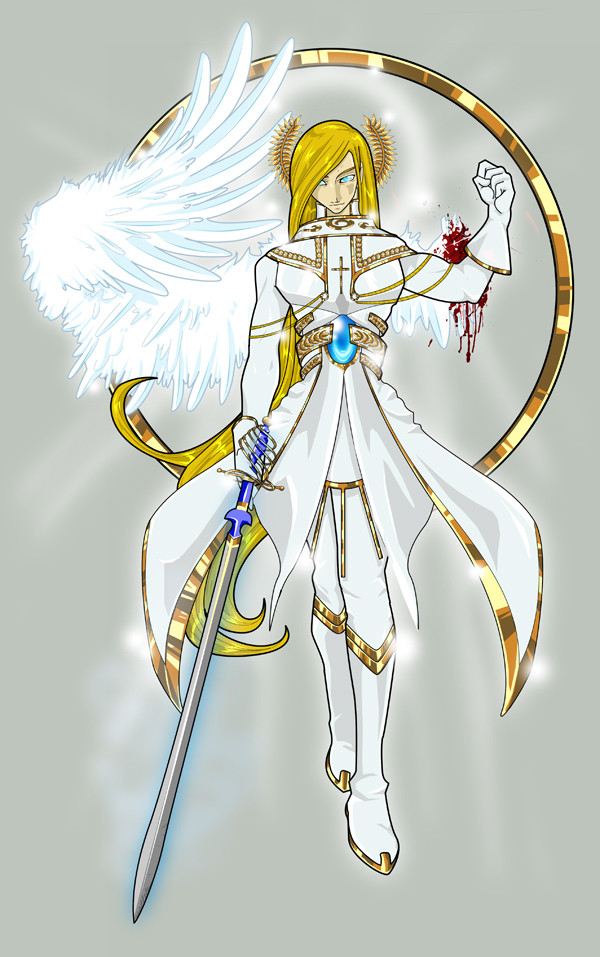
The characters are definitely too cramped together, although this is a commercial “all in one pic”. The crucified one deserved to be better seen, the transparent one is in a not so good pose and in a very uncomfortable spot (with that thing coming between his legs lol) and the light colour of the hair of the one on the right, smack in the middle of the pic, stills the attention and kind of spoils what could be a great spiral.
Pheeh… me, criticising Wen_M. That really made my year !! rolf
 (Wink)")
👍: 0 ⏩: 1


well despite your defeatist comments i think its actually really good.
it kinda looks like the front Ad for an anime movie.
i love all of your works
👍: 0 ⏩: 0

Hmmm... Excuse me but i wonder.... Is it you that draw the cover of the "Dominus Exxet" book for anima rpg ? [link]
👍: 0 ⏩: 1

Hey, it's cool.
But looking at the ghostly boy it's painful in some way... that chain betwen his legs looks like a VERY painful piercing XDDD
👍: 0 ⏩: 0

i absolutely LOVE the front guy. his hair is like.. amazing. not to mention the outfit is great! awesome job!
👍: 0 ⏩: 0
<= Prev | | Next =>