HOME | DD
 Wen-M — Anima: Beyond good and Evil

Published: 2009-03-16 05:47:04 +0000 UTC; Views: 104538; Favourites: 2799; Downloads: 5508
Redirect to original
Description
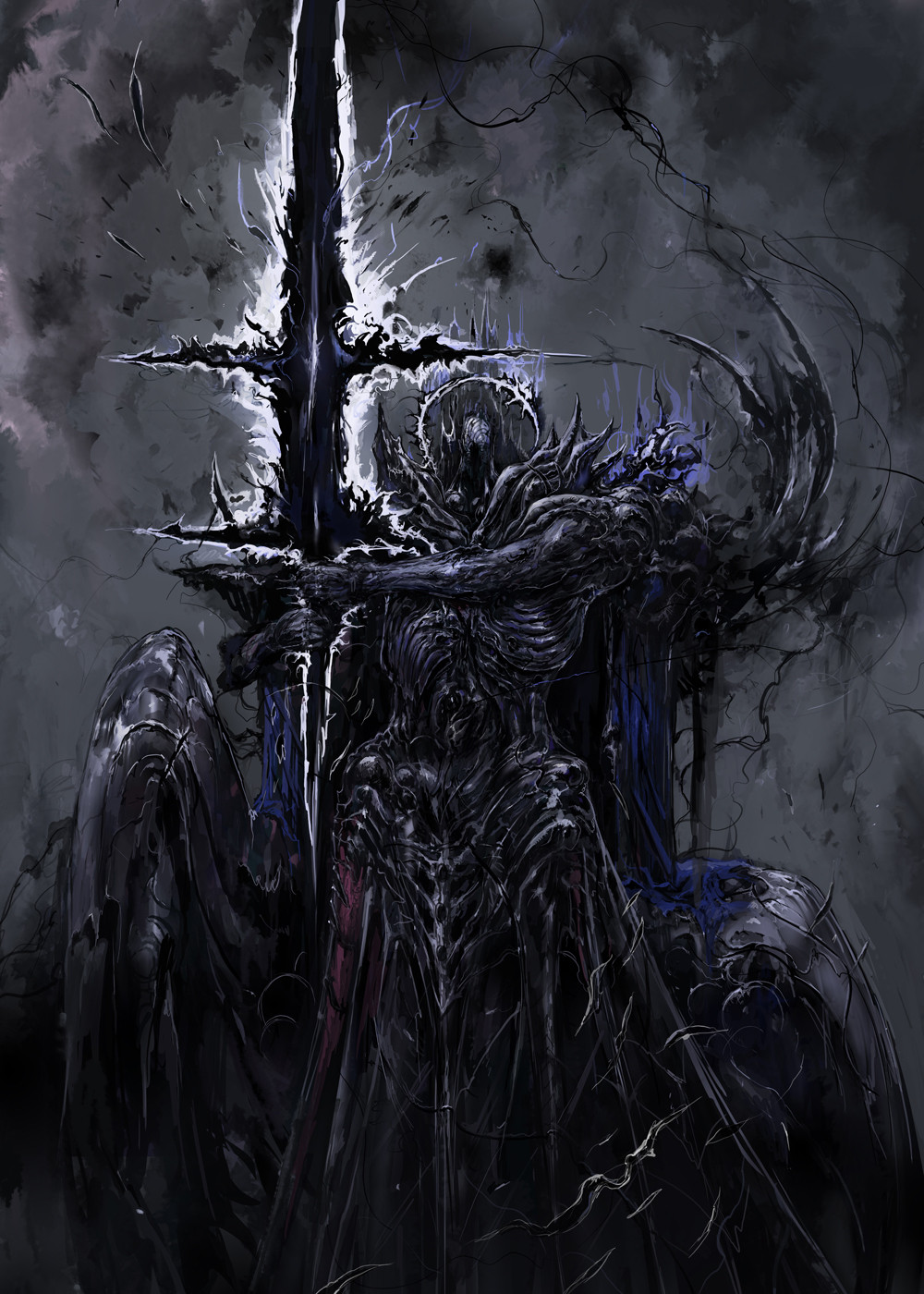
This is actually a pretty old pic...I think from the summer of 2007.lets see, composition is bad, background color/darkness is bad against the characters....sigh.
I am worse in character composition than I am in perspectives @__@
just gotta start practicing more i guess...
Related content


Comments: 215

oooh the people look really cool though, and the hair came out really well :]]
👍: 0 ⏩: 0


I love all of your work, but this is without a doubt my favourite. Even if I agree with you about the background and composition, I think it's great, and I would be reeeeeally disappointed if I won't see the same one but altered (>_<
 (Wink)")
👍: 0 ⏩: 0


Even if it is bad it is still good by a lot of standards, but that is to be expected from such a talented artist. Eager to see these characters posted individually for a clear look at them, especially Nero, unless I totally missed them in your gallery
👍: 0 ⏩: 0

the one in the very back is so epic ")
👍: 0 ⏩: 0

What are you complaining about Aniki? You dont do multiple characters together often - rejoice!
👍: 0 ⏩: 1


But the two characters in the center deserve their own art piece...
👍: 0 ⏩: 0

You are so amazing please tell me you get to do your art in real life and art stuck in a cubical. This is just so good.
👍: 0 ⏩: 1

Cubicles are actually going extinct, like payphones.
👍: 0 ⏩: 1
Weee but I know someone who still works in one.
👍: 0 ⏩: 0


My only problem with this (or your style in general) is the way you do hair. I mean the styles are neat, it's just that the hair looks less like hair and more like yarn or string. A nice shine would fix that instantly methinks.
And don't beat yourself up. You're one of the top-top dA artists; you should be living in perpetual glory and gloating about it. 
")
👍: 0 ⏩: 0

You might think this one sucks,but it's worth all my works! x3
By the way,are you gonna post these characters individually someday?
👍: 0 ⏩: 0

Love the detail, love the characters, not fond of the compositions though at all :S
You have such detailed work, that when you see so many things together, most of it is lost on such a vague background.
I didn't notice the character in the back on the cross until my 3rd look c.c
I still love ya though.
👍: 0 ⏩: 0

i don't know what are you saying the picture is awesome and the subjects are greater than simple monsters i think you must draw more cool char like these
👍: 0 ⏩: 0

Great drawing. The guy in the sword to the right looks awesome, it would be great to see him featured in a drawing.
👍: 0 ⏩: 0

dude..enough with the negative comments on your own work. It's freakin awesome.
👍: 0 ⏩: 0

its very good :]
I think the thing that bothers me most is that the girl in the background seems almost overshadowed by everyone else, especially the transparent character. The transparent man makes it a bit hard to tell where certain things are coming from [the feathers and wings].
Otherwise, I like the piece very much :] The two foreground characters are done very well.
👍: 0 ⏩: 0

I'm a little thrown by the transparent guy with the tentacle/feathers(?) growing out of his crotchal-region...
but the rest is pretty cool
👍: 0 ⏩: 0

this is sexy... I really like this. the transparent thing is pretty.... not awesome, when compared to the awesomeness of the rest of the picture. it/he/she seems out of place lol
👍: 0 ⏩: 0

okle wanna tell me a little more about the picture? Why is my presciousn Deadmoon nailed at the cross?
and who is this semi transparaent, flying guy?
👍: 0 ⏩: 0

just the left sides a tad empty.
all and all very good, i mean your arts always breath takeing so thats never going to change. but its cool to know you -like my self- are still learning and thats the fun part about art i think.
👍: 0 ⏩: 0

Just keep going, this looks promising!
Although... you might want to change that one chain... it looks like it's hanging from his groin
👍: 0 ⏩: 0

oh gosh but this is still hot. I love the transluscent person/wings & the multicolored glowing feathers. ;U;
👍: 0 ⏩: 0

You should do master studies of people with better composition skills than you do. That should fix whatever you feel is lack in your composition skillz!
👍: 0 ⏩: 1

i have too much pride so i will be looking into books...
👍: 0 ⏩: 2
Books! Pah!
"I hear and I forget. I see and I remember. I do and I understand."
Do some master studies...
...gogogogogogogogogogo! XD
👍: 0 ⏩: 0

*snort* The composition looks fine, considering this is a commercial effort instead of a personal one. *pats* Besides, the two foreground characters were done separately at first, right?
👍: 0 ⏩: 0

-slaps- You can do MUCH better Wen D:
I love the violet thingies floating there tho ;]
Look it this way, you're way better now and this proves you're human and you actually sucked a little more at some point of your life.
It's...some kind of relief for us people that are still in their first steps.
We never will stop growing as an artists, right? :3
👍: 0 ⏩: 0
I'm so glad you finally put this up! The color composition is a little too dark for me, but otherwise it looks fantastic!
👍: 0 ⏩: 0

The the @#$% are you talking about?! Why do you think your art isn't good enough? Seriously though, your lack of confidence in yourself is almost annoying. Your one of the, if not thee best fantasy artist, I've ever seen. And I'm sure most of your watchers would probably agree. You shouldn't be getting down on your ability to create fantastic art. I wish I could draw half as good as you.
👍: 0 ⏩: 0

Well you make up for the composition and perspective short coming with great design and imagination. Great work once again.
For those who haven't seen his journal about his coloring tutorials: [link]
👍: 0 ⏩: 0

We are are own worse ciritcs. Old as the picture may be I still think it looks fantastic
👍: 0 ⏩: 0

Haha you say it's bad, but I really like this collage work! It's like a movie poster x3
👍: 0 ⏩: 0


I like the concept, but I think you're right, the composition is kind of wanky. If it were me, I'd take out the two 'side' characters and put more emphasis on the crucified chick and the white guy beneath her- get rid of the others, they clutter it up. Enlarge the girl in the back a bit, get a new background, and it would be much cleaner, more dramatic. If it were me, and I had time. Still love your character composition, though, and some of the ideas you have going on here.
👍: 0 ⏩: 0

I love the green gloves. :3 They're epic. <333 (as is the whole picture xD )
👍: 0 ⏩: 0

The man in the center looks somewhat like a younger version of another of your characters. Chrono-something.
👍: 0 ⏩: 0

EH?!
What're you taking about, it looks perfectly fine.
D:
👍: 0 ⏩: 0

cool as
and i had criss angel theme song going in the background
which added to the awesome, lol
👍: 0 ⏩: 0

Will u make pic of each char...it would be awesome to see that girl in details....
👍: 0 ⏩: 0

Little constructive compositional thoughts:
The comp isn't THAT bad. It's kinda standard for presentation of multiple people without having said figures interacting. The way you could have maybe solved the issue is having the last character up to the upper left smaller. There's a really beautiful curve going on with the gestures of the first two from the bottom and the positioning.
Other than that? Awesome work as always. I love seeing your stuff. Your attention to detail always really impresses me, and you have really solid colors!
*relurks*
👍: 0 ⏩: 0

this is way beyond what i can do, like cosmically beyond
")
👍: 0 ⏩: 0

... Ok I like the characters, execpt the ghostly one, but yeah the backgroud throws a little wrench in it. Seperately the characters are Awesome! but in this perspective I see it's "off". Just remember this was 2 years ago and you have come a long way, not to mention those are just little things so don't dwell to long. AWESOME Characters!
👍: 0 ⏩: 0

O_O Another amazing work by one of my favourite artists it seems. *still in awe*
👍: 0 ⏩: 0
<= Prev | | Next =>