HOME | DD
 whatshername13 — Human-made concepts
Published: 2012-05-22 20:42:52 +0000 UTC; Views: 590; Favourites: 12; Downloads: 11
Redirect to original
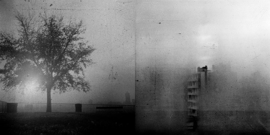
Description
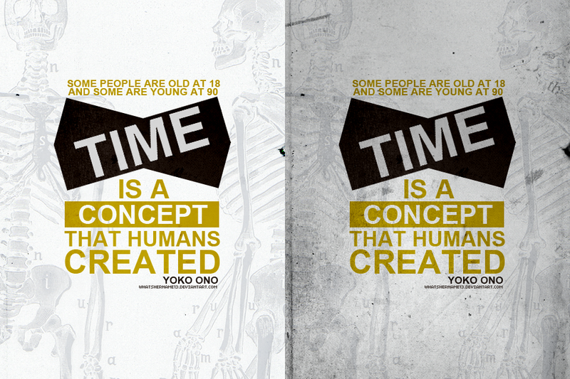
i ' mi n d e c i s i v e
thanks for viewing.
credit | credit
Related content


Comments: 14


LOVE
I prefer the right one because it got a nice texture and it will look even better if you make "Time" brighter.
Both of them are great though.
Well done

👍: 0 ⏩: 0


 (Smile)")


nice. left works better. right's too dull.
well add a bit more brightness to it
and it should be better, i guess.
👍: 0 ⏩: 1


yeahh but i feel like one's too bright and the other's too dull ):
👍: 0 ⏩: 0

great! i personally prefer the left one...
👍: 0 ⏩: 1