HOME | DD
 whatwouldjoshdo — Doctor Who Annual Pg 01 color
Published: 2011-08-30 20:25:36 +0000 UTC; Views: 2030; Favourites: 35; Downloads: 0
Redirect to original
Description
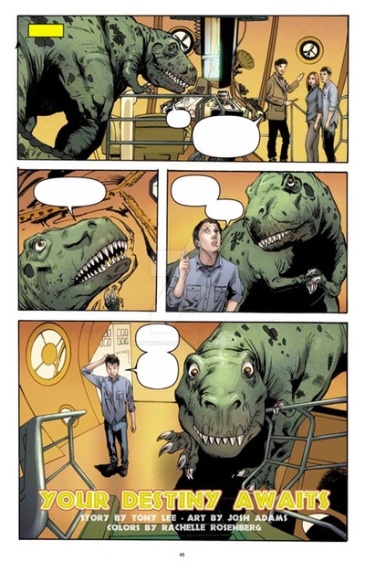
Here are the colors to the first page of the Doctor Who Annual I did for IDW. Rachelle Rosenberg did the colors for all my work on Doctor Who and I have to say, I was extremely happy with how vibrant this page turned out. It really has the charm that the TARDIS should have. In my initial layouts I indicated where I best thought the word balloons should go, I have to check and see if they were used.Related content


Comments: 4


That's a good-looking page, but whoever positioned that balloon in panel 3 wants their letterers' license revoking -- not one, not two, but FOUR tangents?!
(Yes, I know no one will notice that except me.)
👍: 0 ⏩: 1

I know exactly what you're talking about. I was surprised to see that. My first experience working in the comics industry was proof reading for Marvel and I'd spend all day scrutinizing word balloons, script-to-page inaccuracies, and general spelling & grammar so these kinds of things stick out like a sore thumb to me.
👍: 0 ⏩: 1
What baffles me is that it's so unnecessary: just bump the balloons up a little and crop to the top border if the space is tight. I think I'd have had the two balloons in panel 1 at the top, now that I've taken another look at it.
Having said that, hindsight is a wonderful thing. There have been plenty of examples in my own lettering where I've looked at a page after the fact and said: "What the *hell* was I thinking?" …
👍: 0 ⏩: 0