HOME | DD
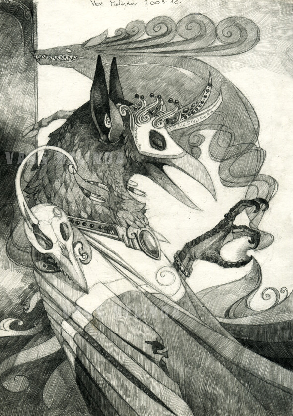
 WhiteRaven90 — Crown of Crows
Published: 2008-10-24 10:34:18 +0000 UTC; Views: 9282; Favourites: 371; Downloads: 223
Redirect to original
Description
Random dude.I think i was influenced by the music of Corvus Corax and In Extremo... Not just a little. Much.
Related content


Comments: 33


The pencil shading really astounds me! So neat and precised but yet so detailed with the accessories!
👍: 0 ⏩: 0


Beautiful pencil values. Tremendously creative. Thanks for showig & sharing it.
👍: 0 ⏩: 0

I suspect they all look like this; we just haven't the knack of seeing them properly.
Beautiful image!
👍: 0 ⏩: 0

love love love love.... makes me want to draw my little crow character in that realistic way (which ive been meaning to do forever, i just can't decide how, all my sketches have been crappy)
👍: 0 ⏩: 0


Wow, this is soooo beautiful... in a creepy sort of way but I love your pencil work XD
👍: 0 ⏩: 0

Oooh I do love the crosshatching, the foot and the skull on the shoulder!
Yuusss! Corvus Corax is totally awesome, but so is Tanzwut
I can totally imagine this going along with their music!
👍: 0 ⏩: 1

Thanks ^^
Too bad that i won't do much crosshatching in the near future, i just started having fun with an art pen and ink.
(good to meet other Corvus Corax fans btw ")
👍: 0 ⏩: 0


This is so beautiful... You are very good at drawing! Great attention to detail and anatomy.
👍: 0 ⏩: 0

i think your opinion of this composition failing is a better example of fail than the comp itself.
gorgeous work.
👍: 0 ⏩: 1
")
But... thanks.

👍: 0 ⏩: 1
true.. opinions aren't fair to judge.
")
👍: 0 ⏩: 0

I wouldn't say the composition is an epic fail, in fact I like it really much
👍: 0 ⏩: 1
Thanks
👍: 0 ⏩: 0

Nekem tetszik, szerintem jó lett, és továbbra is tetszenek a részletek a rajzaidon  (Smile)")
👍: 0 ⏩: 0

I don't see anything particularly wrong with the composition...
Oh man. LUUURRRVE Corvus Corvax (also In Extremo, but to a lesser extent). So sexy - I can definitely see how they could have spawned such imagery
👍: 0 ⏩: 1
Aaaaaah a Corvus Corax fan!
Then i can tell you that i listened In Taberna and Tanzwut and these songs threw the inspiration to my head. D:
Thanks for the comment
👍: 0 ⏩: 1
Ooh, nice :3 My favourite is the Mille Anni Passi Sunt album (esp. Avanti), but I also mean to get a hold of Dulcissima
👍: 0 ⏩: 0

Nice detail, although it seems really crowded around the crows head and shoulders. The simplicity of the robe and background helps though.
👍: 0 ⏩: 0


damn, you did it again :l
There are so many details that worth starring at*drunk english* ;A;
Btw notning bad with the composion for me O.o
👍: 0 ⏩: 1
Well thanks >.>
I would crop 2 cm off from the left side because the hand of the crow is too much on the right side. And the deer's nose is on the left dark line, it doesn't look so pro.
👍: 0 ⏩: 1
Nah pro or not, for me you are pro, so ...>3>
👍: 0 ⏩: 0

ez akármit mondasz egy nagyon jó ké.ped nagyon tetszik a koncepció és az ötlet!
Mint holló a fülek nálam griffessé teszik (nem kedvelem a füles madár ábrázolást annyira) de hát kinek a pap kinek a papné
szeretem a madarakat és ennek az ötlete és tervezése nagyon jó!
")
👍: 0 ⏩: 1
Kössz
👍: 0 ⏩: 1
Szerintem a kompozició nem lett rossz, pont abban én nem érzékelek hibát, de ugye izlések és pofonok, szerintem nagyon jó ké.p lett
👍: 0 ⏩: 0

 (Wink)")