HOME | DD
 WickedIllusionArt — Engineering Prodigy

#marvel #mcu #rdj #robertdowneyjr #graphite #pencildrawing #realisticdrawing #theavengers #tonystark #traditionalart #traditionaldrawing #mcufanart #mcuultimateuniverse
Published: 2010-07-28 02:50:04 +0000 UTC; Views: 17896; Favourites: 818; Downloads: 0
Redirect to original
Description
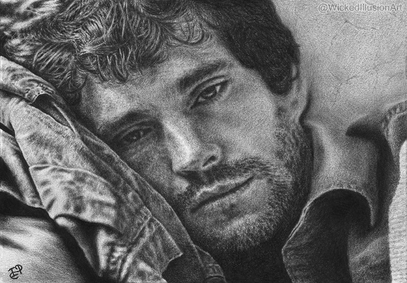
Robert Downey Jr. as Tony Stark/Iron Man from the MCU.
Follow me on IG! I'm more active there and also post WIPs and other content!
A4 Canson fine grain paper ( 160g/m2), 2B mechanical pencil, H, 2H, 2B, 4B, 6B regular pencils, q-tip for a bit of blending here and there, kneaded eraser, ref picture
Related content


Comments: 210


 (Smile)")

Odlicno je, svidja mi se jako. Kao i ona nova s Johnnyjem u dijelovima, favala sam obje.
Sjećam se da sam te jednom pitala zašto slike nisu veće, i odgovorila si (kao sto sam i pretpostavljala) da je to zbog krađe slika....
I sad opet jedna slika kod koje bi jako rado vidjela detalje sjenčanja... Pa sam se sjetila da ti predlozim, da mozes slike uoploadat ovako male, a mozda odabrat par detalja na slici (npr u ovom slučaju oči, sjenčanje lica i dijelova oklopa - to bi jako rado vidjela) i da samo te dijelove crteža staviš u skoro normalnoj veličini, da možemo vidjet te detalje?
Samo jedan dobronamjerni prijedlog, a ti napravi kako želiš i nastavi s ovakvim radovima i dalje, odlični su.
👍: 0 ⏩: 2

P.S. Nekako je "mutnjikav" Nemam pojma zašto. To je do dA, ne do skeniranog crteža.
👍: 0 ⏩: 0
Hvala
Moji crteži su više manje svi manji od A4 tako da stvarno ne propuštate puno što se tiče detalja. Da ima što vrijedno od detalja za vidjet stavila bi ja te close-up slike.
Evo privremeno sam ti stavila ovaj crtež na 900px tako da ga možeš vidjet čak i malo većeg nego šta je u stvarnosti.
Sumnjam da ću uskoro počet stavljat te close-upove tako kad god te neki crtež posebno zanima samo reci pa ću ti ga ja privremeno povećat da vidiš i kasnije ga opet vratit na staru veličinu.

👍: 0 ⏩: 1
yay. Hvala puno.
Sad cu ga detaljno proucit, pa ga mozes vratit na onu veličinu kad hoces.
👍: 0 ⏩: 1
Baš mi se jako sviđa kako si sjenčala lice, kako nije sve zblendano, glatko ravnomjerno, to mi je baš super.
Ja sam vec duze vrijeme zanemarila crtanje, ali ako se kad tome vratim, nadam se da ću skupit malo višeš hrabrosti i uspjet i ja crtat sličnije tome i tamnije nego dosad.
Fora je ta "grubost" i baš paše na ovoj slici
👍: 0 ⏩: 0


This is awesome!! I just drew the same one, ha!
👍: 0 ⏩: 1
Thank you! I just saw it! It's fantastic and so...smooth compared to mine
👍: 0 ⏩: 1
Just different style is all?
👍: 0 ⏩: 1
What do you mean by that? I mean, what did you think I'd say?
👍: 0 ⏩: 1
that mine was smoother. I think you liked it better, but I humbly disagreed. yours is great!
👍: 0 ⏩: 0
Thanks! Some picture I googled.
👍: 0 ⏩: 1

really? i've been trying to look up a good one for myself to do ever since the second one ame out, but i haven't found one yet that really suits me. i really like the one you used as a reference, so do you mind if i use it? just give me the link here or if you want it to be private then just as a note. im sooo stoked on doing it, its just the problem of a reference that's bringing me down.
👍: 0 ⏩: 1
I can't find the exact photo I used (mine was larger if I remember right and not cropped to portrait, but this one should be good too [link]
👍: 0 ⏩: 1
thank you so much! this will do just fine. 

👍: 0 ⏩: 1

This piece is phenomenal. Even though it's not quite where you want it to be, it's still pretty awesome, sometimes the artist is their own worst critic.
👍: 0 ⏩: 1
Thank you very much!
👍: 0 ⏩: 0


oh my god! i cannot stop staring at this! i feel like hes going to jump out of my computer screen, it's so incredibly realistic
👍: 0 ⏩: 1
Hheheh Thank you very much! Yeah, he's a bit scary ;D
👍: 0 ⏩: 1
")


Yay! I’m very glad to announce you that your artwork has been chosen to be amongst the best deviations submitted to our in the month of June. You can check it out here: [link] & here: [link] . 


👍: 0 ⏩: 1


this looks amazing! very realistic and intense looking. great job!
👍: 0 ⏩: 1

He really looks in deep pensive mode, ready for serious action. ")
And of course, I'm admiring the sheer details you put into this.
👍: 0 ⏩: 1
Thank you very much!

👍: 0 ⏩: 0


AMAZING.. just amazing! I wouldn't worry with the extra stuff to "fix" on this one it looks great how it is
👍: 0 ⏩: 0

I love his expression too
Thanks!
👍: 0 ⏩: 0

| Next =>