HOME | DD
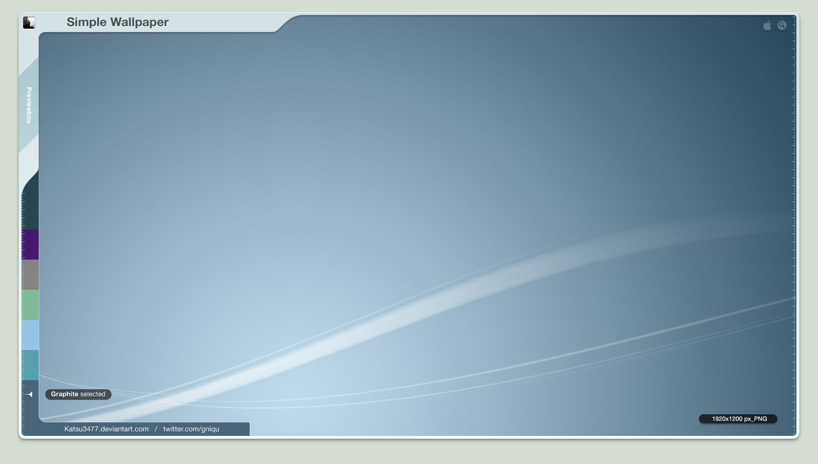
 WillyEpp — Simple Portfolio

Published: 2010-12-29 17:26:24 +0000 UTC; Views: 4703; Favourites: 21; Downloads: 133
Redirect to original
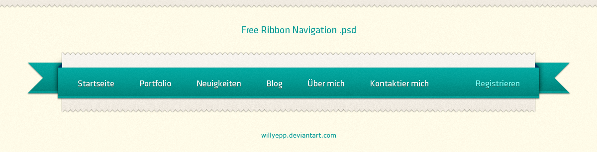
Description
Inspired byThe awesome interface i used for preview is "Clansnation Forumsdesign " by
Visit their gallery
 (Wink)")
Related content


Comments: 29


 (Smile)")

Irgendwie erinnertmich dasLogo an Mikes Logo
Ich finds ansich aber noch recht langweilig von den Farben her, dein Portfolio geht im Vergleich zur Preview einfach unter...
Kannst du besser...
👍: 0 ⏩: 1

Das mitm Logo hat er mir auch gesagt xD Ich hab einfach ne Standartform genommen, die ich in PS hatte und hab nicht dran gedacht^^ Ist eh nur Flächenfüller
Btw bei nem Portfolio sollen doch die eigenen Werke im Vordergrund stehen und nicht das Design an sich, oder irre ich mich da?
Dennoch danke
")

👍: 0 ⏩: 1
Dennoch sollte das Portfolio ja nicht langweilig aussehen, schlicht ja aber die farben dürfen ruhig etwas interessanter gestalltet sein
👍: 0 ⏩: 1
")

Primarily, I would like to bring to light that your artwork here is absolutely curious. The technique you have implemented is absolutely incredible. It is distinct to me that you put your soul into it with your faultless magnitude of powers. The background of this piece is greatly exact for the emotion that I think you are struggling to capture, but in hindsight this statement is likely unnecessary. However, I think that your use of colour could of been a lot better as I contemplate that it wasn't able to match the capability observable in the remainder of the piece. In conclusion I would like to reassure you that it has been a joy to invest energy in this criticism for you and I hope it will inspire you to up the level of your excellent piece.
👍: 0 ⏩: 1
wow.. thanks a lot for this great critique!
it's nice to hear that words and i try to keep it in my mind
👍: 0 ⏩: 1


Danke dir ")
👍: 0 ⏩: 0


haha mist wie biste nur dahinter gekommen??
ehm eine frage
was machste eigtl. mit den ganzen designs?
gammeln die in irgendeinem ordner rum oder verkaufst du sie irgendwann mal oder setzt du sie in html / css um?
👍: 0 ⏩: 1
Die gammeln rum, leider... hab keine Ahnung von HTML und Co und kaufen will sowas wohl auch niemand ^^
👍: 0 ⏩: 0

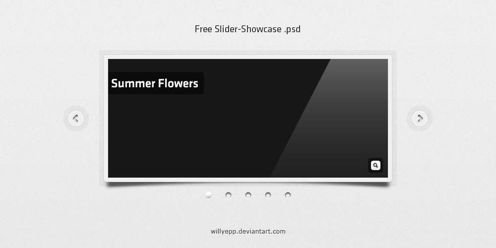
Nicht schlecht, Nicht schlecht ^^
Gefällt mir gut.
Hättest aber die Pfeil-Buttons außerhalb der Preview machen sollen.
Und bei der Search-Box würde ich mal einen #FFF-BG und Runde Ecken versuchen
👍: 0 ⏩: 1
Nä, ich mags nicht, wenn bei solchen Slideshows die Pfeile draußen sind^^
Die Search -Box hatte ich zuerst anders, war mir dann aber zu groß... und dein Farbcode is mir viel zu knallig blau
Aber danke für das Feedback
👍: 0 ⏩: 1
In PS is das natürlich FFFFFF
Das is die HTML-Kurzschreibweise...
👍: 0 ⏩: 1
Ich hab so viel Ahnung von HTML wie Maulwürfe vom Fliegen xD
Aber ich denke, dass weiß zu knallig wäre.. die Sufu sollte ja nich im Fokus stehen^^
👍: 0 ⏩: 1
jo, das kann sein, aber das grau ist mir zu dunkel... und der Schatten auch zu groß.
👍: 0 ⏩: 1
Habs jetzt geändert.. so besser?
👍: 0 ⏩: 0