HOME | DD
 wineass — iOS7 Icons v1.2
Published: 2013-06-10 21:10:22 +0000 UTC; Views: 42696; Favourites: 73; Downloads: 14262
Redirect to original
Description
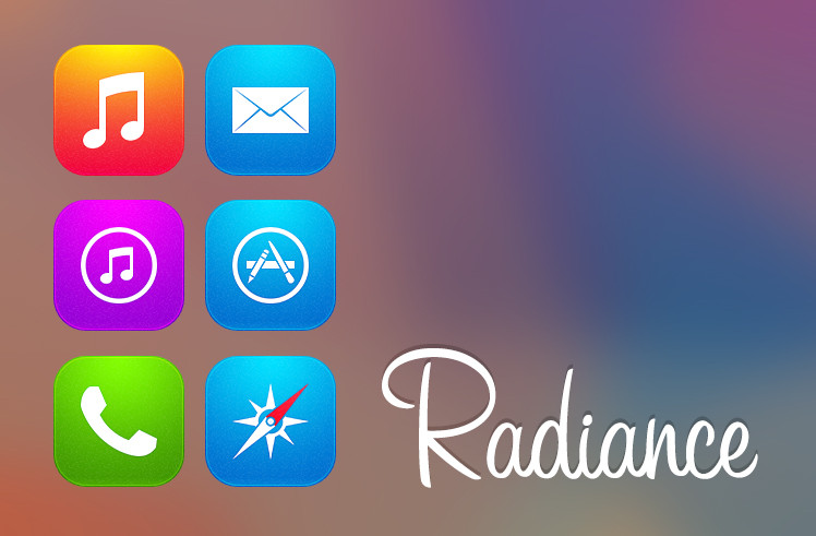
Tried to make copies and this is the outcomeUse it how you like, jus cred me
1.0:
Photos
Music
iTunes
Messages
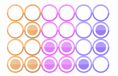
GameCenter
1.1 update:
Weather
Calender
Facetime
Calculator
1.2 update:
Compass
Appstore
Safari
Related content


Comments: 38


Helvetica Neue Thin, Thanks
")
👍: 0 ⏩: 1

How can I install them on my Samsung Galaxy S4?
 (Smile)")
👍: 0 ⏩: 1

Download them here, on the right side side there's a "download now" button if you scroll down
& thanks for the fav
👍: 0 ⏩: 0


Click "Download file" at the right side
its a rar file with all the icons
👍: 0 ⏩: 0


Please add App Store icon i want that on my Nexus 4.
👍: 0 ⏩: 2


Original? this is what i made from pictures like this [link]
👍: 0 ⏩: 0


Thanks
Yes that would be great!
U can use it how you want to, just cred me
👍: 0 ⏩: 1

Thanks a lot. Of course you'll be credited for your work
👍: 0 ⏩: 1

I like them, but I have to be honest... I'm not a big fan of their new look.
👍: 0 ⏩: 1
I think many ppl will take the 7 as you do... Thats sad cuz JohnIve have done a great job
👍: 0 ⏩: 1

I can't agree, those new icons look amateurish and are simply hideous...
👍: 0 ⏩: 2
Well, they are very thought thru
👍: 0 ⏩: 1
nope, they are the most inconsistent icons I have ever seen, and I am not bashing them only because everyone else does, I just don't like those icons, but what could you possibly expect if they're made by industrial designer...
👍: 0 ⏩: 1

Did you see their game center icon? It just random...the mail icon look worst. The Photo icon? how does it represent "photos"?
👍: 0 ⏩: 1

agree with yacko, not feeling the new style at all
")
👍: 0 ⏩: 0