HOME | DD
 withery — Color Tutorial (omg so long T^T)

#colortheory #colortutorial #digitalart #digitalpainting #arttutorial
Published: 2015-08-26 02:37:23 +0000 UTC; Views: 10661; Favourites: 266; Downloads: 88
Redirect to original
Description
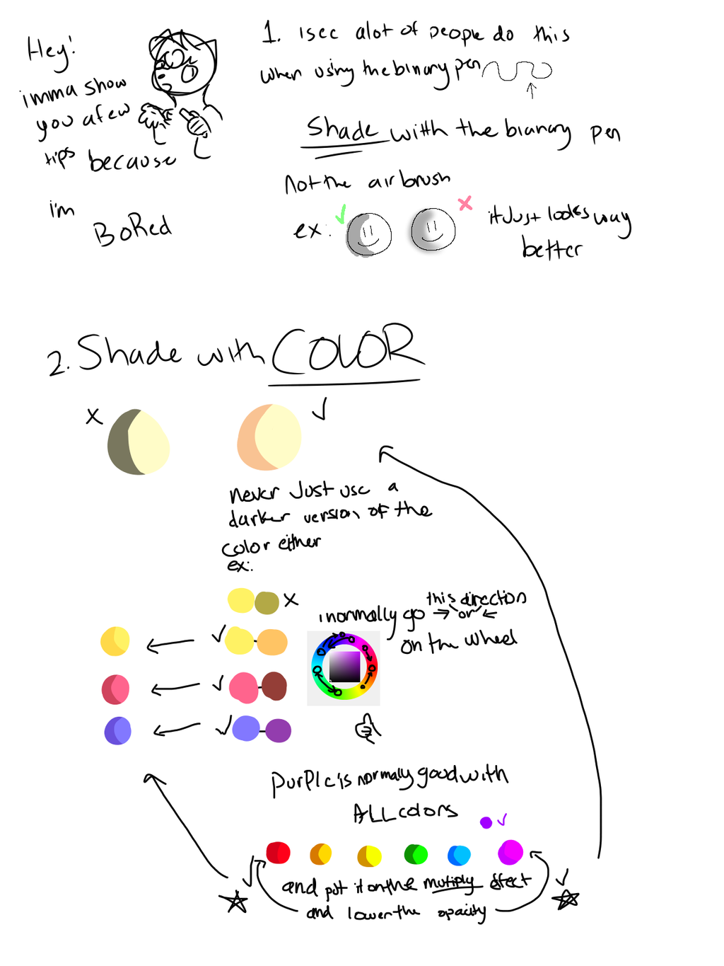
Sorry guys, this was formatted for tumblr where I originally got the request. It's super long, but I hope it's helpful.1) Some Basics
This is about the extent of my academic knowledge on color theory, so if your interested check out some of these awesome tutorials
Color Theory Tutorials-
kaenith.tumblr’ s color theory post
workqx.com
2) Palettes
For those of us who can’t pull fantastic color schemes out of our ass (or rather out of the color picker) palettes are an amazing tool! in fact there are a ton of great palette generators out there that are free to use. Below are three of my favorites-
coolors.com (used to make the above palettes)
Color palette exercises are also a great practice tool. Using a finite set of colors makes you really think about your composition and what your trying to achieve. Sometimes having too many color options muddles your final product, so even though it’s challenging to limit your color palette to say, five colors, your end result tends to be much closer to your mental vision for a piece.
here are some great palette challenges
3) Crystallize Method
Wan’t to make your own palettes? This is a great way to do it besides the random generators. Whenever I stumble across a particularly beautiful/dynamic photo I save it to a special folder to use later with this technique. You should avoid using the eyedropper tool on a non-crystallized photo because it will be very difficult to pinpoint particular colors. Even if you think your clicking on one color the dropper only samples from a very small area. By crystallizing the image you isolate the dominant colors that define that picture. Then you can use the eyedropper tool at your discretion to pick colors for your palette. There is not right or wrong way to pick them, but I like to stick to about 5 colors (1 light, 1 dark, 1 saturated, 1 unsaturated, and a wild card). I still recommend keeping your palette to no more than 6 colors. These should be the dominant colors of your piece, and while more can be added later in your coloring process as small accents, these 6 or fewer palette colors should be your primary go to for the bulk of your work.
4) Time to Experiment
Thumbnails should ideally be done at the beginning of your creative process. Make a small/simplified version of your idea or copy and shrink a sketch down to a manageable size. Then take those palettes you made and start experimenting! Make 10 thumbnails, make 20, make 100!!!! until you find a color scheme that grabs you.
5) Mood
what are you trying to express with your picture. Is your character happy or sad? sleepy or wired? stressed or relaxed? Your color scheme can go great lengths to help you communicate that. The above associations aren’t un-bendable rules, more guidelines to consider. Again- try them out in thumbnails before moving on to work on your actual piece.
6) Use contrast to create a focal point
Pretty self explanatory. Depending on your piece you probably don’t want your subject matter to blend into the background. Contrast will draw your viewer’s eyes right to the point of interest you create
7) Super Secret Color Hack
Here it is… my secret weapon. Everyone gets to a point in a digital painting whether at the beginning, middle, or end, only to realize something is frustratingly off with the color. If you’re like me then going back to individually tweak things is tedious on the verge of pointless (I’m a habitual layer merger). NEVER FEAR! COLOR BALANCE IS HERE. By moving the sliders you can change the overall color balance. This won’t fix individual color goofs, but it can drastically change the feel of your piece. Did your picture turn out too cool? warm it up by sliding more towards the red/magenta/yellow. Maybe the opposite happened and you’re to hot- cool that bitch down with more cyan/green/blue. Why not go for broke and just randomly slide things around! Who cares! if none of it works just hit cancel or undo. Alright, unfortunately now that you know my secret I’m going to have to kill you…
8) Common Mistakes and Things to Avoid
bring on the sparkledog hate mail. Every time a scene kid makes a sparkledog adoptable a kitten dies. (I’m just kidding lol, if you wanna burn your retinas out making these monstrosities more power to you)
For the rest of us, we will avoid using every color we ever thought was remotely cool when we design a character or background. Believe it or not there is such as thing as too many colors. Where do you even start to look when it comes to sparkle_poop87? Your eyes are drawn in 17 different directions. Nothing makes sense, nothing flows, in fact I had two epileptic seizures just making him. Sparkle_poop87 is also a great example of the pitfalls of simply picking colors as you go from the color picker. When I made him I chose colors as I went by hastily grabbing them from general color areas. What I’m saying is- yes, I can pick a blue and a purple and there are many blues and purples in the world that will work well together, but that doesn’t mean I’m necessarily going to choose them off the bat. You need to study your colors side by side before using them in your piece to decide if they work together or not.
9) Simplicity is Key
Think of your favorite characters. What do they have in common? What makes them so easy to pick out? When artists design characters they want them to be unique, but also immediately recognizable. Above are some of my favorite characters from various creators and they all have very simple, well thought out color schemes. Pikachu, arguably one of the THE most recognizable characters on the planet, only has 3 colors in his design! Steven Quarts has those most in this lineup and he tops out at 6. Now I’m talking about major colors in this case. I didn’t count the pink in fin’s mouth because that color is not integral to his design. I could have just as easily filled in his inner mouth with black and you wouldn’t have thought anything was off about him. You would still know that’s Fin from Adventure Time. (same thing with the white in Steven and Pikachu’s eyes. Don’t believe me? try it. Make color palettes from your favorite characters (taking only those primary colors that would make the character drastically different if they were changed) and see how many you get.
10) Save a Copy of your Sketch and/or Lineart
my last little tidbit would be to make sure to save a copy of your sketch and/or lineart before you start to color. Duplicate the layers and hide them out of your way. This way if halfway through your piece you find you’ve messed up, beyond what is reasonable to repair, you can start over. Go back to the beginning. Heck, go back to your thumbnails. What were you trying to accomplish with your color scheme? What mood were you trying to set. Do you remember when things started to go wrong? Are you trying to work with too many colors? There is nothing wrong with scrapping something and starting fresh. It’s a much better option than forcing yourself to finish something only to get to the end knowing you aren’t going to like how it turns out. Failure happens to the best of us. Learn from it and try again. That’s how you grow as an artist. You can do it! I believe in you! Now get out there an draw some stuff!
Related content


Comments: 15

Or unless you're trying to do Lisa Frank's style on purpose lol. But awesome tutorial.
👍: 0 ⏩: 0

Every blog tells something. This blog is actually fantastic and I’ve got enough things while reading this post. generators 2016
👍: 0 ⏩: 1
")

Aww, the crystallize method looks awesome! I've to try it too! Thx for sharing!
👍: 0 ⏩: 1

you're welcome, it's what I do
👍: 0 ⏩: 0

Awesome tutorial, I had to try the crystallize-method-palette instantly - though, if I would upload the picture of all palettes your eyes would bleed
👍: 0 ⏩: 1
glad it helped! yea, I have a folder specifically designated for my palettes
👍: 0 ⏩: 0

Some good points in there. Hopefully more ppl see this and stop doing their annoying solid color oversaturated pony crap reference sheets -.-
Anyways well done and thanks for sharing.
👍: 0 ⏩: 0

ew i need to improve
i really need to study colors/ palettes because i don't have experience with them
👍: 0 ⏩: 1
👍: 0 ⏩: 1
yes it is
/insertabeautifulandkinkygifhere\
👍: 0 ⏩: 0

I am full of moderately helpful tips
👍: 0 ⏩: 0
