HOME | DD
 WOLVERINE25TH — SATURDAY MORNINGS FOREVER: SCOOBY-DOO
Published: 2013-01-14 02:44:30 +0000 UTC; Views: 2520; Favourites: 46; Downloads: 11
Redirect to original
Description
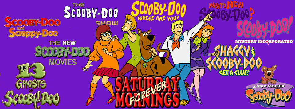
A banner for my Facebook group Saturday Mornings Forever, this time featuring Scooby-Doo. Because of the number of Scooby shows with the same basic premise (kids see "ghost," kids run from "ghost," "ghost" gets caught and unmasked) I didn't think it warranted a different banner for each. So, here we have the Scooby gang being bombarded with their various show titles. Ghosts of Scooby past!Related content


Comments: 19

This is a pretty cool banner highlighting the "Scooby-Doo" franchise.
👍: 0 ⏩: 0

I'm such a Doo fan...
I've seen reviews and read what critics said about the various incarnations and movies and can't say I agree
Of the series the only ones I didn't like/don't watch are the Get A Clue and Be Cool but I've like and still watch all the rest from the original to Mystery Incorporated...yes i like 13 Ghosts and am a Scrappy fan so critics can just deal with it
For the most part I've also like the movies say for the real-life ones (partly due to making Scrappy the villain and partly for how weird they were)...the voice actors changing made some of the more recent movies harder to watch but once I get beyond that I enjoyed them...my favorite by far is Cyber Chase...on the other end is Zombie Island...just too dark and like the real life ones too weird (creeped me out as a kid) and I'll probably collect the movies and series on iTunes over time (minus the few I didn't enjoy)
I've always loved mysteries and Scooby really pushed me further in that direction...some felt it was fake and others really hated some characters but I've enjoyed just about everything
👍: 0 ⏩: 1

I'm not the biggest Doo fan. The problem overall with the Hanna-Barbera years was it was basically the same episode recycled over and over just with new branding until 13 Ghosts. I did like The New Movies because of all the guest-stars, that one would be my favorite of classic Doo, and I watched A Pup every Saturday morning. I haven't watched Mystery Incorporated yet, but I hear that's the one to beat. I was intrigued by what I've read so far. I have seen some of Be Cool, and boy, isn't that a let down. Probably the worst incarnation since Shaggy & Scooby.
As for the movies, I haven't seen most of them but I have been gradually filling them into my collection. The live movies were trash. I regret seeing the first one in theaters.
👍: 0 ⏩: 1
To each their own...but I can understand that whole predictable thing can get old fast
I loved the stars on the one series but couldn't pick just one since a lot were fun to watch (always tuned in to see who would be on that day)
And totally agreed on the live action...waste of $5 going to see it and never saw the rest...and that is the only sticking point for me about MI...they keep that "hatred" of Scrappy and cast a darker light on Flimflam
👍: 0 ⏩: 0


Here's the video hope you like. m.youtube.com/watch?v=eHMjiHJn…
👍: 0 ⏩: 1
I'm working on a retrospecitve series called Scoobypalooza where I look back on the Scooby series it's similar to Doug Walkers Disneycember or James Rolfe's Cinemassacure Monster Madness. I was wondering if you can make me a title card for the videos, I'll give you credit.
👍: 0 ⏩: 1
I'm thinking of a blue background with Scooby in the center and beside him are the other incarnations (puppy version, live action version, Get a Clue version and Mystery Incorperated above him is the Scoobypalooza logo with the original Logo font for the Scooby part. If you wanna add something that's fine
👍: 0 ⏩: 1
What size and send me your logo.
👍: 0 ⏩: 1
im thinking of a 40x30" and do you want to email my logo to you
👍: 0 ⏩: 1
i saw it and i already emailed it to you
👍: 0 ⏩: 0
Took a base image of the gang and removed the background. I Googled each of the show's titles and removed the backgrounds and resized as needed. Put in my trade dressing and positioned everything.
👍: 0 ⏩: 1
what i ment is what did u use and how did you remove the background
👍: 0 ⏩: 1
Ah, Photoshop. For most of them I was able to use the wand tool which selects anything of a similar color. Some of them I had to go in and manually erase around the letters with the eraser tool. Both leaves you with a transparent background. Not much skill needed, just a little patience.
👍: 0 ⏩: 0
