HOME | DD
 woxy — Jump in

Published: 2009-01-08 16:06:23 +0000 UTC; Views: 1503; Favourites: 22; Downloads: 29
Redirect to original
Description
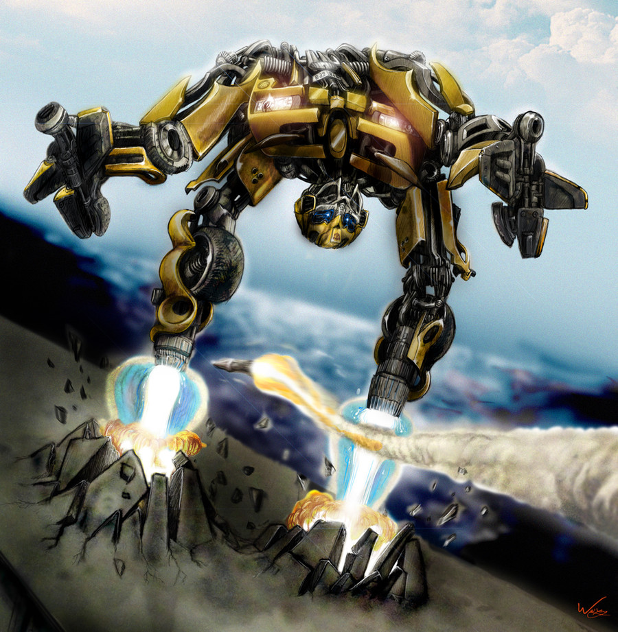
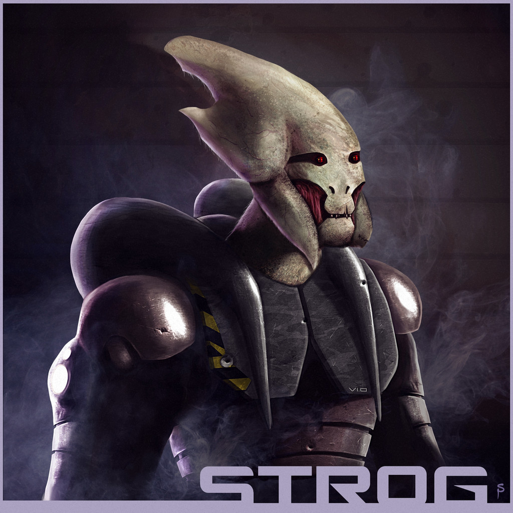
Improved version of this--> [link]some cropping, lights and others stuff to make it look better
 (Smile)")
cheers

Related content


Comments: 18


not in the link for the original in the artist comment
")
👍: 0 ⏩: 0

This one has many improvements and details 
Nice going and getting better with your digital skills
")
👍: 0 ⏩: 1
hey, thank you for a nice comment, I'm glad you like the stuff that I tryed to improve
👍: 0 ⏩: 0

i think it looks better
a slightly more vibrant purple and cropping do nice.
👍: 0 ⏩: 1
yup, I like the purple you use on your pictures and I said hey, I can try it too
👍: 0 ⏩: 1
funny thing is.. i never really liked the color... but when i put it with other things, it seems fantastic. I started practicing some color from an artist my teacher introduced us to named Jeremy Vickery. He does lighting at pixar animation studios. A little boring to listen to, but his stuff is very insightful. I think you might like it too.
👍: 0 ⏩: 2
It's not in his free tutorials, but it's in his dvd's about light and color.
👍: 0 ⏩: 0

