HOME | DD
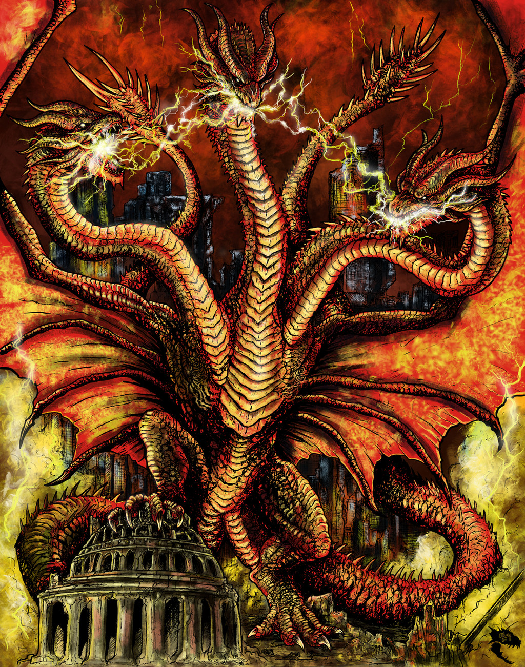
 WretchedSpawn2012 — Crimson Spike Godzilla

#godzilla #creaturedesign #digitalpainting #dinosaur #gojira #horror #illustration #japanese #kaiju #monster #photoshop #sciencefiction #shingodzilla
Published: 2016-11-05 01:14:11 +0000 UTC; Views: 7896; Favourites: 325; Downloads: 86
Redirect to original
Description
The painted version of my black and white Godzilla wretchedspawn2012.deviantart.c…Related content


Comments: 18


Aaaaaaaaand... another fan version of Shin Godzilla that looks leagues better than the film version...
👍: 2 ⏩: 2

Oh, my god, right?! It's not just me?
👍: 0 ⏩: 1
People keep telling me that Shin looks terrifying but I legit don't see it. To me, it either ranges from adorable to downright goofy looking with the only scary thing to me design-wise is that face on its tail.
👍: 0 ⏩: 1
To me, Shin looks like an inbred Yoshi.
👍: 0 ⏩: 0

Thanks! Actually wasn't meant to be a redesign of new movie, more just a version of the way I would have wanted to see Godzilla. But I will say...the two latest Godzilla installments in my opinion made some odd design choices on the monster, mostly with his proportions
👍: 0 ⏩: 1
You're welcome. I don't feel that way at all about the 2014 version. The 2014 version was designed to look like a real creature and they accomplished exactly that. The 2016 Godzilla was designed to look like a horror creature... instead, he looks goofy as fuck
👍: 0 ⏩: 1
I'm kinda mixed on both designs. There are bits of things I like and there are things I dislike about them. For the 2014 one most of my dislike comes from the the fact he has a lot of tiny features on a large chunky body. I'm not really fond of the small boxy head and the overly thick stumpy legs/ feet. Though I SH Monsterarts made a figure that was a more proportioned to my liking, and the feet were more angled and not as stumpy. I did like the crocodilian look of it though. As for Shin Godzilla my only complaints are googly eyes (REALLY odd design choice) and the stiff arms. I did like the radiated marks all over his body though.
👍: 0 ⏩: 1
The only problem I had with the 2014 design was the head size (and a little bit on the feet). I thought he had a very expressionate face and they did well incorporating the dog-like and eagle-like features into his make-up. Plus, I liked the box snout, it gave his face a very thick and durable feel to it; the kind that you know won't break if someone like Gipsy Danger punched him in the face (and it makes sense considering how Godzilla uses his jaws in most of his fights). As much as I liked the previous Godzilla designs, it never made sense to me why so many of them possessed such thin, brittle looking snouts (especially Godzilla 2000), seems kind of disadvantageous. Plus, I liked the chunky body, it was very reminiscent of the 90's era where Godzilla looked like a walking balloon . I'll also admit though that the feet could have had longer claws, the S.H. Monsterarts version did a good job of actually giving him real toenails 
I liked the zombie look they gave him and I usually never complain about the Godzilla's tiny arms but what upsets me is that Godzilla is the 'king' of monsters and one of his trademark abilities is super strength (even Legendary Godzilla was still able to lift the Femuto off the ground by the neck) but Shin Godzilla's arms are completely useless... he has NO PURPOSE for them. He can't even bloody move them
👍: 0 ⏩: 1
Comparing Godzilla to a sauropod is a bit out of relevance, since sauropods walk on four legs and Godzilla walks on two like an upright theropod. All of that weight is going to the front, and angled feet bare more support for that type of creature so it's just odd they picked that design route. It would have worked/ looked better for a kaiju walking on four legs but for Godzilla, in my opinion, it does not so much.
Also what Godzilla 2000 lacked in snout size was made up for the fact that his teeth were significantly larger and stronger. That one and the GMK Godzilla had larger snouts than the ones before them.
I honestly dunno what Toho was thinking with Shin Godzilla's eyes either. I don't find them scary as much as I find them aesthetically ugly (and not in the good way)...just way out of character. That said I still have yet to see the film, and sometimes my opinion of a creature design can somewhat change when I see it in action on screen.
👍: 0 ⏩: 1
Why would that be out of relevance? Sauropods are elongated so they have to walk on all fours. Godzilla isn't elongated so he stands on two feet but feet with that design are required for massive creatures like that since any other foot structure would cave in. Grant it, Toho doesn't base their series on realism but Legendary's does, that's the difference.
Those teeth wouldn't have done much good if they were knocked out... or if his snout broke.
Haven't seen the film either. They don't have showtimes in the middle east
👍: 0 ⏩: 0


Thanks! I'm a huge sucker for the 2000 design so that's why I picked the red spikes over the traditional blue ones
👍: 0 ⏩: 0

This is an overwhelmingly badass redesign. Awesome work!
👍: 0 ⏩: 1

I suppose my only critique is shouldn't his elbow spines be black? Like his knees?
👍: 0 ⏩: 0
