HOME | DD
 Wrice — 10-10-05
Published: 2005-10-10 21:14:32 +0000 UTC; Views: 4626; Favourites: 55; Downloads: 358
Redirect to original
Description
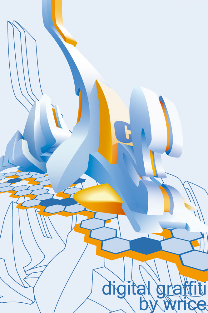
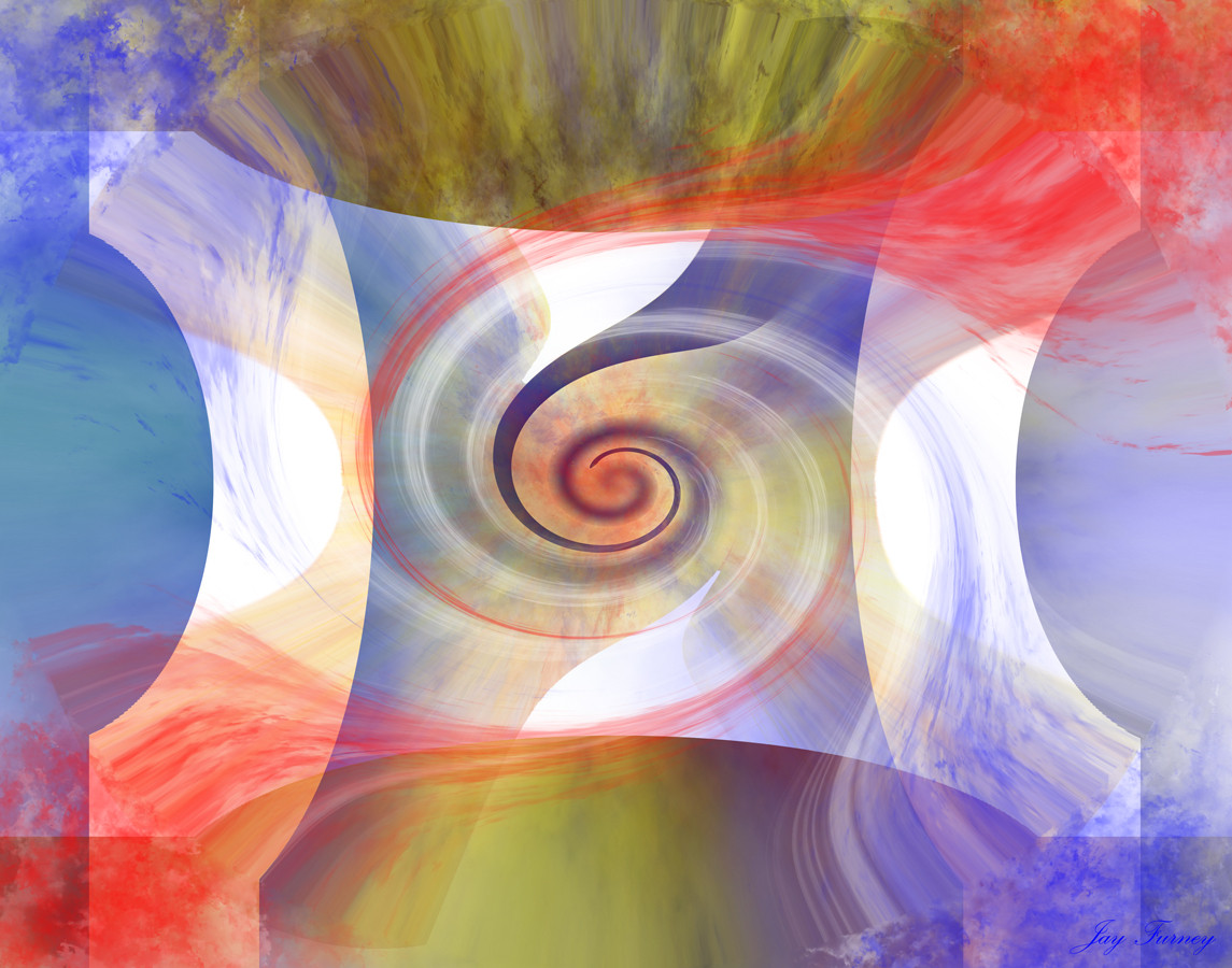
well...here is my second try on Illustrator...I thank C4rl for his very constuctive color comments!
PS: sorry La Maitre I didn't know where to put the canadian flag! But I really thought about it!
Related content


Comments: 39


 (Smile)")

Great Piece ... respect for your Illustrator skills
really great work!
👍: 0 ⏩: 0


Any chance u 1 day make a graffiti tut, on how to do something like this in illustrator ??
Great work btw
GFXman
👍: 0 ⏩: 0

Je pense que l'on peut prendre ça comme un compliment alors merci! Je reconnais que je suis gros fan de Daim alors ça déteint un peu (beaucoup) sur mon style, avec beaucoup moins de talent bien sur
👍: 0 ⏩: 1

un peu beaucoup lol (les couleurs bleu et orange)!! mais t'es pieces sont fresh!! BIG UP!
👍: 0 ⏩: 0

C'est canon ça comme truc ")
")
👍: 0 ⏩: 0

thanks a lot. Your comment is highly appreciated, especially regarding your amazing gallery!
👍: 0 ⏩: 1

Man To bad its digital Graffiti cuse it would be nice to see that hit up on the streets and walls of my hood so of the tag art people do just dosen't cut what could be done so Kodos to you for the awsome work
👍: 0 ⏩: 0

neat.contrasting. would love to see it transfer onto wall tho.
anyway nice digital graf ~
👍: 0 ⏩: 0
pixelitepanda [2005-10-16 02:09:26 +0000 UTC]
Illustrator, gah, that's like the hardest thing for me to use. Sick job on this though,

👍: 0 ⏩: 0


You´re really going in this technique,,/1!
good work
keep it up !
👍: 0 ⏩: 1


Solid like a 60's chev mate, can't fault it. Loving the perspective and overall flow of the piece and even your background action is on point to a T.
Very schpick.
👍: 0 ⏩: 1


Je ne sais pas si j'aime l'orange, je pence pas que sa ne fonction pas si bien que juste le bleu.. Mais j'aime le contour dans le fond, et le nouvel angle que vous avez ultilise.
-
hah, no worries about the leaf, I'm surprised you even tried.
👍: 0 ⏩: 1
thanks for your comment...when I posted it, it was totally blue but after a little talk with c4rl I changed some elements in orange and, trust me, it's really better like this!
👍: 0 ⏩: 1
hah, fair enough.
there are some aspects of the orange I erally like..but I still wasn't too sure about it.
👍: 0 ⏩: 0

Thanks for the comment and fav! about Illustrator, I'm really a beginner but it doesn't seem harder than photoshop...
👍: 0 ⏩: 0


That's pretty sick. I like how it interacts with the background, not your best though. ;x
👍: 0 ⏩: 1
thanks! I will try to do something better next time!
👍: 0 ⏩: 0