HOME | DD
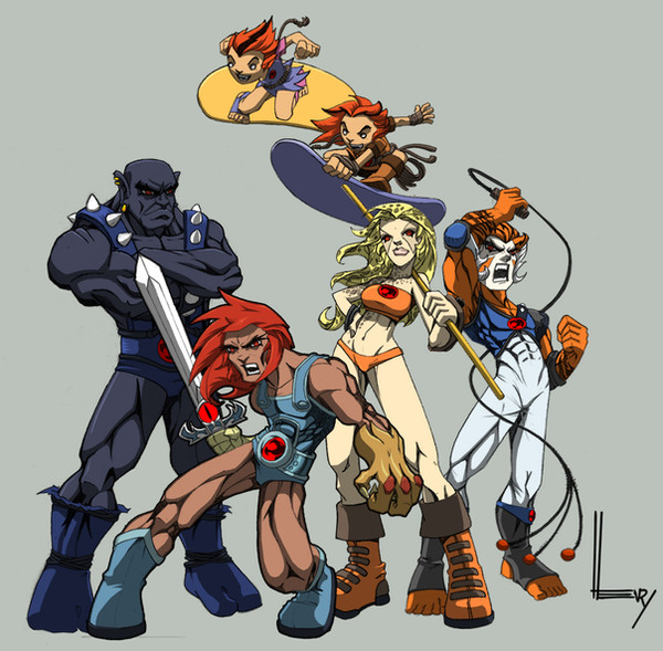
 wrightauk — Colours: TMNT

Published: 2007-09-30 12:51:34 +0000 UTC; Views: 2842; Favourites: 66; Downloads: 59
Redirect to original
Description
My first ever attempt at colouring (I know it ain't first in the gallery, hehe).Lines by greatLP .
Related content


Comments: 17

This is a very good pic! Great movement and the colouring is good too. ^^ Nice work!
👍: 0 ⏩: 0

nice work  (Smile)")
...
...
at least that's what i thought at first ahaha
👍: 0 ⏩: 1

It looks like we've got similar taste in the lines we choose to colour. I coloured this [link] about a week after you uploaded your version (though I've only just found your gallery). Mine's a little different to yours. For a first colouring this is awesome. You should see my first. It's so bad it's not even in my gallery. I think the first image in my gallery is my third colouring.
👍: 0 ⏩: 1

Thanks for all the comments. We have coloured quite a bit of the same stuff
👍: 0 ⏩: 0

i think it looks cool. though there is some shading missing hehhee
👍: 0 ⏩: 1
Yeh, I know. This was my first attempt at colouring EVER, so there are bound to be mistakes.
👍: 0 ⏩: 0

hmm ..nice! but still there's missing something...
maybe the colors of both the background and the characters are too simple.. so you could change for example the bg to make it more interesting
👍: 0 ⏩: 1
Thanks for the feedback. Personally I think it's the shadows on Raph's and Michy's shell. The grooves are shaded but there's no overall shadow...
I know there's something not quite right about it, but as it's my first ever colouring attempt I'm leaving it as is
Well, that's my critique on it anyway
👍: 0 ⏩: 1
I didn't mean that theres something not right, anyway
I think the background color makes it look a bit "flat"
👍: 0 ⏩: 1
Ah, ok ")
👍: 0 ⏩: 1
yeah, you've got the right to do so.. still.. this grey ..then black would be better
 (Wink)")
👍: 0 ⏩: 0


Nice job!
I really like the subtle color differences on their skin. The bandanna shades are awesome as well.
👍: 0 ⏩: 1