HOME | DD
 Wyrdiam — Aaron Shape-shift WIP
#animation #baboon #beast #gorilla #lycanthrope #primate #shapeshift #shapeshifter #teen #teenwolf #therion #transformation #werewolf #wolf
Published: 2018-01-13 18:12:11 +0000 UTC; Views: 2494; Favourites: 33; Downloads: 0
Redirect to original
Description
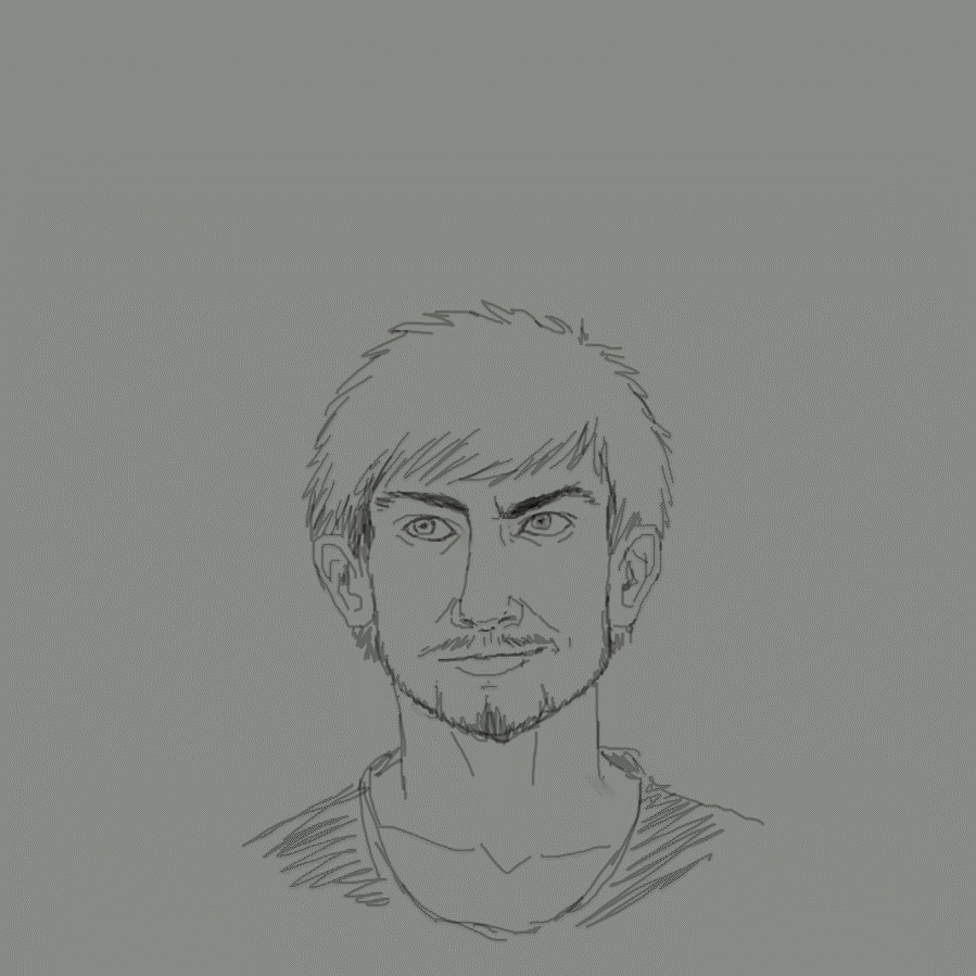
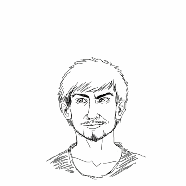
Something I've had in my mind for a while, and I wanted to make it live outside my mind.So I sketched up this!
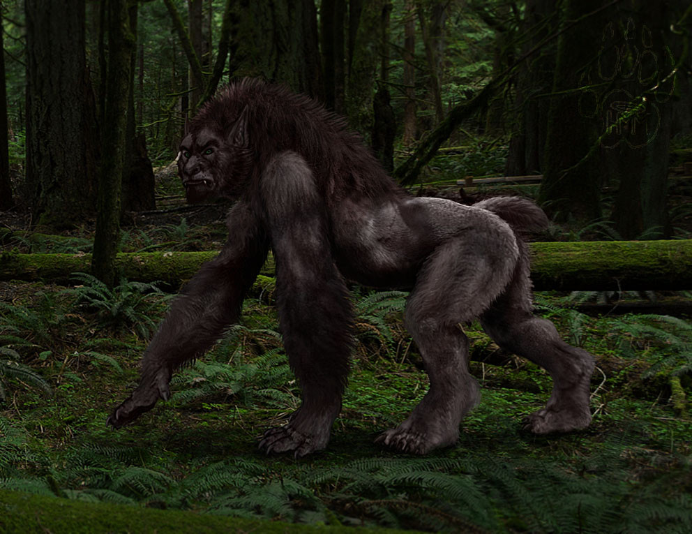
Aaron shape-shifting into his Therion (Beast) form, from his human form. (only the head)
For more info and pictures on my take on 'werewolves', look here: h-m-m.deviantart.com/gallery/5…
Critiques and animation tips etc. is very welcome since I'm new to this! This is my second attempt at animation (digital)
Also, this is only a rough sketch animation. I might fine-tune it if I get feedback. Or I'll just leave it for now.
 (Smile)")
My first animation walk-loop can you see here: h-m-m.deviantart.com/art/Theri…
Hope you like it!

---
TEXT EDIT:
The critiques and tips I've gotten have helped a lot! Big thank you to everyone!

I'm currently working on improving the animation.
Making more frames between the original sketches.
I'm cleaning up the lines, getting rid of the sketchiness. (Even though I like it, it's good practise to take it to another step.)
I now know that in the beginning and the end of the animation, I have to make the frames longer. It looks better and gives a nice pause before the shape-shift begins and when it's completed.
Switching the greyish background to white.
The lines are more contrasted/darker.
It will take some time, since I have stuff I'm working on at work, which I sometimes work on at home as well. (I love my work
I get to be creative and do the things I love..ART!)But I am determent to finish this animation!

TEXT EDIT TWO:
It's finally finished!
")
Watch it here: www.deviantart.com/h-m-m/art/A…
Related content


Comments: 12

Beautifully done! I really love how everything flows into one another, yet the style is still kind of choppy. Wish I could offer some critique but I'm left without much to offer. Perhaps the line thickness could be more consistent to lend a bit to the realism? Otherwise I think this is wonderful.
👍: 0 ⏩: 1

Thank you very much! 
I'm cleaning the lines up a bit, and I'm adding a few frames between the original.
You'll be notified when I re-upload the cleaned up version!

👍: 0 ⏩: 0

Man, I absolutely love looking at your werewolves. Definitely one of the best concepts I've seen c:
Very nice animation!
👍: 0 ⏩: 1
Aww 
Thanks again!
👍: 0 ⏩: 0

The art is great and I love how the head grew and became broader, and the final smile sharing his joy to be a werewolf.
now at your request, here some boring thing you surely know.
The compressor you use add some artefact in the background, this can be avoided by reducing the number of colour, use a white or transparent back ground.
The animation have some "back and forth" effect, it seems your draw independently. You must use the previous pict (using transparency) as ref to avoid this. the effect is obvious with the shirt, as is suppose only to stretch but it's totally different at each frame. as well as the line on his neck.
Last tips, as the "I move" is usually for account leaving, so at first I thought I'll have to update my fallow list
👍: 0 ⏩: 1
Thank you! I'm pleased the expression I tried to convey was a success!
I noticed that, but for me it's not something I really care about right now. (I can't draw on white backgrounds since I'm sensitive to bright lights/screens. I use a dark universal 'skin' in my browser and in photoshop.) But good to know why they appeared and how to not get them in the future, thanks!
I did use the previous picture with low transparency to sort of get the same lines, but it seems I wasn't that precise.. I sort of rushed each layer. I'll try clean them up to be more precise if I decide to do that!
Yeah, I thought about that when I wrote 'I move', I've seen 'I moved' if someone chanced accounts. Sorry for giving you a slight heartattack.
What can be a good substitute word for 'I move'? To let you know that it's moving. Or just use the 'Animation' that's also on the preview picture, but bigger size?
Thank you again for taking time to give feedback! I'm grateful, even though I might have seen the things you mentioned. It's always good to have someone else state them out too!


👍: 0 ⏩: 1
Note I was abble to cach the expression because I use a tool to see each frame the time I want.
It would be better to have a longer time of display at the start and at the end of the loop
As human eyes are more sensible to blue light, almost all screen have a "bluish" colour temp set by default, you need to set the colour temp to "warm" to get something more natural.
This also explains why there is so much difference between what you have on screen and what you get on print. (out of the fact that it's not the same colour space, additive RVB vs subtractive CMJN)
Maybe if you turn the colour temp to a warmer one and reducing the backlit you'll find a white background less harmless.
There is no need for a screen to send you more light than a blank paper under a normal light but builders tend to turn them to powerful flashlight to advert about how much candela they have.
You can also use a grey layer and hide it on the final.
You need to check the difference between 3 frame, just to not make mistake if you compare just two, you can't figure out if it's the good movement direction example
If you want this :
/
|
\
but you check only two frame you may do this
/
|
/
|
\
resulting in a back and forth move
I used to see "animated"
👍: 0 ⏩: 0

This looks REALLY solid! I love the progression of the expression and how the features themselves morph! My only note is that you could (if you wanted to) add additional frames in between each of these to make it even smoother (but you probably already know that, haha). But this is already really good as is! Keep up the awesome work!
👍: 0 ⏩: 1
Thank you! Yeah I've been pondering if I will add in-between frames or leave it as it is. Some frames seem to go by too quickly, and adding frames might help.
It'll be a great practise to actually try making it more smooth!
Thanks again!
👍: 0 ⏩: 1
No probs, keep up the awesome stuff!
👍: 0 ⏩: 0
