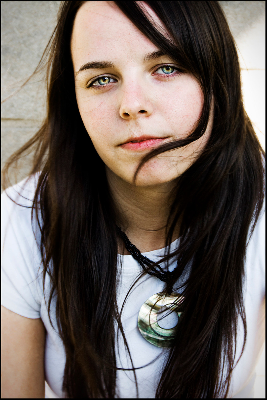
HOME | DD
 wzrdofozfan — Headshot

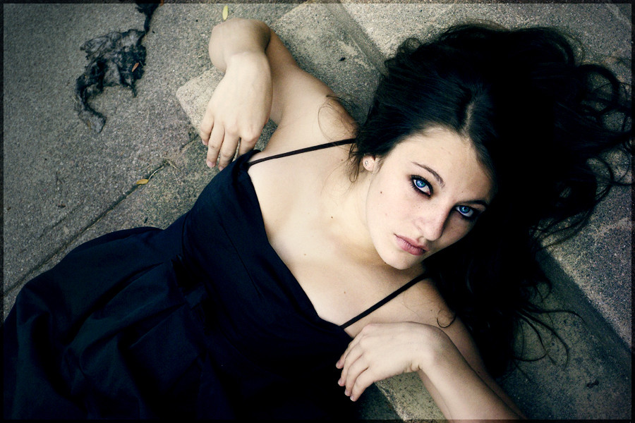
Published: 2009-11-19 16:30:47 +0000 UTC; Views: 1023; Favourites: 21; Downloads: 26
Redirect to original
Description
I am the photographer, not the model.-ers
I'd love your opinion on this piece. The main the I am wondering about is her arms. Do they work well as a "frame" for her face or not? What about her skin tone verses the background? Does it pale her out?
As you can tell, I tend to over think things, so I'd love any feedback you have to give.
Related content


Comments: 71


Haha, I wish! They were contacts.
👍: 0 ⏩: 0

WOAH those eyes. I'm glad you cropped it this way. Armpits very rarely work lol
👍: 0 ⏩: 1
Don't be fooled - they are contacts.
Yeah, I was really unsure about the whole armpit thing, but I think it worked out okay here.
👍: 0 ⏩: 1

#GimmeFeedback
Yeah, I am not a big fan of the arms. I wouldn't say that they frame her face... They are rather distracting.
I'm not sure that the background pales her out, but it is rather dull... It's concrete... Not to exciting.  - =P")
Another thing that I noticed was the eyes... two things- the color and the hair. The hair in front of her eyes distracts from her face, in my opinion. A few wisps would be better than a big piece like here... And the color... I am guessing it's photoshopped because it looks unnaturally blue...
Last thought- It looks just a tad over exposed.
Hope that helps... I feel so critical I'd appreciate any feedback you have on my work as well!!
👍: 0 ⏩: 1
Well, since there was nothing positive with that comment (see constructive criticism), you should feel critical.
She has contacts on.
Thanks for your comment, but I've decided to leave this piece as is. Thanks again.
👍: 0 ⏩: 1
Sorry if you are offended, but you asked for feedback and that is what I thought.
👍: 0 ⏩: 0

Before reading your comments I remembering thinking that her arms make a beautiful frame for the shot. I don't think her skin is too pale at all. In fact I think that her dark hair and blue eyes look great against the skin tone. The background seems to fade away to me and I don't actually notice it much. I hope that does not sound bad. Great shot!
👍: 0 ⏩: 1
Thank you very much for your feedback.
👍: 0 ⏩: 1

There is only one problem I have with this. Her arms are more pale than her face, so they sorta distract me...
👍: 0 ⏩: 1
Thanks for your feedback.
👍: 0 ⏩: 1
nice job! I really like the idea of the pose, and the details of the face and hair that you captured, I agree that the forearms are possibly too bright, and that maybe if you where to try this pose gain you should have her arms closer together at the top, to tie it all together and have less of an 'open' feeling?
👍: 0 ⏩: 1
Good deal. Thanks so much.
👍: 0 ⏩: 0

This is great!
I have a few critiques...
First of all I think the photo looks a bit washed out. You can adjust this with Photoshop.
About the arms, I don't love their position, but that's up to you! However, I do think it's a creative posture. Her facial expression is wonderful.
Overall, a great photo!

👍: 0 ⏩: 1

I don't think the background makes her look any more pale...you could increase the saturation of the wall behind her, the left side would have a nice cool tone to contrast the warmer tone of the right side. Nice shot though, love the mood.
👍: 0 ⏩: 1

I definitely think that the colors wash her out a bit, maybe just adjust the levels so it's a tad darker?
I like how the blue tint in her hair is consistent in her eyes.
and also, her arms do look a little strange, I think if the entire arm was shown, not just cut halfway through the arm. It would give the photo more depth, I think
Nice photo though, I love her expression!
👍: 0 ⏩: 1
Thank you very much for your comment!
👍: 0 ⏩: 0

Yes, the arms sort of frame her face. They draw attention to it but don't stand out themselves too much, which is good. The cream in the background looks better than the blue. It makes the skin look paler, but also more natural and healthy at the same time. It also makes the eyes and hair stand out better. The blue part of the background coincides with the eyes but doesn't actually add to the image.
The whole picture looks very fresh, I think. It's a compliment to both the model and the photographer. ")
👍: 0 ⏩: 1
Thank you very much for your detailed comment.
👍: 0 ⏩: 1

I notice she has a very intense facial expression  (Smile)")

👍: 0 ⏩: 1
Thanks for the comment on her hair. I appreciate you acknowledging how it helps the composition.
👍: 0 ⏩: 0

This is a very strong shot, and the use of her arms as a frame is an interesting ides. I think that the work well in this context, however the shot I feel is a little to overexposed. I think the model is too pale for what it looks like your doing here. She is wonderful, and those are great eyes. I would work on the exposure and not worry about the background, it could be darker and work just as well within the image.
👍: 0 ⏩: 1
Thank you very much for your comment.
👍: 0 ⏩: 1


I really love the deep blue color of her eyes! I wish they were a bit more in focus though. In portraits, I've noticed that they are more intense when the eys are the main focus of the picture. There's that instant connection, and as the saying goes "eyes are the windows into the soul." It's really necessary for a strong portrait
You asked about the arms working as a frame. I can see where you're going with it, but I think they detract from the picture. Perhaps if you weren't as zoomed in and her whole arms were visible? I think it would have a bigger impact.
The background is alright as well. I think it could possibly be a little bit more intriguing or perhaps be darker, but since you're afraid of her being too pale, it's best you went with a lighter background
Overall, I think it's pretty good! Well done

👍: 0 ⏩: 1
Thank you.
I think if her hands were also in the picture, it would've helped.
By the way, she wears blue contacts. Her eyes are naturally dark brown.
👍: 0 ⏩: 1
Ahh, I see. I was wondering if you upped the saturation only in her eyes  (Wink)")
They're really striking!
👍: 0 ⏩: 0

Well the arms are good thing in the photo cause it likes she's being photographed against her will, and probably drunk, beaten, drugged or something like that s
and it's awesome effect
the background is a little uninteresting so with better background and even black and white effect that could be a photo worth of calling "perfect"
👍: 0 ⏩: 1
Thanks for your comment.
👍: 0 ⏩: 1

This is a lovey shot, the look she's giving the camera is piercing and eye-catching.
I agree with ~iSpreadLoveAndPeace , her forearms are too light, they should be darkened to better match the rest of her skin. But I really do like the arms framing her face, it's a cool effect.
For future reference on a picture like this, maybe have the wrists together so it kind of closes the circle around the face. The way it is now, the top doesn't have the same closure as the bottom does.
👍: 0 ⏩: 1
Good deal! Thanks so much for your suggestions!
👍: 0 ⏩: 1
No prob, glad I could help!
👍: 0 ⏩: 0

There is nothing wrong with the way she have her arms. I am though a little bit... what should I say, thoughtful about the background. I'm not sure I like it completley. My first thought was a darker, much darker background, that would bring out her paleness differently than it does now. But then I thought again. and maybe you should have had the light source from a different direction, in that way you might get some more shadows on her arms and face. I think I would like that...
Anyway, I like her expression and the whole concept so good work. I'm not sure if I was to any help but yeah, I tried.
👍: 0 ⏩: 1
Yeah, the sun was actually coming in from behind her and she was sitting in a bulldozer.
👍: 0 ⏩: 1
Anytime
Yeah, that might explain why things are as they are. But as I said, the picture works. But I like when there are a little shadows as well
👍: 0 ⏩: 0

I love her face, but just darken her forearms a little; they take away from the picture due to their brightness. :'D
Other than that, this is stunning. ^^
👍: 0 ⏩: 1
Thanks so much. I didn't noticed how overexposed her arms were until you and another deviant mentioned it.
👍: 0 ⏩: 1
You're welcome. It's just a trick of getting lighting right.
👍: 0 ⏩: 0

I love this pic. But upper right hand is too lightened... And everything else is uber super
👍: 0 ⏩: 1
Thanks
I see what you mean.
")
👍: 0 ⏩: 0

First, this assumption, obligations have to be vertical. The reason, the arms. Only if the model was showing her hands would have justification the horizontality of the photo. The arms detract attention to the model, and absorb much light, they feel very outside to the shoot.
Regards. and keep up the good work
👍: 0 ⏩: 1
| Next =>