HOME | DD
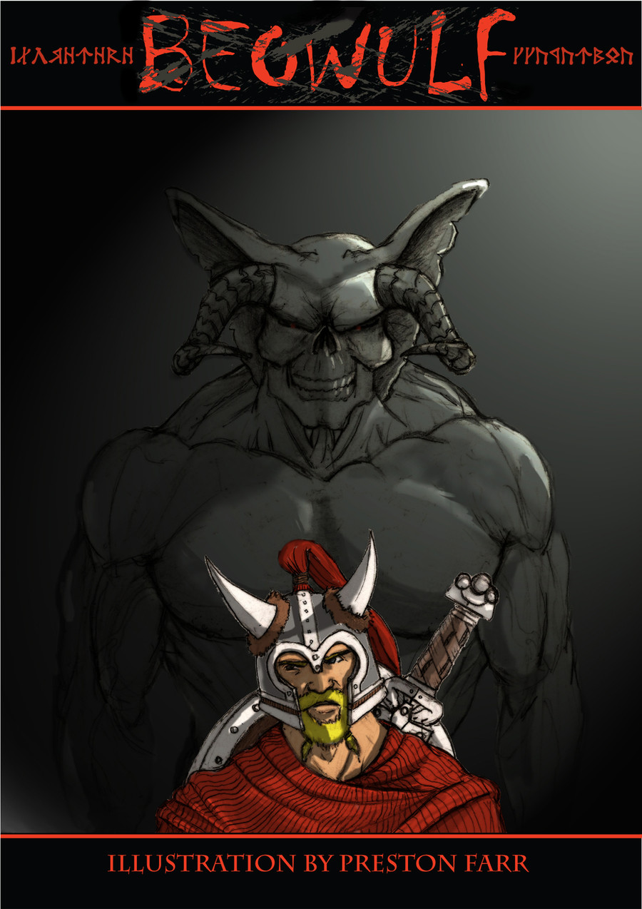
 Xavisavvy — Beowulf Cover
Published: 2009-06-11 04:29:54 +0000 UTC; Views: 1865; Favourites: 2; Downloads: 10
Redirect to original
Description
I did the line art using graphite, and scanned it into the computer. Thanks to a friends advice, I think the scans look much better. (Smile)") This is as much as I am going to do for now, but if you have a crit or comment on what you like or how I can make it better, SPEAK UP! I love comments
This is as much as I am going to do for now, but if you have a crit or comment on what you like or how I can make it better, SPEAK UP! I love comments
Related content


Comments: 16

Looks a lot more professional = )
Can't see any blurry lines, uneven color tones, any inconsistencies
👍: 0 ⏩: 1

Your picture was robbed! ROBBED I SAY! It deserved a sticker. If I could have put two on, I would have given you one!
👍: 0 ⏩: 1

hah, thanks
👍: 0 ⏩: 1
To be honest, I was surprised I got even one sticker. But your right, my pic does have a certain apple to the women-folk. What are you gonna do for the next project? I have no idea what i'm doing.
👍: 0 ⏩: 1
Cliff says I need to do Master Chief from Halo vs. Duke Nukem.  (Devil)")
👍: 0 ⏩: 2

duke is waaay tougher than master chief. i'm pretty sure of that.
👍: 0 ⏩: 1
HAHAHA! MASYER CHIEF! You so should! This would be for your ad?
👍: 0 ⏩: 1
I was thinking about doing a movie poster.
👍: 0 ⏩: 0

I think you need to carry the shadow over to the main character cause it looks like they dont share the same space....and slightly stronger highlights on the monster were you already placed them would help push it out more from the shadows without over doing it..its going to turn out great!

👍: 0 ⏩: 1
sweet!~ I shall continue working on it until I nail it.
👍: 0 ⏩: 1
I put some more rim lights on the face.. (surprisingly hard to figure out with a skull in such odd lighting.)Do you think I should push the highlights more? (I lightened the bg a bit because when it printed it came out a big black mush)
👍: 0 ⏩: 0

oops, i just commented on your wall, sry
👍: 0 ⏩: 1